

Typefaces have such interesting names don't they? I am a big fan of the web-based application called "Cheese or Font," that shows you a name and asks you to identify it as a cheese or font. You have to wonder where some of these font names came from and what the story is behind the font's invention and early use. I went through some font history, courtesy of Wikipedia and dug up these fun font facts for you to enjoy! 
- This group of typefaces is named for punch-cutter Claude Garamond who worked during the 1540s.
- Garamond's Roman typefaces were adopted by the French court and gained influence across Western Europe.
- You can visit the only complete set of original Garamond dies and matrices at the Plantin-Moretus Museum in Antwerp, Belgium.
- Rockwell was first designed by Monotype foundry's in-house design studio in 1934.
- Rockwell was featured in the Guinness World Records late 1980s and early 1990s publications.
- The New York Times uses a similar font, Stymie Extra Bold for headlines and sometimes in its Sunday magazine.
- This oh-so-cool typeface was commissioned by the Bauer type foundry and designed in 1927 by Paul Renner.
- Futura is based on the geometric shapes representative of the Bauhaus period.
- Renner believed a modern typeface should express modern ideas rather than be a revival of a previous design.
- Renner's original concepts for Futura, including alternative characters, can be found in the typeface Architype Renner.
- This typeface was designed by Howard Kettler in 1955 and was commissioned by IBM in the 1950s for use in its typewriters.
- IBM did not secure legal exclusivity to the typeface, and Courier became adopted as the standard font for typewriters industry-wide.
- In Hollywood it is a best practice for screenplays to be typed in 12-point Courier font.
- Kettler originally named the font "Messenger," but then revised the title to "Courier" to give the font more dignity, prestige and stability.
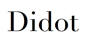
- Didot was first created in 1783 by Firmin Didot, a member of a famous French printing family.
- In 1814 Napoleon appointed Firmin Didot as the Director of the Imperial Foundry.
- Harper's Bazaar uses the Didot typeface on its front cover, and CBS used a Didot variation for years as part of its iconic eye logo.


[...] in extra bold weight, and Stymie Bold. Memphis was designed by Emil Weiss saw ATF squaring off . Fun Font History & Facts The New York Times uses a similar font, Stymie Extra Bold for headlines and sometimes in its Sunday [...]
Stymie Extra Bold Font...
[...] e legal exclusivity to the typeface, and Courier became adopted as the standar [...]...