


A nice illustrated cover by Renee Castro.
 However you feel about the legalization of pot this is a nicely put-together ad. And for being a full-page ad that could have been crammed with random information and splashed in garish colors it's supremely tasteful.
 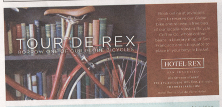 What jumped off the page for me with this one was the nice photography. Hotel Rex took a bit of a risk here using a thin sans serif font on newsprint in white, but lucky for them the colors were registered properly.
  Some of the best ads were also some of the smallest. This one for Brown Owl Coffee was especially charming.
  Once again, an unexpectedly tasteful ad for cheesesteak of all things.
  Here simplicity really helped this ad stand out. On a page with a lot of full-color ads competing for attention often the most streamlined ads won my attention.
  Newsprint is not a very forgiving medium. The only colors that print cleanly are black, 100 percent cyan, 100 percent magenta and 100 percent yellow, everything else is a mix of these that has the potential to print a little off — often ruining the readability of type. It was smart of La Cocina to keep the type black but they also get style points for making this ad bold and attractive.
  A nice color palette and sparing use of type make this ad for Park Merced Apartments easy on the eyes.
 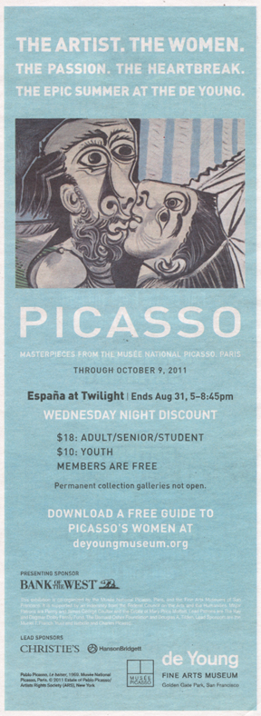 Ads for museum exhibits are notoriously packed with information. They have to include dates, times, admission, partner logos, legal copy, etc., so kudos to the DeYoung and its design department for always making the hierarchy of information easy to read.
  Last but not least, this ad for Haamonii shochu uses a clever trick. Since the photography has a white background it buys them a visual cushion from all the noise on the page. Doesn't hurt that it's a good-looking bottle as well. You can check out what all these ads looked like in the context of the page by flipping through the online version of the Best of The Bay here.


No comments yet.