

Have you tried print advertising for your business? Many small businesses don’t have the time or resources to have ads professionally created. So what’s a small business to do? Here are some tips, tactics and examples of small business advertisements, including what they’re doing well and how they could make a few simple improvements:
What to include
Before we dive right into examples, here’s what you should include in every advertisement:
- Your logo or business name: If your business’ logo/name doesn’t contain what you do, make sure to clarify that in the ad. For example saying “Klimisch’s Inc. Collision Repair” instead of just “Klimisch’s Inc.”
- A CTA (call-to-action) with supporting contact information: Say exactly why people should contact your business and what you can do for them. For example “Call us at (415) 000-0000 to save money on home insurance today.”
- Additional information about what your business does and how you can help your potential customers. Keep your ad copy short and to the point.
- Supporting visual elements like a photo or graphics. This can be your logo, a picture of your business, or a graphic related to your business.
Additional guidelines to keep in mind
- Hierarchy of information: Choose the information from the list above that is most important, and make it the main focus of your ad. Every piece of information in your ad should be weighted according to its importance. If everything is the same size, it can all blend together.
- Less is more: Don’t overwhelm people with information. Keep it as simple as possible while getting the useful information across.
- Use your space wisely: Don’t use every inch of white space because you can. Leave some breathing room so people can digest your message.
- Use contrasting colors for fonts and backgrounds to make sure that your copy is readable. The best combo is dark type on a light background because it’s easier to read.
- Fonts, fonts and fonts: Use mostly sans-serif fonts, use different font sizes to differentiate the importance of the copy; however, don’t use too many font types or too many font colors (think one or two max). The biggest font offenders that tend to thoroughly annoy people include Comic Sans, Curlz and Papyrus.
- Have at least one other person who isn’t working on your ad proofread it over to make sure there aren’t spelling errors, incorrect information or missing information.
Here are some examples to illustrate our tips. Keep in mind these ads are smaller than they were originally printed in the publications. Stanley Steemer: A little color and a lot of white space goes a long way. Stanley Steemer has includes all of the information from my must-include list plus, they added coupons. The message is very clear and understandable. 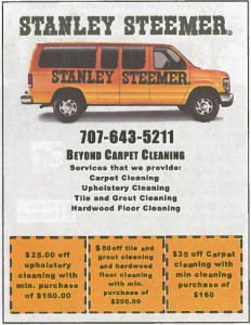 Napa Valley Rug: This ad has all the information needed. Two things that could use some improvement, however: 1) The ad is in black and white (when all the other ads on the page were color); and 2) most of the fonts are the same size. By adding color and font size variation, they could have really spiced things up!
 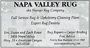 BusinessMixers.com: This is a prime example of how a simple ad can be effective. It’s straight and to the point and very understandable without using too many graphics, words or fonts. Yes, it’s also in black and white like the above ad, but that’s how it was supposed to be printed. Make sure to check the specifications of each publication or website before creating your ads (see more info about this in the “pro tip” below)!
  The Book Worm: This charming ad wonderfully illustrates hierarchy of information. The logo with supporting visual element is attention-grabbing, while the description and CTA (in a smaller font) tell me exactly who they are and what action they want me to take, (i.e., “Visit us online!”). The font they used is clear and they varied the font size to show the importance of the information. The Book Worm must have studied up on its advertising techniques!
 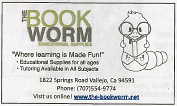 These are all print ads but the same elements apply to online ads. The most important part of advertising is to show who you are as a company, so have a little fun with it! *Bonus pro tip: Ask for the “specs” or specifications for each ad. This will tell you what ad size is needed, the resolution, bleed/no bleed, acceptable formats (i.e., jpg, tiff, pdf), unacceptable formats (i.e., Microsoft Word or Microsoft Publisher) and whether it’s full color or black and white. What tips would you add to our list for creating effective print advertisements? Share away in the comments! This post originally appeared on VerticalResponse and was contributed by Jenny Klimisch. Klimisch is a marketing specialist at VerticalResponse. VerticalResponse Inc. provides a full suite of self-service marketing solutions for small businesses including email marketing, social media, online event marketing, postcard marketing and online surveys. You can connect with Klimisch on Twitter @jenklim


No comments yet.