
The 2011 NCAA Men's Division I basketball tournament starts today! I was going to do a post on the best college basketball logos, but I couldn't find enough good design examples to choose from! I think the strongest logos are the ones that have gone unchanged, such as the University of North Carolina's basket-weave letters or UCLA's throw back gold-and-blue cursive logo. But many of the college basketball logos could be much improved. So I have chosen three of the men's college basketball logos that I think are screaming for a makeover. I am judging based on how user-friendly and powerful or intimidating each logo is. When you are rooting for D-I hoops you want to feel energized, and I'd argue that the logo is a big part of that excitement. It's on the hardwood floor, all the uniforms, equipment and fan gear, so you want the logo to really pack a powerful punch. Here are my picks for logos that need a makeover: 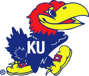 University of Kansas Mascot: Jayhawks Who's this feathered guy? Why it's the Jayhawk, of course. I know each university has its own colors, but I don't know why anyone would use equal parts primary red, blue and yellow in one logo. Plus something about this happy bird's face screams "Food & Beverage" industry to me. There's nothing intimidating about this Jayhawk. I feel like he should be selling me peanuts at the supermarket not representing a basketball team. What do you think?
 My verdict: Needs improvement. Vary the colors and update that bird so that he looks angrier and more modern like the Temple University Owl (shown at right.)
 ![]() Ohio State University Mascot: The Buckeyes First of all, I am not the least bit intimidated by the Buckeye, a man with a nut for a head (the nut represents the Buckeye tree, state tree of Ohio). Mascots aside, the Ohio State logo needs to be toned down. When you look at it now, you get a headache trying to decipher the different white borders that overlap from layer to layer. If the designer just loses a few of those white outlines, it would be more visually appealing and readable. It would probably reproduce even better on shirts and other fan gear. My verdict: Needs Improvement. Somewhere inside the Ohio State logo is a cleaner, simpler version waiting to get out!
Ohio State University Mascot: The Buckeyes First of all, I am not the least bit intimidated by the Buckeye, a man with a nut for a head (the nut represents the Buckeye tree, state tree of Ohio). Mascots aside, the Ohio State logo needs to be toned down. When you look at it now, you get a headache trying to decipher the different white borders that overlap from layer to layer. If the designer just loses a few of those white outlines, it would be more visually appealing and readable. It would probably reproduce even better on shirts and other fan gear. My verdict: Needs Improvement. Somewhere inside the Ohio State logo is a cleaner, simpler version waiting to get out! 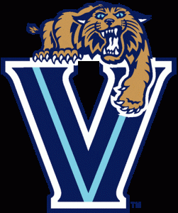 Villanova University Mascot: The Wildcats This logo has a lot going for it. The letter "V," has a lot of potential design wise. Also, the Wildcat is a pretty intimidating mascot. In this version, he looks pretty angry and is even taking a swipe at the competition with his paw. Yet this logo suffers from the same exaggerated outlines as the Ohio State logo. There's got to be a good-looking design solution for getting the cat on top of the "V" without putting a navy, and then a white border between the two elements. I also don't understand the light blue "V" inside of the larger "V." That's a good example of an element that doesn't add anything to the overall design. That blue line makes the design more cluttered and it's hard to know where to focus. If the designer loses the light-blue "V," then the Wildcat's eyes would be the focal point and the logo would be fierce! My verdict: Almost there Villanova! Just lose the outlines and the extra light blue "V" and you'll have a simple, stellar logo. What are your favorite college basketball logos? Share your thoughts in the comments below. Featured Image Credit: Minimalist Photography

3 March Madness Logos That Need A Makeover
March 14, 2011

About Britt Brouse
Bookplate design: 3 tips for graphic designers Print marketing: 7 benefits to leverage in your business
Leave a Reply
What is the PsPrint Blog??
The PsPrint Blog is a resource for graphic designers, freelancers, small business owners and fans of print marketing. You'll find helpful techniques on printing everything there is to print, including business cards, postcards, brochures, stickers, invitations, greeting cards, door hangers, magnets and more. The PsPrint Blog shares creative ways to improve your design and layout skills, and useful tips for marketing your business in any medium. We also like to have a little fun, sharing design inspiration and spotlighting some our favorite customers' printed pieces in our "Hot Off the Press" series.


No comments yet.