

It's important to keep track of these things. (Image via Joe Stone.)
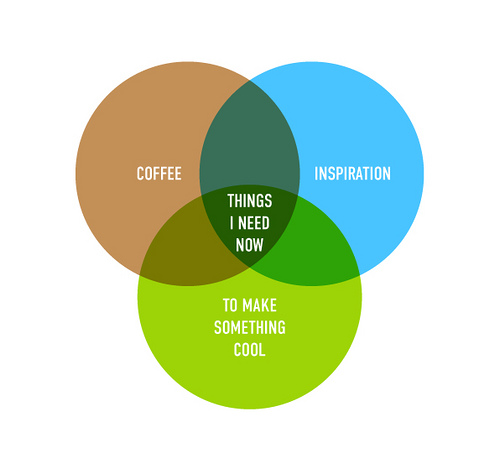
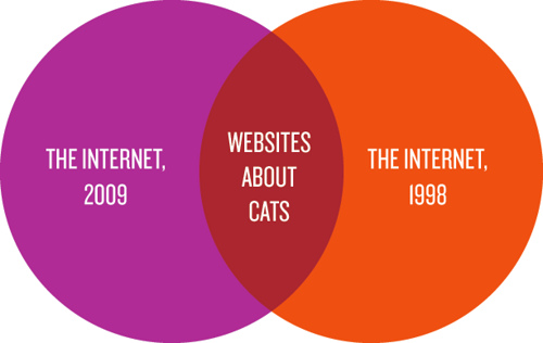
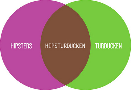
 Frank Chimero did a series of funny Venn diagrams (which are, sadly, no longer in his Flickr stream) on various topics. There are a few more below.
 This fine Venn diagram is from The Rag Bag and opened my eyes to the unholy unions happening in the world of cutlery.
 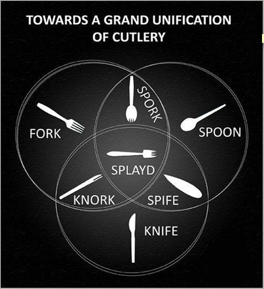 A useful gut-check flowchart from Typcut.
 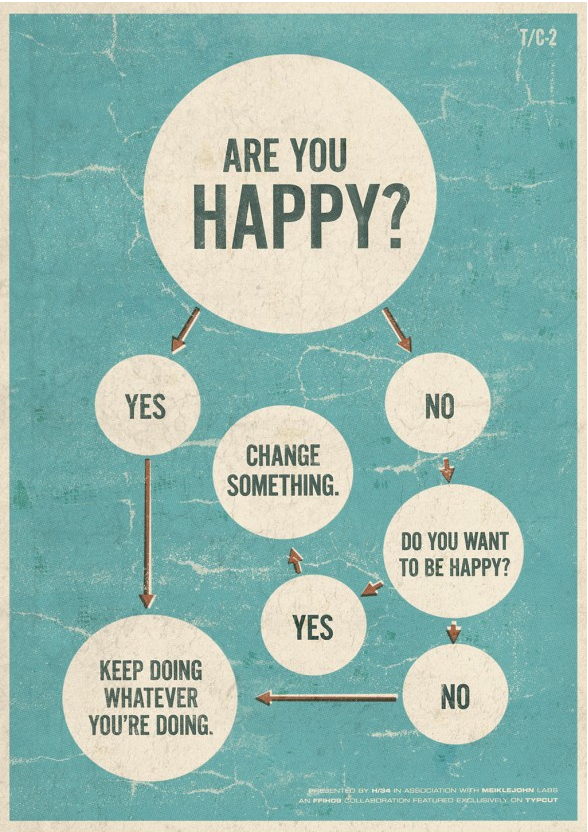 Or there's this one posted by Susanna Wolff on CollegeHumor.
 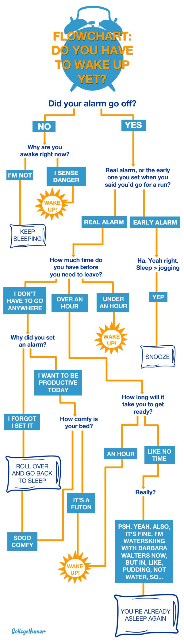 But flowcharts can also have some real decision-making utility. As a designer, I find Julian Hansen's font-choosing flowchart very useful. It's actually a really great way for nondesigners to pick a font based on their tastes and the intended usage. (Find the full chart here.)
 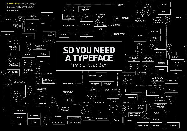 Here's a detail of where you might start if you were looking for a typeface for an invitation.
 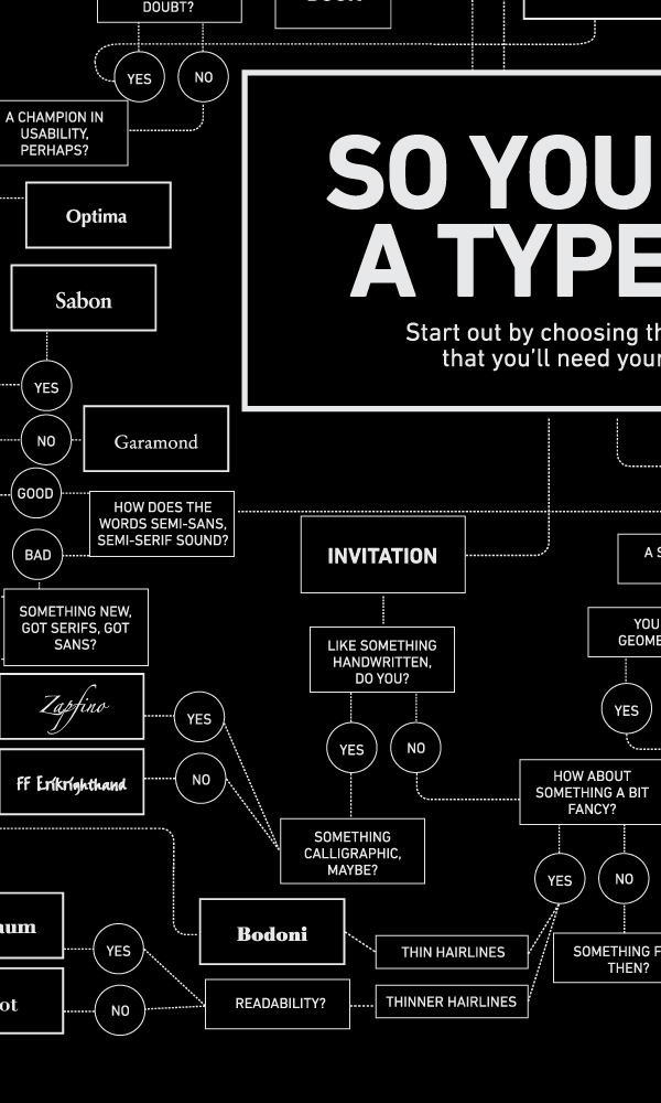 Another great decision-maker if you're looking for something new to read is SF Signal's flowchart of NPR's top 100 science-fiction and fantasy novels. (Find the full chart here.)
 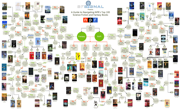 A lot of the selection criteria is really funny as well, so it's worth it to read through even if you're not in the market for a new book.
 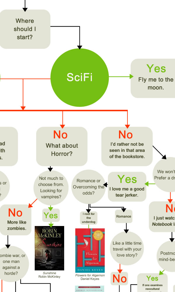 Another great chart for the TV obsessed is this one from The Rag Bag that gives props to some of the most familiar and well-worn character actors of this generation.
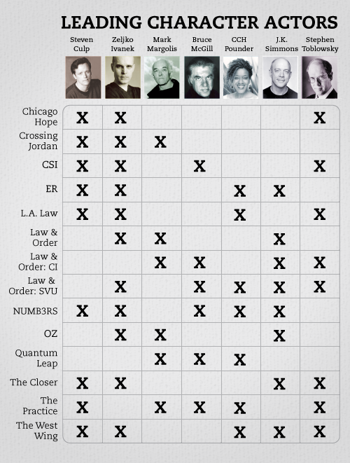


These are awesome! Definitely sharing this post...
This reminds me of a really great one I found recently by a graphic designer - here is the link :) http://arenacreative.com/blog/graphic-design/how-would-you-like-your-gra...
These diagrams are very creative and interesting. Most of them I have not seen or unique ones . Kudos for creativity.
Thanks Creately! Which is your favorite?