

What’s your type? Knowing the correct names for the parts of type characters will help you identify different typefaces, and the more familiar you are with type characteristics, the easier it will be for you to pick a typeface that expresses the idea, feeling and tone of the piece you are designing.
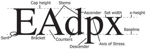
Ascender The tall stem that reaches upward on lowercase letter like b, d or I
Axis of stress The direction of an implied line that passes through the thin parts of the round letter shapes Baseline The implied line on which most type characters rest Bracket A curve from the serif to the main stroke Cap height The height of capital letters in a typeface Counter A shape inside of a letter Descender The part of a lowercase letter that extends below the baseline of letters like p or q Serif Small cross-stroke at the end of a main stroke Set width The width of a character Stem The main stroke of a letter X-height The height of most of the lowercase letters in a particular typeface, not including the ascenders and descenders To keep up on the newest fonts available, check out My Fonts. They have an informative newsletter each month. There are also a number of great blogs about type. My favorite is I Love Typography. It’s worth checking out. Where do you learn about new type fonts? Share them with us.


Wow, that was simply amazing.
You go girl, I can't wait to see what you come up with next.