| Magen Mitchell | Salt Lake City, UT | |
| www.magenmitchell.com | View Gallery | |
 | |
<!--more

| Magen Mitchell | Salt Lake City, UT | |
| www.magenmitchell.com | View Gallery | |
 | |
<!--more
Living in America, the melting pot, we have the privilege of experiencing many different kinds of culture through our neighbors. As a designer I’ve drawn inspiration for many designs through other cultures. Just look around in your area and you can see how we’ve adopted certain looks for things based on different cultures. When you hear the word “spa,” for example, you think of a certain environment and feel.

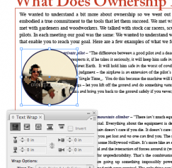
For those designers switching from QuarkXPress to Adobe InDesign there is a bit of a learning curve and changes in terminology to get used to. One of the items that took me a little while to adapt to was calling what I knew as a runaround in QuarkXPress, a text wrap in InDesign.
Writers aren’t the only ones to experience a creative block. You don’t hear about the other creative professions experiencing it as much, but trust me it’s out there. When you’ve got a deadline but feeling uninspired what can a designer do? Here are just a few suggestions that I like to follow when I hit a design block: Go back to the basics Remember the basics of design; see my previous blog post "Elements of a Printed Page Every Designer Should Know".

In the past couple of years I’ve really tried to focus on making changes in my lifestyle and habits to be more Earth conscious.  Some of those habits I learned early on from my parents such as recycling aluminum cans, turning off lights or not letting the water run while I brush my teeth.

I think everyone who has a logo needs to look at his or her logo as you would your wardrobe: Does it reflect who you are now, or does it date your appearance? Let’s discuss some companies, the evolution of their logos, and whether or not it was necessary to redesign their logo. Refreshed but still the same Just like any good makeover, a logo redesign should still reflect its original personality. The updated logo should have the branding qualities consumers have become familiar with, making it easy to recognize the new version. My favorite recent redesigned logo is UPS.
I know the horrific images that race through the minds of most designers when you utter the words “clip art.” This happened to me the other day when a potential client was discussing a future business card design job for her husband’s business. She asked if I had Print Shop, because there was a particular piece of clip art she had in mind: A lion sharpening his claws on a tree for her husband’s knife sharpening business. I actually pictured the dated cartoon-like drawing in my head and shuttered a little bit.
I used to hate, hate — let me say this again — hate it when my college instructors had us do page after page of thumbnails. As much as I hated them — and, honestly, I still don’t do as many as I should — I know they have a real value when brainstorming for any design. Thumbnails will help any designer to chart a path of visual thinking in the design process. They are thumbnails because they are small Thumbnails are small in size, but they should always be proportional to the actual piece you are designing.

I love clean design. To me the less information, a.k.a. words, the better because I’m a visual thinker. The reality of media today, regardless of learning processes, is the fact that your window of opportunity to grab the public’s attention is merely seconds. So, in print media, how can you get your message across?

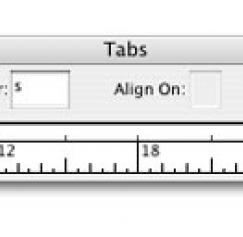
I use leaders in InDesign on a frequent basis since I happen to do quite a bit of publication designs. Back in the day, I used to have to do this manually in Quark, and when InDesign first came out it didn’t have this feature. Now, there are no excuses to use a leader for table of contents pages, and this is something that could be useful for menus as well.
I learned a hard lesson as a freelance graphic designer not too long ago. When you have a client — even if it’s a friend like mine was — and they are known to be a stickler for color, then get a press proof. My client — a photographer that specializes in black and white photography — was doing his own business cards by sending the file to a copy supercenter; however, he was not happy with the quality of the paper or the finish so he asked me to design the cards.
I’ve been there: The client calls and says they have a deadline to meet, and it was yesterday. They aren’t the only client you have that is on a deadline so whom do you serve first? This is always tricky, because every client counts when you are a freelance graphic designer. First, tell the client who contacted you with a rush job that you can get back to them by the end of day or the next day; however, they will need to pay a rush fee to bump their job to the top of the priority list. Make sure to charge something that may be hard to swallow like $50 to $100.
The PsPrint Blog is a resource for graphic designers, freelancers, small business owners and fans of print marketing. You'll find helpful techniques on printing everything there is to print, including business cards, postcards, brochures, stickers, invitations, greeting cards, door hangers, magnets and more. The PsPrint Blog shares creative ways to improve your design and layout skills, and useful tips for marketing your business in any medium. We also like to have a little fun, sharing design inspiration and spotlighting some our favorite customers' printed pieces in our "Hot Off the Press" series.
