

What do these 10 logos all have in common? They all use buildings and architectural imagery in their design. These logos come from many different sectors from construction to nonprofit, education and more. You'll see some really familiar logos and some new ones, too. I tried to select logos that were iconic at first glance and that seemed to be using the building-theme in a new or original way. Here goes: ![]()
Even though I root for the Phillies, I had to include the New York Mets logo, which features the city's skyline and a bridge inside a baseball. [Image from this site.]
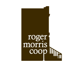 When I look at this logo I "get it" right away. It's a brownstone, it's a cooperative. I love the lowercase type and the way the letter "p" is anchored to the bottom of the building. [Image via Logopond.com.]
 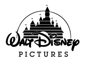 Speaking of iconic logos with buidlings in them, the Walt Disney Pictures logo hinges on the park's famous Cinderella Castle. [Image via Toxel.com.]
  This is a great example of a logo with an emotional impact. The pencil drawing and the flowering script design under the name conveys a cozy, quaint feeling. [Image via Logopond.com.]
 ![]() The Marquette University logo integrates a beautiful gothic steeple from the campus. [Image from this site.]
The Marquette University logo integrates a beautiful gothic steeple from the campus. [Image from this site.] ![]() The suggestion of a group of buildings is just enough to make this logo work. I am not sure I understand why the two orange squares are in the logo, but I do like how they keep the eye moving. [Image via Cisnerodesign.com.]
The suggestion of a group of buildings is just enough to make this logo work. I am not sure I understand why the two orange squares are in the logo, but I do like how they keep the eye moving. [Image via Cisnerodesign.com.] ![]() The Cedar Rapids Theatre incorporates its building into its logo with this fun, retro design. [Image via this site.]
The Cedar Rapids Theatre incorporates its building into its logo with this fun, retro design. [Image via this site.]  I don't love the font choice, or the relative size of the font next to the design element, but I do love how it takes you a few seconds to realize that the colorful sphere next to the company name is really a bundle of high-rise buildings, or a giant city. [Image via Logopond.com.]
  What's that above the organization's name? Is it a triangle? Is it stars? Is it a group of people holding hands? No wait, it's houses! Brilliant design. [Image via Punkbyte.com.]
  Sometimes the best solution is an understated solution -- such as putting a roof over the letter "M." [Image via Logopond.com.]


Great work on this post, it really helped me a lot!