Logos seem to change with the times, for better or worse. The most classic example of this logo evolution can be seen with sports teams. Growing up I remember the logos from “NBA Jams” on Sega Genesis. Yes, that game was the business. My, how the NBA logos have changed since then! And, the NBA logos are of course not the only sports teams’ logos to have changed over time. It is also surprising how some logos stayed true to their original with minor adjustments and how some changed but came full circle to a closer representation of the original. Retro is in after all. Some seem to have changed for the better, whereas other logos I feel lost quite a bit of their soul after changing to a new look. Let’s take a look at the interesting progression of 10 sports logos. 1. Denver Broncos
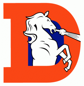
1970s-1990s
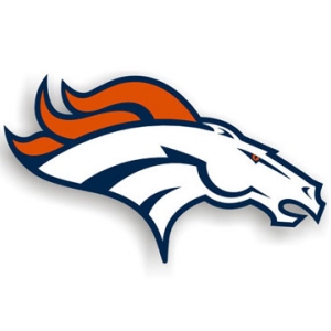
Late 1990s-Present
OK, so when I first saw the old Denver Broncos logo I thought for a split second that it was a unicorn shooting magic out of its nose. It took me a moment to realize the D was for Denver and the unicorn was actually a bronco. The new logo definitely gives the Broncos a much tougher image - just look at those neck muscles! It looks like the change was needed here for sure.
2. Denver Nuggets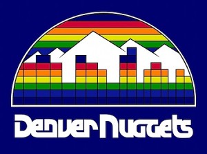
1982-93

1993-Present
Denver Nuggets, what were you thinking? The original logo blows the new one out of the water. All right, maybe it could have used a little revamping to bring it up to date with modern times. The original does look a little stuck in the ’80s, but it has classic throwback appeal, and the type looks awesome. The new logo, updated in 2003, looks quite bland in comparison to the logo created in 1982. I can see how the new logo ties in with the word “Nuggets” better and gives off some gold rush charm, whereas the old logo looks more like a slot machine.
3. Baltimore Orioles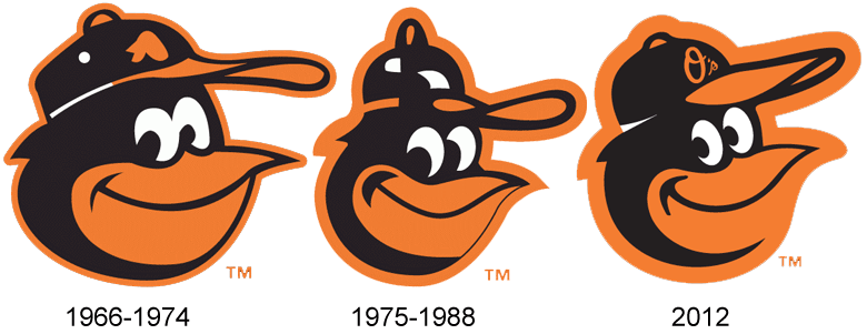
Image from SportsLogos.Net
Is it just me or did the bird lose a lot of weight in 1975 then gain some of bit back in 2012? Granted this is just the cap insignia, but it’s great to see the Baltimore Orioles stay true to their roots. I’m not a huge baseball fan, but if I was I would like the Orioles. Their cap insignia just seems so jolly.
4. Golden State Warriors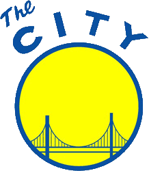
1960s

1997-2010
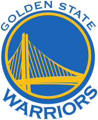
Present
It seems like the Warriors have a bit of a problem calling anywhere home. Throughout their history they have played home games in San Francisco, San Jose, San Diego and, of course, Oakland. I guess it’s just California love across the board then. I like how the logo has gone back to its roots, since I was never a big fan of the weird blue guy, “
Thunder.” The new logo is pretty sweet, showing off what looks like the new
Bay Bridge.
5. Maryland Terrapins
Old

New
Man, the original logo sure does look old. But, I can’t help but like it more than the new logo. The original terrapin looks so jovial, banging his fist and laughing. Perhaps he’s had a few drinks. The new terrapin looks far too tough to be a real turtle. He reminds of
Tokka from the “Teenage Mutant Ninja Turtles” movies. His toe nails are a bit gnarly as well. In any case, I prefer the chuckling turtle to the bossy one.
6. Memphis Grizzlies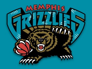
2001-2004

2005-Present
Memphis and grizzlies in the same sentence just seems like a contradiction. I guess that’s what happens when the team moves from Canada to Tennessee. It would be like the Minnesota Timberwolves moving to Miami. The
new logo doesn’t seem to have the same nostalgia as the older one stuck in my brain from my childhood NBA Jams days. The original grizzly looked like he was about to slam dunk someone’s face and now he looks like he’s about to tell a wise story. Though, I will say the font used for the word “Memphis” is pretty neat and the logo overall is well designed.
7. Minnesota Timberwolves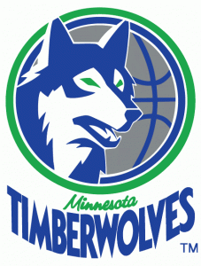
1989-1996
Present
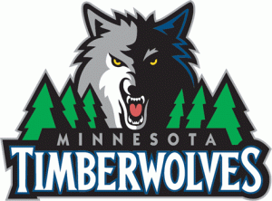
Another logo shifted from a more classic look to a tougher image, perhaps to make the team appear more aggressive and strong. I really loved the original Minnesota Timberwolves logo. The color scheme and wolf illustration went well together. As with many old logos, the original did need an update, but did they really have to turn the wolf into a snarling werewolf?
8. San Diego Padres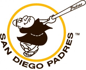
Original
1990s
2000s

2012
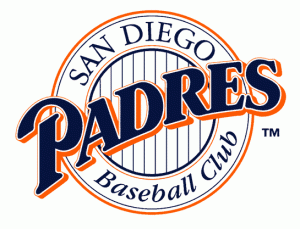
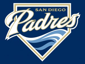
The Padres can’t seem to make up their mind! I can’t say I blame them for the most recent change. The logo with the wave illustration just doesn’t match up with the name Padres. However, the cursive typography in the wave logo is skillfully done, and the overall look is very clean. There is something attractive about the somewhat goofy appearance of the bat-swinging friar in the original logo, but it is, of course, not much of a design masterpiece. The newest logo is clean and simple. I can appreciate the simplicity, yet it seems to fall short of anything more than mediocre.
9. Seattle Supersonics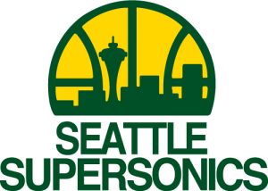
1975-1995
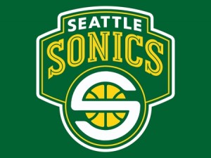
2001-2008
This one reminds of the Denver Nuggets switch up. The original logo is swathed in classic throwback goodness and was replaced with something that looks closer to an Oakland A’s logo with some wonky “S” emblem. I agree the logo could have used a little makeover with a less boring of a typeface, but it went a little too far. The Seattle Supersonics have since relocated to Oklahoma anyways, where they play as Oklahoma City Thunder.
10. Tampa Bay Buccaneers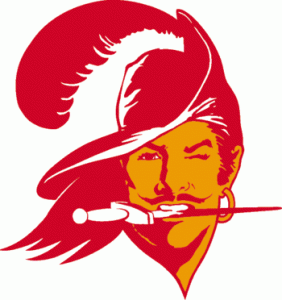
1976-1996
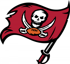
1997-Present
I can’t say I blame the Buccaneer’s for this one. If any team probably needed a shift to a more masculine logo, it was the Bucs. The old logo reminds me of Orlando Bloom, except prettier and trying too hard with the whole dagger in the teeth thing. Nothing is wrong with being a pretty pirate, but when it comes to football it just doesn’t fit. I don’t think anyone shed a tear when this one changed!
About the Author: | Paul Smith is the newest addition to PsPrint’s blogging team, filling a new role as content writer after establishing his roots with PsPrint’s Customer Service department. Although new to blogging, Paul is no stranger to writing, having had a crush on words and books for as long as he can remember. With a love for the environment, food and music, Paul can be found after work cooking up a storm of healthy mouth-watering vegan food (yes, it’s possible!), reading an epic sci-fi novel or expanding his quirky eclectic music collection whilst watching a nature documentary! Email him today at paul@psprint.com or follow him on Twitter. |


Haaaaa! -- > "The original grizzly looked like he was about to slam dunk someone’s face and now he looks like he’s about to tell a wise story."
Maybe I'm the odd man out, but I like most of the old logos better! Maybe it's because those are what I was familiar with growing up.