
This week's post is all about judging books by their covers - specifically vintage books. Older book cover designs are artful and understated. They use illustration and graphic design in such a way that many of them could be blown-up to poster size and still work well. Here's a round up of 12 inspiring vintage book cover designs that use great typefaces, illustrations and color combinations:
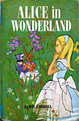
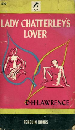
This illustration on this cover is creepy. I also like the stacked type in different colors. Image via: www.Bookscans.com This cover looks like an old travel poster. The simple two-color design packs a lot of punch. Image via www.wikifirsteditions.com. I like how the Coliseum, which is a big part of the story, shows up in the background of this cover. Image via www.Bookscans.com The hat pin sticking into the title subtly underscores the violence at the center of this book. Image via www.manhattanrarebooks.com This cover illustration is classic. The use of color is perfect. Image via www.Coverbrowser.com Francis Cugat's famous illustration for the first edition of "The Great Gatsby." Image via www.Debenblog.blogspot.com The font on the cover is nostalgic and somehow reminiscent of the old South. Image via www.Wikifirsteditions.com Crazy type is fitting for this novel, and I like the colorful cover design. Image via www.Earlybirdcatchestheworm.wordpress.com. Alice has been re-imagined by so many different illustrators and filmmakers. Here is another great character-sketch of her. Image via www.Alexiesworld.blogspot.com Here's another cover that's so interesting, it could easily become a full-sized poster. Image via www.Simania.co.il Brilliant idea to smear the cover of "Lord of the Flies" with a red design that suggests blood and fire. Image via www.Designspongeonline.com. I love that this book was banned and had to be surreptitiously smuggled from reader to reader. The hot pink cover with nude figures speaks to the erotic story inside. Image via www.Bookscans.com.
12 Vintage Book Covers
September 7, 2010


About Britt Brouse
4 Cost-Effective Promotion Ideas for FreelancersPrint marketing: 7 benefits to leverage in your business
Leave a Reply
What is the PsPrint Blog??
The PsPrint Blog is a resource for graphic designers, freelancers, small business owners and fans of print marketing. You'll find helpful techniques on printing everything there is to print, including business cards, postcards, brochures, stickers, invitations, greeting cards, door hangers, magnets and more. The PsPrint Blog shares creative ways to improve your design and layout skills, and useful tips for marketing your business in any medium. We also like to have a little fun, sharing design inspiration and spotlighting some our favorite customers' printed pieces in our "Hot Off the Press" series.


So beautiful! I want framed posters of all of these.
I've always liked this analysis of The Catcher in the Rye cover:
http://www.printmag.com/article/catcher-the-cover#axzz0yxTPsIO3
OK, here comes the TV nerd ...
There was a challenge on Bravo's "Work of Art" in which the artists had to design a cover for a classic book, and the winner got their book cover published. The winning cover was for "The Time Machine" by H.G. Wells, but sadly Bravo has put their logo and the show's logo on the cover, which really takes away how cool it looked.
See! http://www.amazon.com/dp/0143118412/?tag=realityblurred
I like the "Great Gatsby" cover. The original "Catcher in the Rye" had a really nice cover also.
There should be a fly on LOTF. And I'm with David on Gatsby. AND I actually have a 1st edition In Cold Blood with that very cover.
[...] Just because something is old doesn’t mean it’s not cool. PsPrint blogger Britt shares 12 “old” book covers that not only inspire graphic designers and illustrators in their work but inspire folks to pick up the book and read it in her blog post, “12 Vintage Book Covers.” [...]
I just discovered this keen site:
http://thejacketmuseum.wordpress.com/
[...] parfum cartier pasha cartier pen cartier perfume cartier ring cartier ring price cartier roadster cartier santos cartier santos 100 cartier sunglasses This entry was posted in Uncategorized by [...]