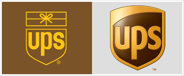
I think everyone who has a logo needs to look at his or her logo as you would your wardrobe: Does it reflect who you are now, or does it date your appearance? Let’s discuss some companies, the evolution of their logos, and whether or not it was necessary to redesign their logo. Refreshed but still the same Just like any good makeover, a logo redesign should still reflect its original personality. The updated logo should have the branding qualities consumers have become familiar with, making it easy to recognize the new version. My favorite recent redesigned logo is UPS. You will notice they still kept the overall shape, color scheme and font shape and just refreshed and refined it. The overall shield shape is still intact after removing the outdated string-tied package. The colors are still gold and brown but with more depth and warmer hues. The font is still lowercase but an even sleeker sans serif. Overall, the new UPS logo reflects a modern edge, while still having a timeless quality. The new curvature within the shield reflects the forward movement of the company. I know my analysis is a bit geeky, but other designers will understand. In fact, I encourage other designers to comment on your favorite logo redesign.

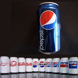
Too many redesigns lead to consumer confusion Redesigning your logo too much can make the wrong impression. A perfect example of this is poor Pepsi, whose logos are a constant casualty of the cola wars. Pepsi has been competing with Coca-Cola since the birth of the beverage for the No. 1 status but still has not ranked in that position. Their solution is to redesign their brand every couple of years in the hopes of gaining a larger following in the youth market; however, I’m afraid it has the opposite effect for consumers. Changing too often gives the impression of being unstable, and nobody wants to get attached to a product that could change its flavor or maybe even go out of business. Coca-Cola, on the other hand, has hardly changed their logo since launching in 1885. They still use the signature Spencerian Script typeface and red can. Maybe the stability of their logo has helped them keep the top spot in the cola market.

This is just the latest interpretation of the ever-changing Pepsi logo.
 These were just my professional opinions and observations. I’m sure you have some thoughts, too, so please share some logo redesign insights and post a comment.


[...] The Lowdown on Logo Redesign “I think everyone who has a logo needs to look at his or her logo as you would your wardrobe: Does it reflect who you are now, or does it date your appearance? Let’s discuss some companies, the evolution of their logos, and whether or not it was necessary to redesign their logo.” [...]
[...] logo redesigns have created such a furor as Gap’s, which was unveiled last week. To catch up, Gap rolled out a [...]
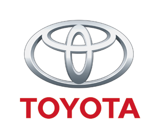
The Toyota logo is suppose to be two ovals that make all the letterforms of the name ... T O Y O T A can all be formed by those two shapes.