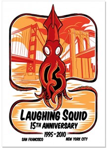
Designed by Josh Ellingson, printed at PsPrint.
Josh Ellingson gets the freelance projects many graphic designers dreamed about when they were young: jobs involving robots, burlesque dancers and monsters – most with his own brand of comic stylings. The artist has been a regular contributor to Laughing Squid, Hi-Fructose Magazine, Wired and more, with his bright orange cephalopod once again adorning
Laughing Squid’s anniversary posters this year. Ellingson skipped the “Mad Men” route that most graphic designers pay their dues at, but that doesn’t mean he fell upon a consistent list of paying clients. In a recent interview, Ellingson discussed with me his path to installations in space and on public transportation, how he deals with opinions that clash with clients and the merits of the new version of Adobe Illustrator.
You graduated from art school just over 10 years ago – did you do agency work after that? What made you decide to go freelance? Directly out of school I went right into freelance for the first six months or so. I was scrambling to find work in Michigan, and then a friend moved to San Diego and invited me to come crash with him. So I moved out and looked all over L.A., San Diego and San Francisco. A friend in comics worked in San Francisco and let me stay in his place. I interviewed all over for a couple weeks. It was easy to get a job in San Francisco at the time – easier to get a job than to find a place to live since it was the dot-com boom. This was my introduction to a big city and real-life experience. I walked into a great job and faced a cattle call to find a place to live. I worked for
Blue Mountain greeting card company. It was a great first job. I worked there for a year and a half, and it helped my drawing ability to animate that much. I was still doing my comics on the side. All of that led me to build my portfolio, which let me shop around my freelance work. Then the dot-com boom failed, I tried to drum up freelance work and I took a job at an online-casino place.
Dan the Automator hired my buddy who hired me to make artwork – that was huge. The art director for
Wired saw it, and that was the beginning of my freelance career for magazines. I started getting gigs with
Popular Science,
PC Magazine and more. The work blew up and then went away, and I had a gap between 2004 and 2007. These days it comes and goes, but I’ve managed to work for various magazines since then.
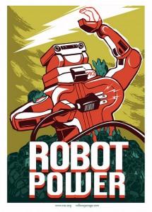
Designed by Ellingson for Willow Garage.
I like posting on my website the more fun, eclectic jobs. But I did a cover for a health insurance magazine, and I’ve done logo designs for academics. I do like to focus and promote fun illustration work, but I take on all sorts of clients. I have friends who put on robotics conventions and put me in touch with these jobs, and I do stuff for burlesque performers who know all sorts of awesome people.
You created Laughing Squid’s 15th-anniversary poster, and you blog for the web-hosting company. How long has that collaboration been going on? I’m a big Laughing Squid fan. Founder Scott Beale is a comic fan, and I met him at the
Alternative Press Expo around 2002. He then asked me to make artwork for Laughing Squid, and it was a blast. He started working with
Hi-Fructose Magazine, and he arranged for me to do their back cover. Scott’s been a huge supporter of my artwork from the beginning and a great friend. I’ve been guest-blogging for Laughing Squid for the past year, and it’s been fun to be featured with other artists.
There’s a comics element to a lot of your work, and you say you’re a bit of a fanboy – did you ever consider a career in comic books? Oh, yeah – I definitely considered a career in comics. Early on, before I went to art school, I was self-publishing comics, and friends and I started a comic company – it was our dream to work for Marvel or DC. So I’d set up at comics conventions in Michigan when I was in high school, and through college I still self-published and met people at conventions in Michigan and the Midwest. I still exhibit at comic-cons even if it’s just to sell prints. I still do covers, but I no longer create books. And this year I missed
Comic-Con for the first time in eight years.
You’ve said that your projects usually start off as colored pencils on paper. Do you then scan them in and finish up in Illustrator, or do you use a tablet and draw directly on the screen? I use a
Wacom tablet, and, especially with these fast turnarounds, I’ve been using
SketchBook Pro rather than paper, which is new for me. That’s helped me speed up my process.
How would you describe your process moving from assignment to finished product? I usually start with a design brief, talking with clients about what they’re looking for. Then I do a series of roughs, which are pencil drawings or digital pencil drawings. I do a lot of them for myself and then show some to the client. I then produce a second, tighter drawing that’s usually not in color. Then if that works we move forward, and I do the line work independently. If you see my work, it looks like it’s inked – that’s all usually in Illustrator. I turn my lines into fills, and I’ll stop at a certain point if I feel it’s getting too rigid. Sometimes I’ll switch to hand-drawn so it won’t look too thick.

The man himself: Josh Ellingson.
Next I start blocking in colors, and once I finish that it’s a matter of layering it till I get the color the way I like it. Sometimes to mix things up I’ll edit the color with Color Balance. A lot of it’s just experimentation. Color is the funnest part for me. It’s surprising – I don’t always anticipate how it’s going to look Often there are revisions, and that’s part of the reason why I stick with Illustrator – sometimes it’s a battle to keep things fluid and organic because vector art can get very stiff, but Illustrator is so flexible. A client might say, “That’s great, but those seats in the BART station have to be that exact blue,” and Illustrator lets me make it that exact blue. That flexibility has kept me with Illustrator – if I had to paint, that would be a time-suck. When it comes to sending files, too, sending vector files is so much easier with Illustrator. Though the downside is sometimes clients will open those files and start changing colors themselves.
You say you primarily use Illustrator for your artwork – have you upgraded to Adobe CS5? Yeah, I have it. It’s pretty cool – it has some goodies. One of the coolest is the variable-width strokes. It’s rad – you can take one line and change it at various points. It’s just another level of flexibility for a program that’s already flexible. They got rid of a lot of the bugs. I haven’t messed with Photoshop, but I’ve heard good things about the different scalings. I guess Flash is way different now, too.
How do you handle critiques, such as edit requests, from clients? I guess it’s different with every request and every client. If it’s a huge request outside the design brief – something they’ve already signed off on – I just make it clear to them that it’s been signed off and say, “This is how much it’s going to cost.” That usually ends that conservation. If it’s an irrational request that goes against the nature of the piece, I just try to reason with them. Sometimes if it’s a commercial client I just have to roll with it. But if I can talk them out of it, I try. It’s always a collaborative effort.
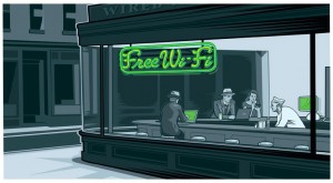
Ellingson design for Wired.
Some of the best stuff in my portfolio is stuff I didn’t want to do. The “
Wi-Fi Diner” piece I did – the Hopper redo – I didn’t want to do that. How many times has it been done? I submitted so many designs I thought were better, and they weren’t. Now that’s one of my most popular pieces and gets the most reaction. Because Wired wanted to go in that design direction, I accepted that challenge. And I figured, “If I gotta do this, I’m going to get a Mac in there and give this woman a Palm Pilot.” I learned a lot from studying that Hopper piece. Every few years it gets reblogged, and I get all these great e-mails from it, and I’ve sold a number of prints. That’s a great example of how collaborative direction works out really well.
How do you market yourself? Lately, Facebook and
Twitter have been huge for me. I didn’t anticipate those, but the web has always been a big part for me. I’ve always maintained a website and turned it into a blog and kept up with what I’ve been up to.
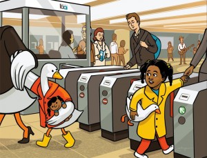
Part of Ellingson's BART installation.
I’m listed with
Gawker Artists. I found out about that really early on. When Gawker isn’t running advertisements, they’ll run an artist banner, so, for example, they’ll run a Josh Ellingson banner on
Gizmodo, which has a huge audience. One of the things I found out about was an art show at the International Space Station. I got into it, and
my artwork went to space! A lot of the work I get is word of mouth through my crazy friends who have interesting lives. Trade shows like Comic-Con and
APE are huge for me – I meet great people who might not use me but refer me.
Is there anything you are working on now that you can tell us about? Lately, I’ve been posting my artwork for a
YouTube meme series. I’ve got conventions coming up. I’m getting ready to go to the
New York Comic Con. I’ve never done that, and I’m really excited. In addition,
Will you be attending the Alternative Press Expo in San Francisco this year? Yes, I’ll have a table there next month, selling my prints. I’ll have a couple original pieces there. This will be my sixth or seventh time there.




[...] the excellent Oakland based printing company that we use to print our posters, just published a great interview with Josh Ellingson, who recently made our Laughing Squid 15th Anniversary Poster (printed at PsPrint). [...]
I worship and adore the Bart posters! Also, my husband met Josh at the Alternative Press Expo last year and said that he is a real class act.
I might actually go to APE this year to buy one of his prints.
Josh I know how proud your family is of you. Especially that Grandpa person of course. He always sends me things about you. I hope that your future continues to soar to the sky and be all that you want it to be.
Hello, I think your site might be having browser compatibility issues. When I look at your blog in Chrome, it looks fine but when opening in Internet Explorer, it has some overlapping. I just wanted to give you a quick heads up! Other then that, awesome blog!