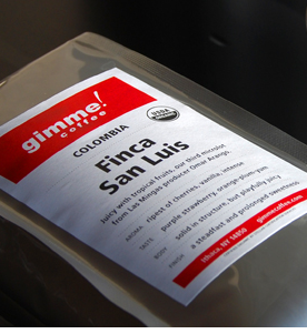
I love coffee almost as much as I love craft beer. OK, I love coffee more! I also find myself veering toward coffee shops and roasters that have cool logos, branding and packaging design. Here's a roundup of five coffee roasters from around the U.S. that all have very distinctive logos, branding and packaging. 1. Gimme Coffee - Brooklyn, N.Y. Gimme Coffee's name is kind of hilarious, and its red and white logo looks like it's rushing forward, which goes very well with the "gimme." The exclamation point makes it distinct and memorable. The packaging is silver and sleek and also features the trademark red and white logo.
2. Stella Caffe - Seattle, Wash. The Stella Caffe logo lady puts the Starbuck's lady to shame. I like the red star and blocky type too. Something about the logo, as shown on the green background on the company website, looks midcentury or Cuban to me.
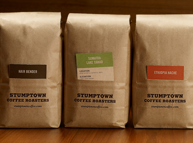
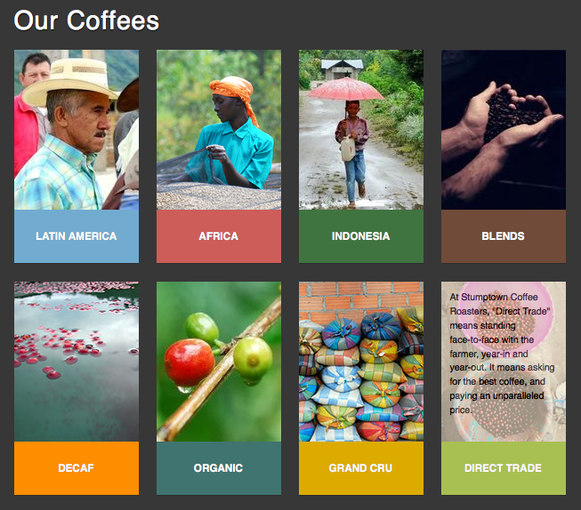
3. Stumptown Coffee, Portland, Ore. Originally from Portland, Oregon, Stumptown Coffee now has locations in New York as well. The new packaging, designed by Fritz Mesenbrink, uses a simple color-coded card system to show which type of beans are inside. The Stumptown website is also branded with the same color-code system.
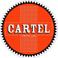
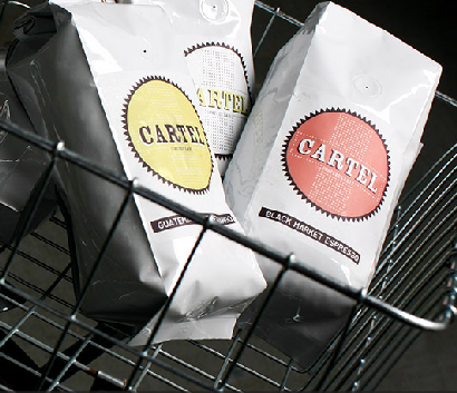
4. Cartel Coffee Lab - Tempe, Ariz. The Cartel typography and logos are very distinctive. I like how the company uses little crosses in most of its branding. The circular logo or emblem appears on a lot of the coffee packaging as well.
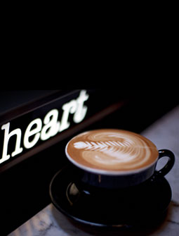
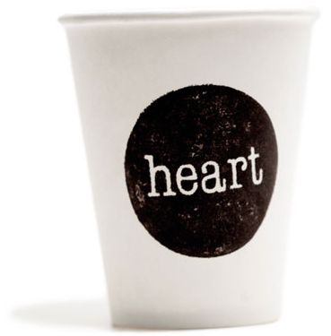
5. Heart Coffee Roasters, Portland, Ore. Heart Coffee Roasters looks like a newcomer to the Portland coffee scene. Thank goodness they side-stepped using a heart shape in their logo. Save the hearts for latte art. I love the font choice and the stark logo that looks like it was stamped onto the white background of the cup.
What coffee branding and packaging do you like the best? Is it an old favorite like Cafe Bustelo? Please share your thoughts and links in the comments.





I love the bright yellow can and distinctive font of Cafe Bustelo -- and I just love coffee cans themselves, too. http://cafebustelo.com/
[...] Mmmm. Coffee. This poster, “The Perfect Pour,” is created by Plaid Creative and shows the correct ratios for making perfect coffee concoctions. Check out this post for more coffee design inspiration. [...]
We did the branding for DAZBOG coffee. The main goal was to maintain the Russian heritage. check out some of the stuff we did for the launch of their tea-line: http://ow.ly/4qG6L . Check out our facebook/twitter too if you're into branding and design. (@adrenalin_inc) + (http://ow.ly/4qG5i)
Coffee marketing to healthcare workers....the largest profession of coffee drinkers!!! Check out: Java Medic Coffee