While spring is traditionally the season for weddings, fall is becoming more and more popular. With that in mind there are a lot of DIY brides out there right now trolling the wedding blogs looking for inspiration for their save the dates, invitations, thank-you notes, programs and seating cards. Much like with your letterhead and business cards, you want your wedding bits and pieces to look like they belong together and share the same colors, fonts and decorative elements. It’s like you’re the CEO of your wedding, and you’re deciding what your brand is going to look like. Your wedding invitation design can represent who you are as a couple — right down to the fonts you use. It seems particularly appropriate to use a pair of fonts that are very different from each other yet play harmoniously together on paper. Opposites do attract after all. Using different fonts together can be tricky but the result is always more interesting and often more sophisticated than what can be achieved with a single font. Let's look at how font pairings work and hopefully you’ll be able to pick up some ideas you can use to build your wedding look. Classic invitations often use a mix script and copperplate style fonts. Copperplate looks very much like a sans but with subtle flares at the ends of strokes and is used in all capitals
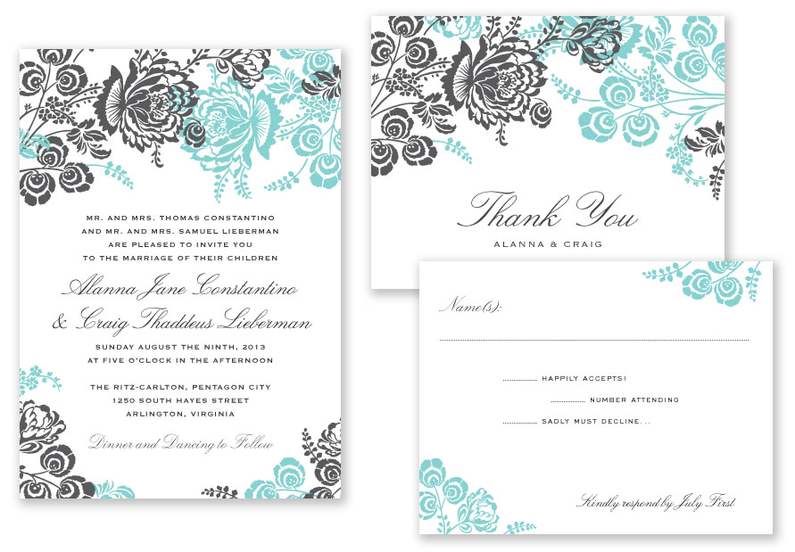
This invitation suite from A Printable Press is a great example of the script/copperplate marriage.
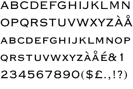
Copperplate Gothic is a classic choice. Using a serif font with a small-caps style will also give you the same formal look.
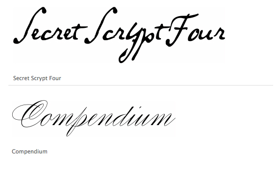
The possibilities are endless with script fonts. Veer.com in particular has a wide selection of good script fonts that range from the ink and quill scratchiness of “Secret Scrypt” to the calligraphic delicacy of “Compendium”
Modern
Modern invitations are less flowery and less formal than their classic counterparts. They often depend on typography rather than illustrative touches to convey the personality of the occasion. This style is especially appropriate for non-church weddings and casual receptions.
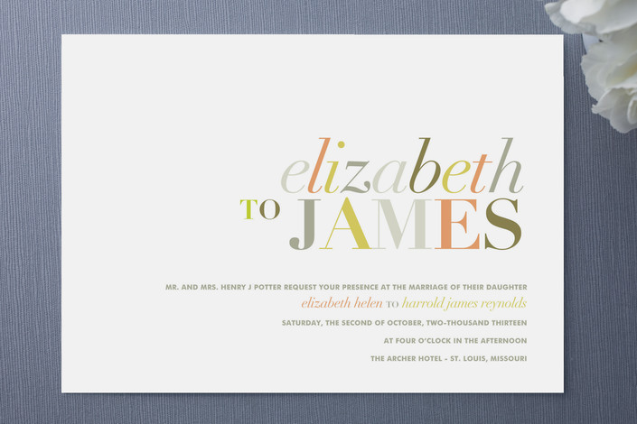
This invite from Minted uses color and font to create a mood of sophistication and playfulness. The names are in a combination of the italic and all-capitals of a Modern-style typeface. These are characterized by a stark contrast between thick upright strokes and hairline serifs. This is paired with a bold sans-serif in small caps to suggest a copperplate in a streamlined way.
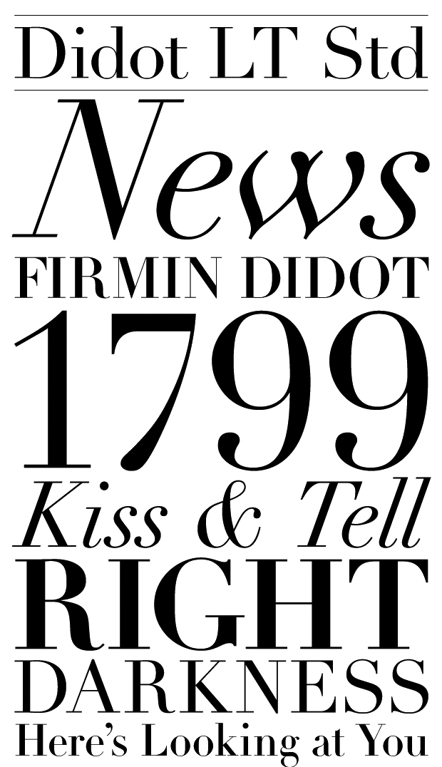
Some of the most popular Modern fonts are Bodoni, Didot and Wallbaum. They’re especially nice used at large sizes to show the contrast to its greatest advantage.
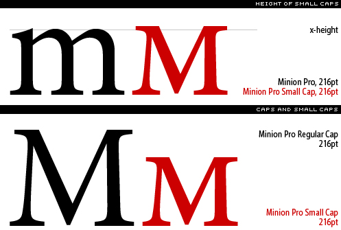
The small cap variant is a version of the face where the capital letters are no taller than the lowercase letters so they flow more nicely in a block of text. They are also easier to read at small sizes so can be used more delicately than regular all-caps.
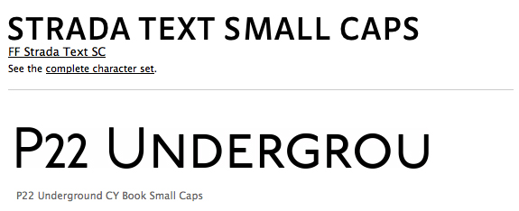
Not all sans-serif fonts have a small caps variant. A couple of good options are Strada Text and P22 Underground.
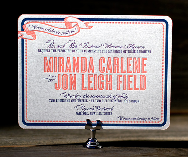
Quirky Quirky invites often play it fast and loose with fonts mixing serif, sans serif, script and funky, elaborate Victorian fonts. This mix can look rustic and handmade at one extreme or swanky and retro at the other.
This invite from Bella Figura leans to the swanky retro side using a script and a tall skinny serif font for the small type and a distinctive in-line sans serif for the names.
Fontshop.com has a lot of fun in-line and outline fonts to check out. Some of my favorites are Folies, Ambule Outline and Elizabeth. 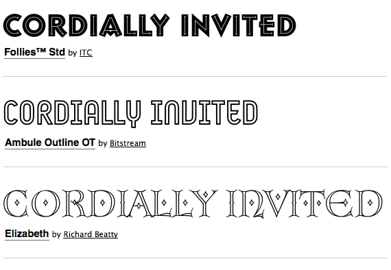






[...] my previous post, “Great Font Combinations for Your Wedding Invitations“, I broke up the typographic styles into classic, modern and quirky. I’d like to delve [...]
I would love to know what the name of the script font you have on your site. The page is at http://blog.psprint.com/featured-post/font-combinations-wedding-invitati... and the font is found on a wedding invitation called "MagicGarden". It is the font used for the names of the bridal couple. If possible, I will need to know where to find this font.
Thank you.
I love the Follies font.
[...] Great font combinations for your invitation [...]