
Ever get the feeling your logo could use some freshening up? Maybe it was done a long time ago, by somebody's talented nephew. Maybe it's a byproduct of the swoosh-happy '90s. Whatever the reason there may be some small tweaks that will make all the difference without re-inventing the wheel. Sports teams do it fairly regularly. Sometimes it's a matter of a trend sweeping a league — the color aqua, retro lettering, etc. Or sometimes it's a matter of streamlining an existing logo to give it some extra punch. When many team logos were originally designed they didn't have to take into account how that logo would look on the web or at small sizes — now they do. Let's take a look at one of my hometown team logos and how they were rebooted for a new generation. (Much love to Sportslogos.net where I found all of these images. It's a great resource for the evolution of logo design in sport.) (World Champion) San Francisco Giants This first logo is basically a slightly modified version of the logo of the 1947-'57 New York Giants. It lasted from the '70s into the early '80s in this form with slanted script over an orange ball. 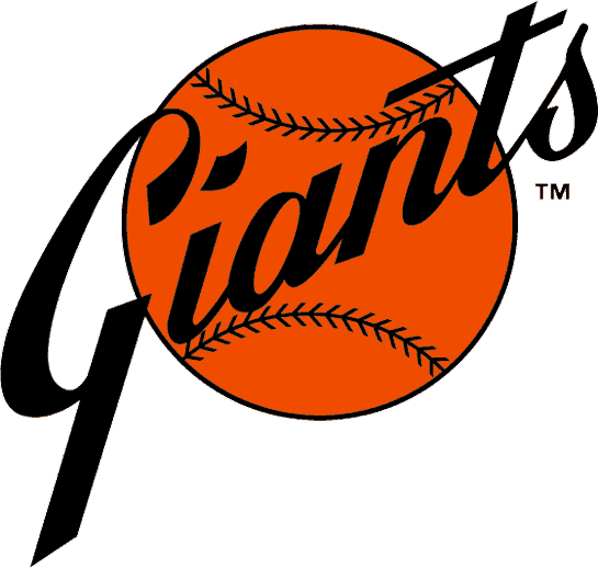 This isn't a bad logo. In fact it saw a bit of a resurrection from 2001-06 without the ball and with the addition of an orange outline and gold drop shadow as you can see below. The only real problem with this logo is that it has no depth. There's no roundness to the ball and the delicate lines of the stitching are distractingly close to the team name. Used at business card size the fine lines would start to interfere with the readability of "Giants."
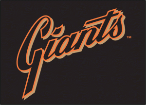
 The '80s saw this beauty. Much bolder. This logo is much more symmetrical making it more versatile for various applications. Sometimes a slanted logo like the first one naturally wants to live in the upper left corner and doesn't look as good on the right hand side of a page, or the center, you get the picture. Here they solved the problem of the stitching by simultaneously making it bigger and moving it away from the lettering. Depth has also been added to the lettering with a heavy black drop-shadow allowing "Giants" to stand away from the baseball shape and command more attention. The main issue with this logo would be the spaces getting trapped inside the letters. The letters flow into each other at every juncture, which means they have to sit tightly together. This traps little chips of background white inside the A and N. Spaces that tiny don't translate well at small sizes and make the whole word look plugged-up.
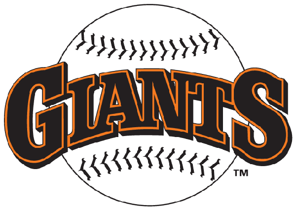
 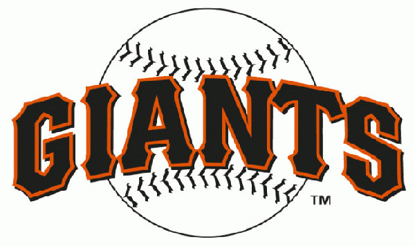 The '94-'99 version addressed the claustrophobic quality of the last version by spacing out the letters and minimizing the serifs. The drop shadow is still there to keep visual separation between the lettering and the baseball. The stitching of the ball is touching the letters again but it's not as much of an issue in this logo since the lettering is so much bolder by comparison. Contrast is important in a logo with multiple overlapping elements.
 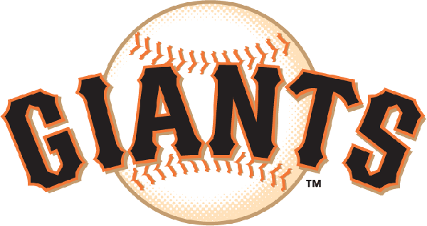 This is the Giants logo in its most recent incarnation. Here we have even better contrast between the background baseball and the lettering. Finally someone decided to allow the lettering to be the only black element in the logo, which gives it the greatest impact. The ball and stitching are now gold and orange and they fade more gently into the background. The other upgrade to the baseball is the extra level of depth achieved by the pale shadow suggesting the roundness of the ball. The letters themselves have a little more room to breath as well. Adding the color gold to the familiar orange and black also makes for a nice color palette. The orange is the bright color, the black is the dark neutral, and the gold acts as a secondary neutral. This adds versatility for occasions when the logo will need to be on a black background. A black drop-shadow would be invisible on the G and S making them look like smaller letters. But the gold drop-shadow shows up on white or black. All the issues with each version of the Giants logo are relevant for your logo reboot. Does your logo need more symmetry? Are tiny detail elements plugging up at small sizes? Are you trapping space in your letters? Do you need more contrast between elements? What kinds of backgrounds will your logo be on? Try to look at your logo with an analytical eye and maybe you'll see something that needs a little tweak to make it clearer and more attractive.

Logo Reboot: The San Francisco Giants Edition
June 21, 2011

About Rosana Mojica
Bookplate design: 3 tips for graphic designers Print marketing: 7 benefits to leverage in your business
Leave a Reply
What is the PsPrint Blog??
The PsPrint Blog is a resource for graphic designers, freelancers, small business owners and fans of print marketing. You'll find helpful techniques on printing everything there is to print, including business cards, postcards, brochures, stickers, invitations, greeting cards, door hangers, magnets and more. The PsPrint Blog shares creative ways to improve your design and layout skills, and useful tips for marketing your business in any medium. We also like to have a little fun, sharing design inspiration and spotlighting some our favorite customers' printed pieces in our "Hot Off the Press" series.


[...] seem to change with the times, for better or worse. The most classic example of this logo evolution can be seen with sports teams. Growing up I remember the logos from “NBA Jams” on Sega Genesis. [...]