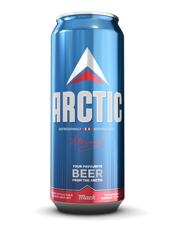
This is the month of Oktoberfest so it seems only fitting that we honor the humble beer label. There's a lot of history in beer label designs. Some conventions, like a ribbon to show award-winning quality or apothecary-like wordiness, are centuries old. I've found some off-the-beaten-path interpretations of beer labels to serve as food for thought. Even the most familiar and conventional piece of design can be re-imagined and re-interpreted to say something new and fresh. Arctic Beer by Tank Design These Arctic Beer cans are sleek and minimal but still make a nod to tradition with a maker's signature on the front, drop-shadowed wood-type style name and a red "ribbon" around the bottom. 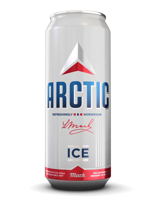
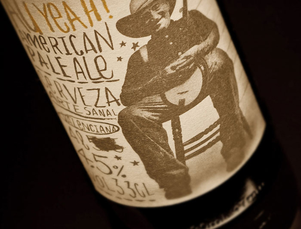
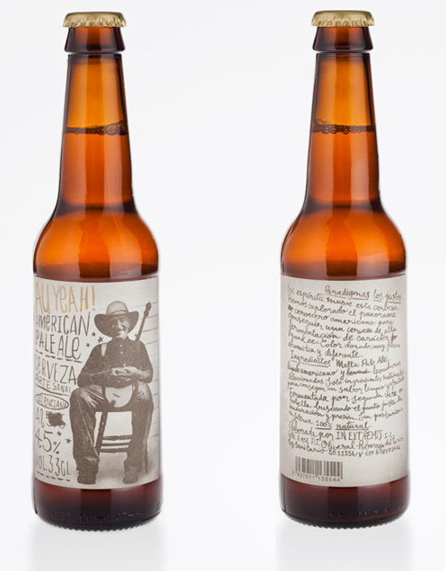
 Au Yeah by Estudio mLlongo This is actually a beer made in Spain, but the design is a playful mish mash of hand-written wording and back-woods Americana, which makes it seem as if the beer had been homebrewed in somebody's tub.
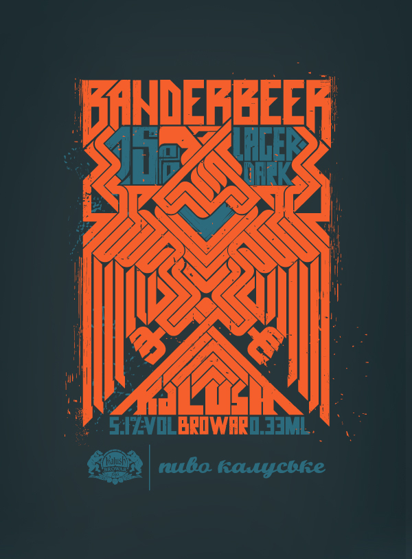
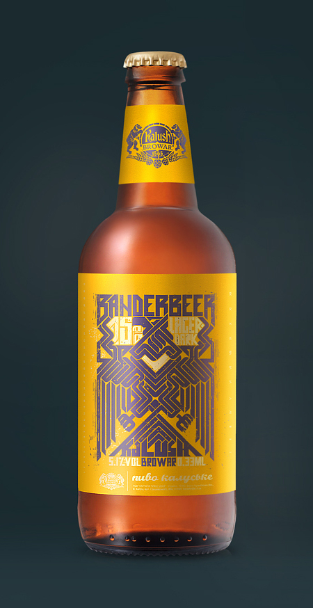
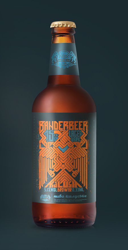
 Banderbeer by Yaroslav Shkriblyak I'm pretty sure this is a personal or school project, but it shows a lot of talent. The mazelike interlocking eagle logo has visual impact and looks original.
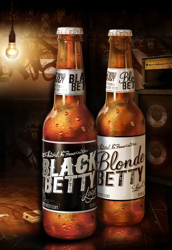
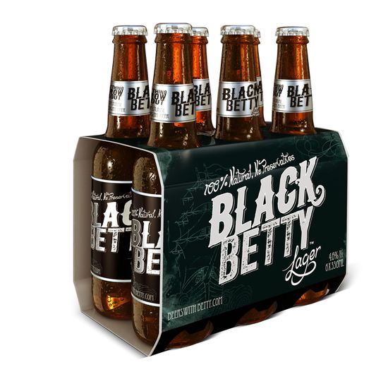
 Black Betty by Passport Australian agency Passport launched its own beer label, explaining it thusly: "It's a new beer that intersects the two growing trends of craft brewing and preservative-free beer with the personality of the live music bars that the beer will be sold."
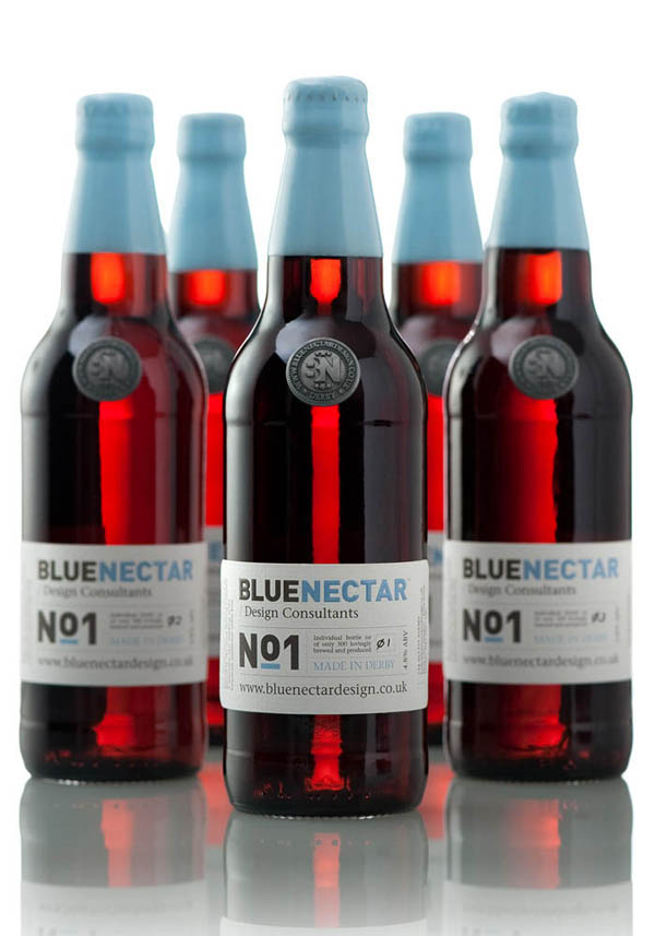
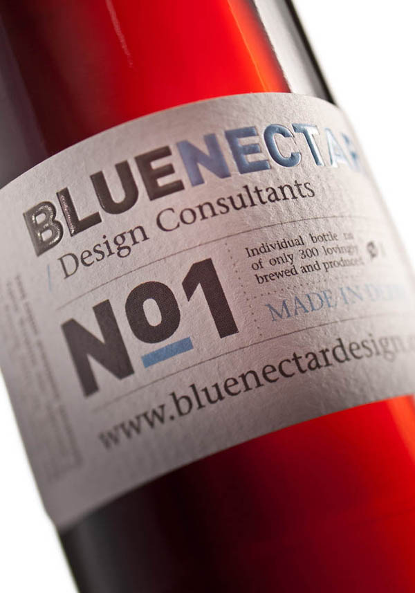
 Blue Nectar by Blue Nectar Design Consulting Since Blue Nectar specializes in beverage packaging it decided to release a limited edition ale to give out as a promotion. The top was dipped in a custom-colored wax to match the company colors.
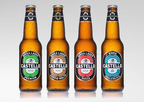
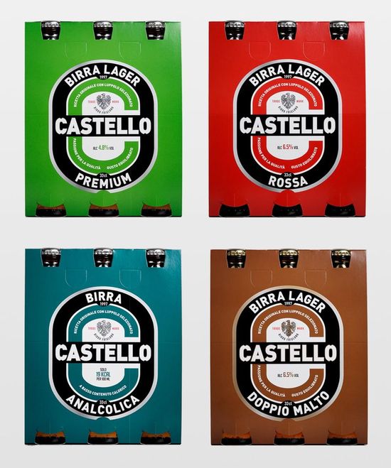
 Castello redesign by AUGE A clean modern redesign that reads well form a distance but doesn't shout for attention ...
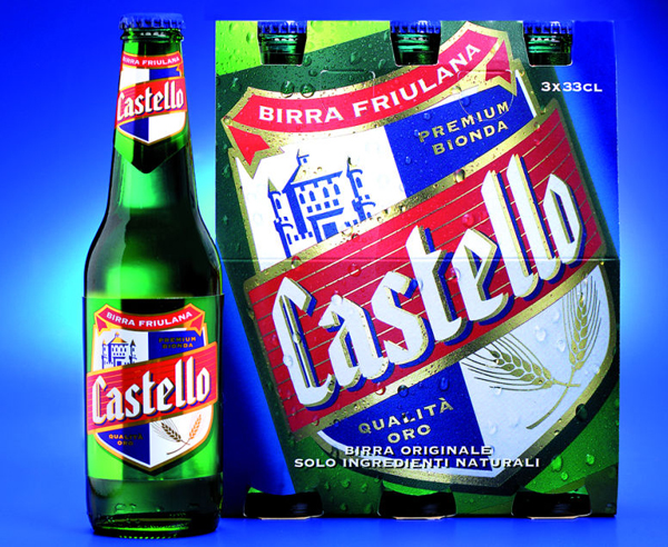
 ... which is a vast departure from the previous design (below).
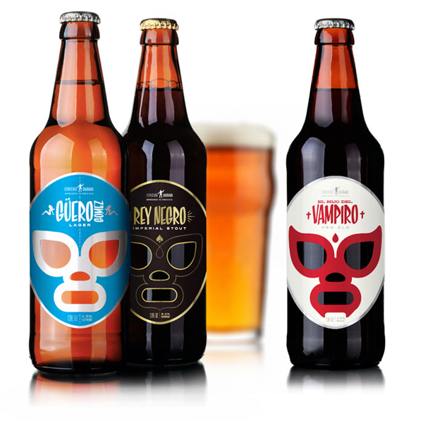
  Cerveceria Sagrada by Jose Guizar Another talented young designer makes up a concept and executes it beautifully. This time it's lucha libre, and the names of the masks are tied to the style of beer — Black King for the stout, Blondie Gomez for the lager and Son of the Vampire for the red ale.
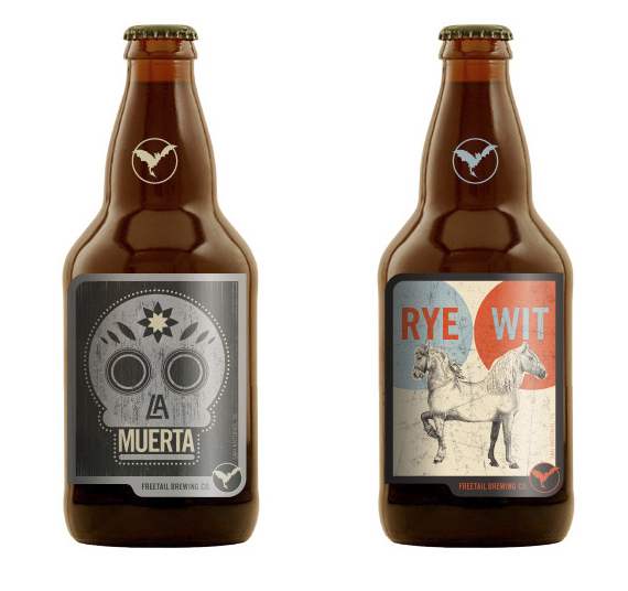
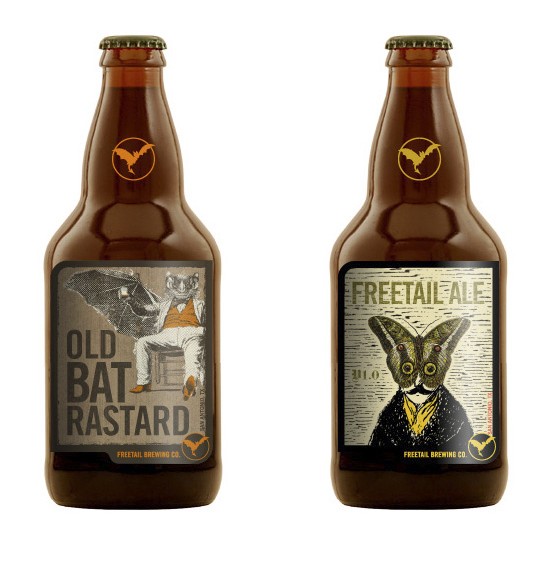
  Freetail Brewing by Mad House These have lots of humor and a nice mixed-media collage, free-for-all style.
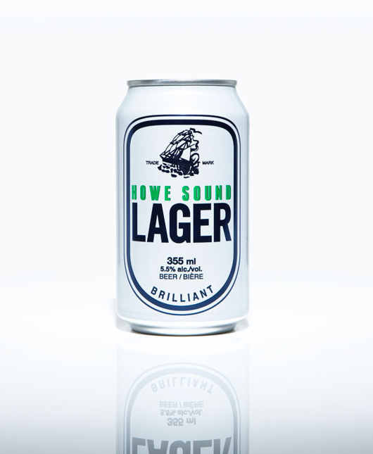
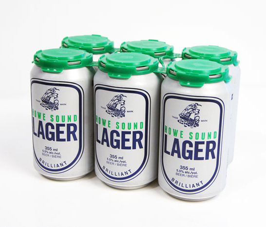
 Howe Sound Lager by The Antidote Inc. This is like the Old Spice of beer packaging. It's masculine, no-nonsense, retro and nautical in its sensibilities. The extra bit of thoughtfulness that makes it special is the six-pack carrier that's minimalist, sturdy and easy to pick up.
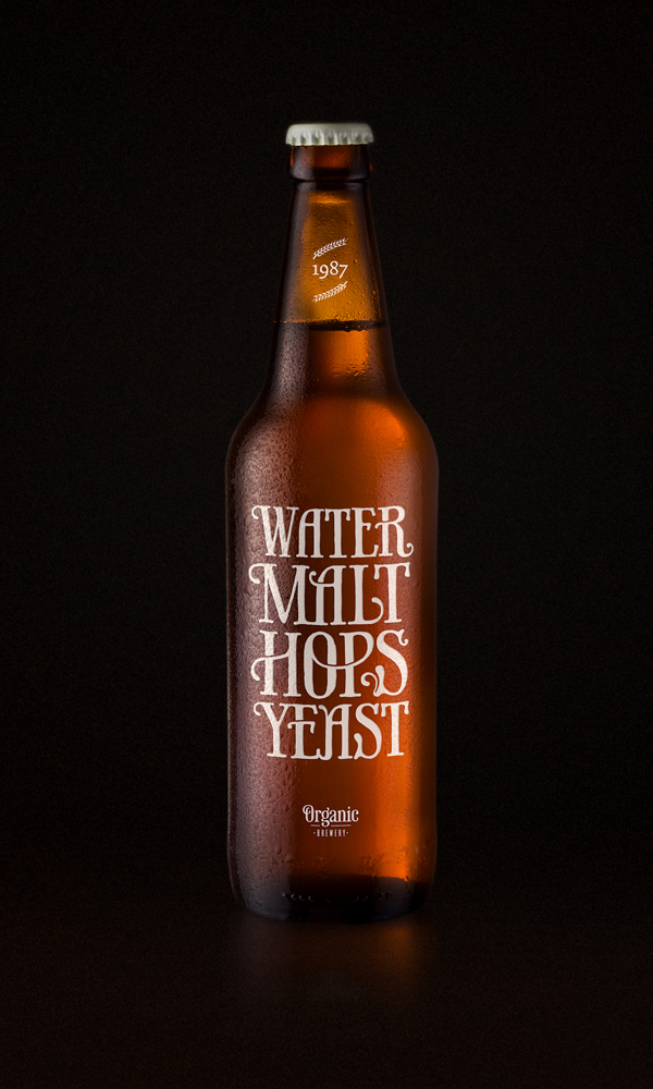
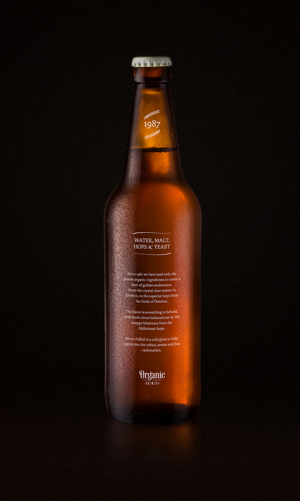
 Water, Malt, Hops, Yeast by Simon Alander A typographically lyrical design by another talented young designer.
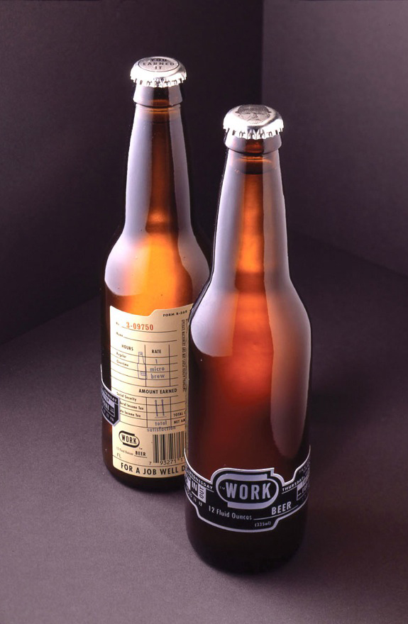
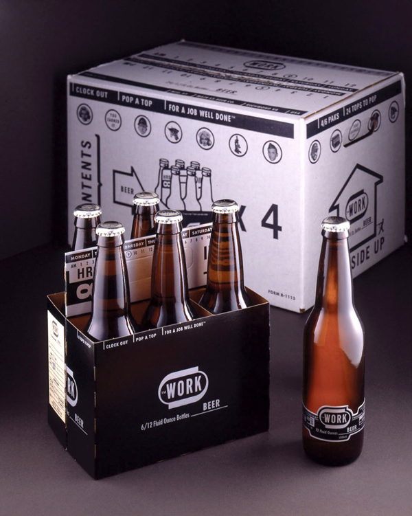
 Work Beer by WORK Labs They brew their own beer and also branded it attractively.
 Most of these beers were found on either The Dieline or Behance Network. Both are great resources for packaging inspiration.
OktoBeerLabelFest
October 12, 2011
Bookplate design: 3 tips for graphic designers Print marketing: 7 benefits to leverage in your business


Gotta love the labels for Wing Man Beer -- different lines on each bottle in the six-pack. http://www.bevlaw.com/bevlog/wp-content/uploads/2009/09/wingman.jpg
[...] brewers take a lot of pride in their seasonal beers, which is why so many pair their outstanding Oktoberfest bottles with creative label designs. I love trying various beers, and I have to admit that names and [...]