There’s a batch of exciting - and not so exciting - new flicks coming our way for the second half of 2012! I thought I’d take some time to check out how their movie poster designs are comparing and see which ones are adding to the hype. 1. Brave The attention to detail makes this a stand out poster, not to mention the dramatic presence of Merida’s fiery curls. I love the carved stone typeface with weaved details. “Brave” is Pixar’s first fairy tale, and apparently will take a more dark and mature tone than their previous films. Sounds like another Pixar winner that could appeal to both children and adults. Grade: A+
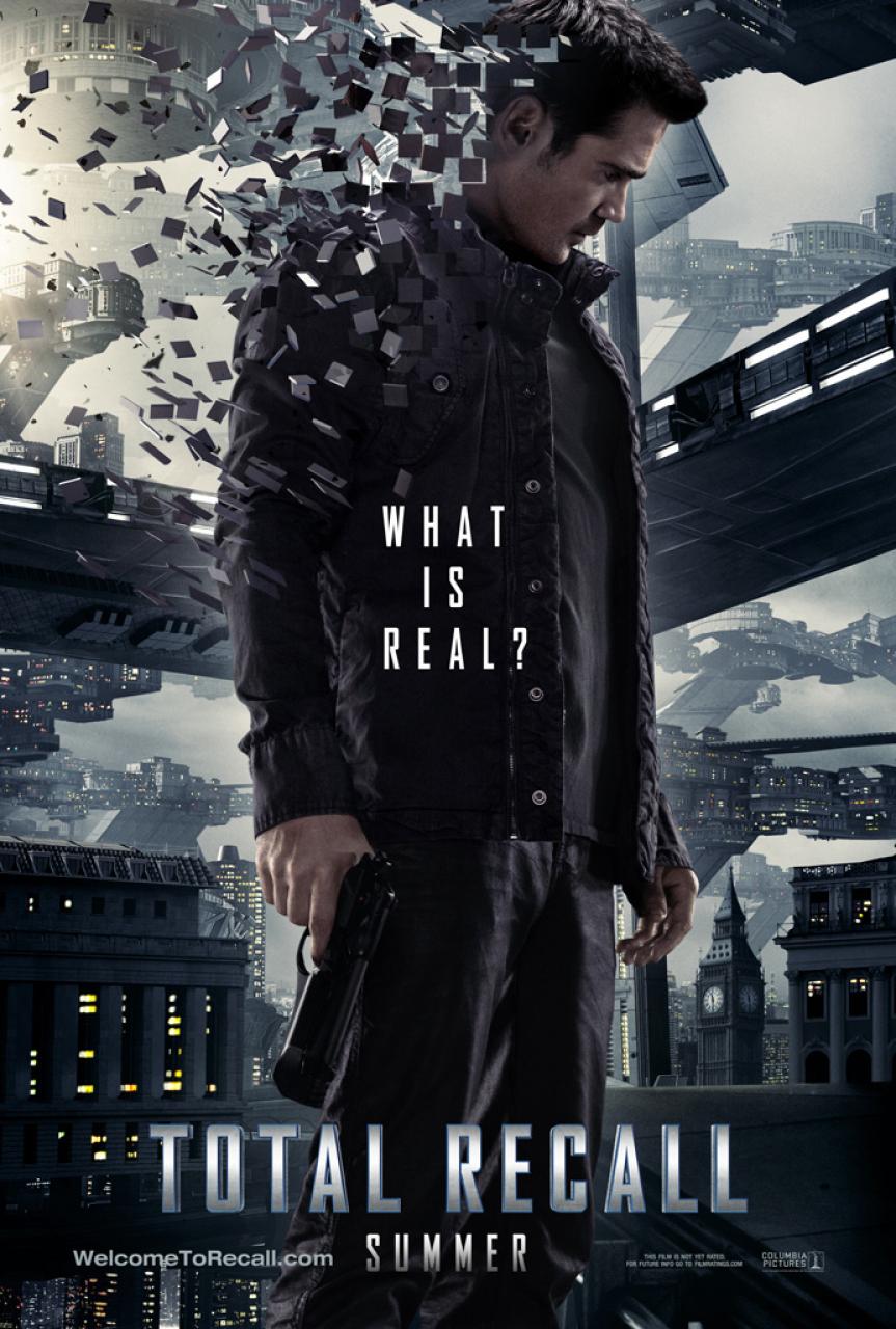
2. Total Recall
I have to say, I do have fond memories of the slightly cheesy 1990 version of “Total Recall” starring Arnold Schwarzenegger. I was also surprised to find it received an overall score of 81 percent on Rotten Tomatoes. Hopefully Colin Farrell and director Len Wiseman (“Underworld”) can do this "Total Recall" remake some justice. I think I may be most excited for the return of the ugly but wise Kuato. The poster itself is pretty impressive with the futuristic London backdrop and chips of the main character, Douglas Quaid, breaking off in the wind. The “What is Real?” text seems a bit over the top, but it sets the stage for the plot based on memory modification and false reality. Grade: A-
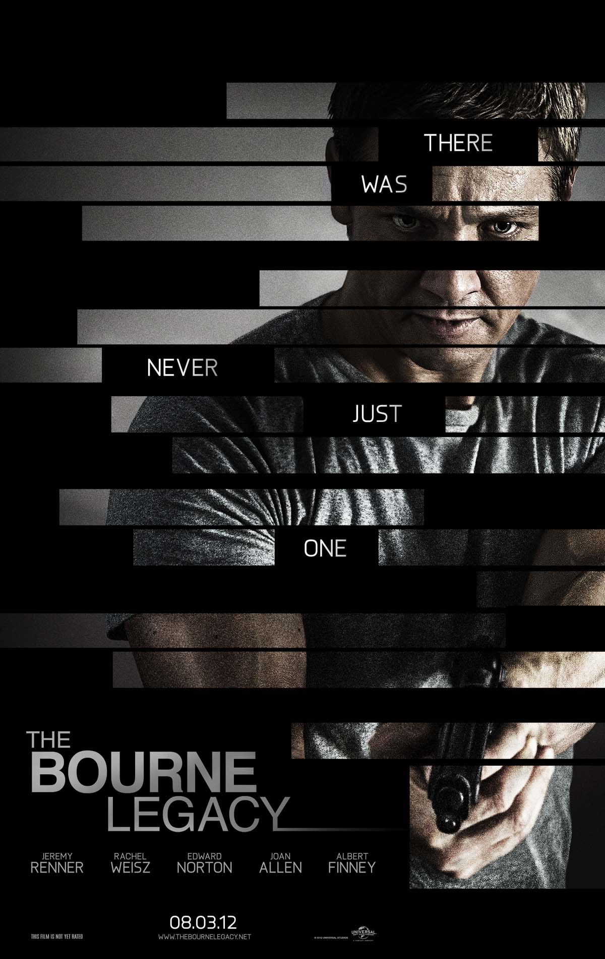
3. The Bourne Legacy In doing a bit of research about “The Bourne Legacy,” it appears that Matt Damon’s character of Jason Bourne will be completely removed and the movie will take on an entirely new storyline. This differs from the book. I wasn’t a big fan of Matt Damon in these flicks, so this is somewhat of a relief. I think the overall poster design is pretty cool without being overly flashy. The shuttered effect gives it a mysterious and classic look. Grade: B
4. Abraham Lincoln: Vampire Hunter "Abraham Lincoln: Vampire Hunter" could either go really wrong or quite well. Luckily, the book’s author has also written the screenplay, and the director, Timur Bekmambetov, has promised historical accuracy — well, as accurate as it can be when it features our 16th president slaying vampires. The book’s plot itself sounds pretty intriguing overall, from a purely fantastical approach. I thought the poster design hit the spot, coming off as dark and subdued without appearing corny. Grade: B
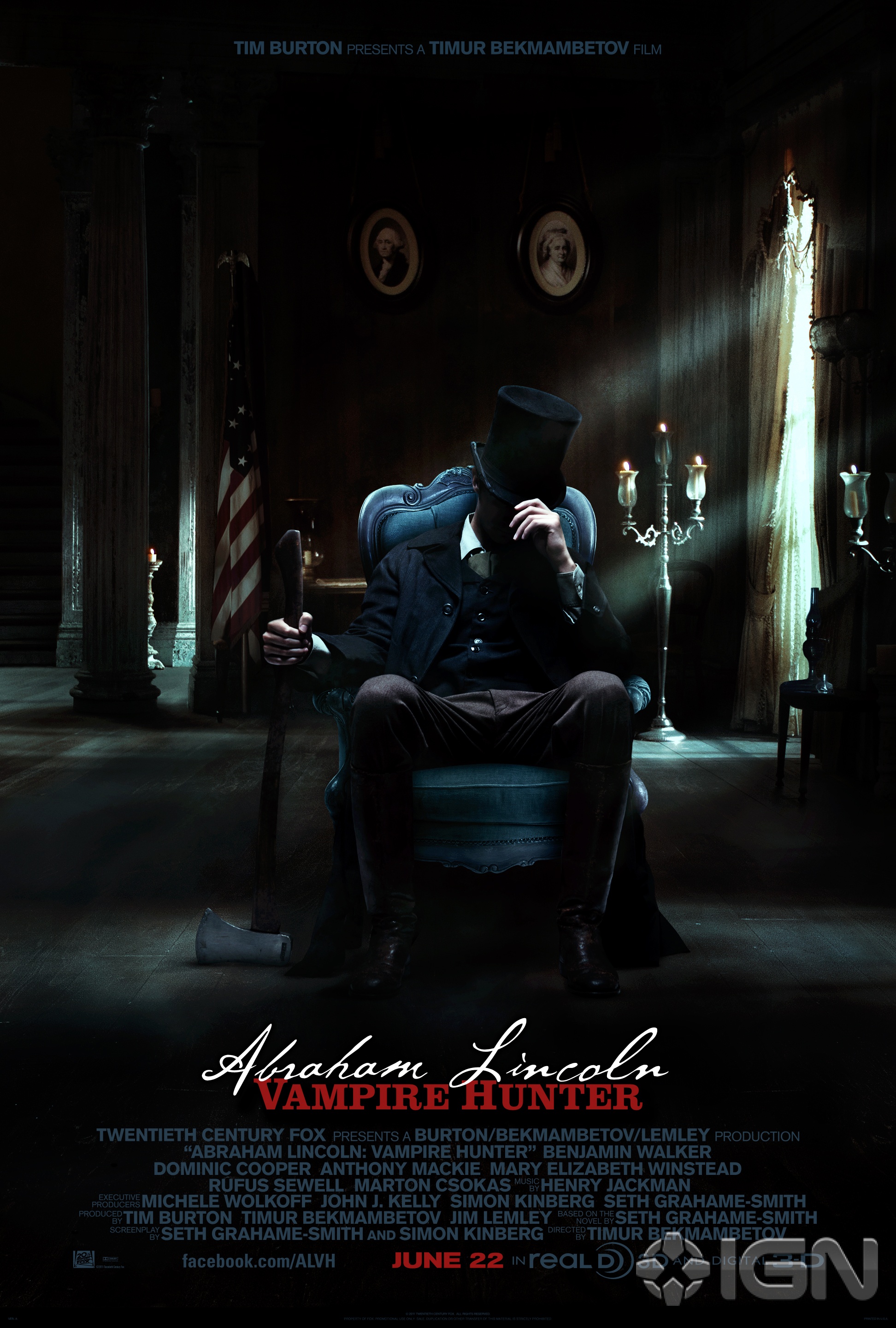
Image credit: IGN.com
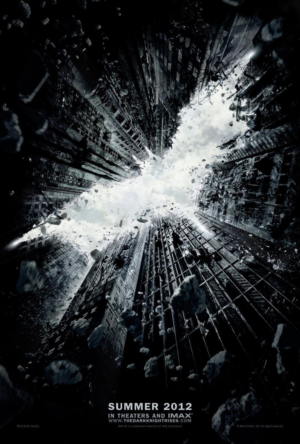
6. The Dark Knight Rises I think this one is pretty cool, considering the buildings are falling in the shape of the Batman symbol. Clever! It leaves quite a bit to the imagination about the movie itself, but a little mystery is good. “The Dark Knight” was pretty awesome, largely due to an Oscar-winning performance by the late by Heath Ledger as the Joker. I guess we’ll have to see if “The Dark Knight Rises” can keep the roll going! Grade: B-
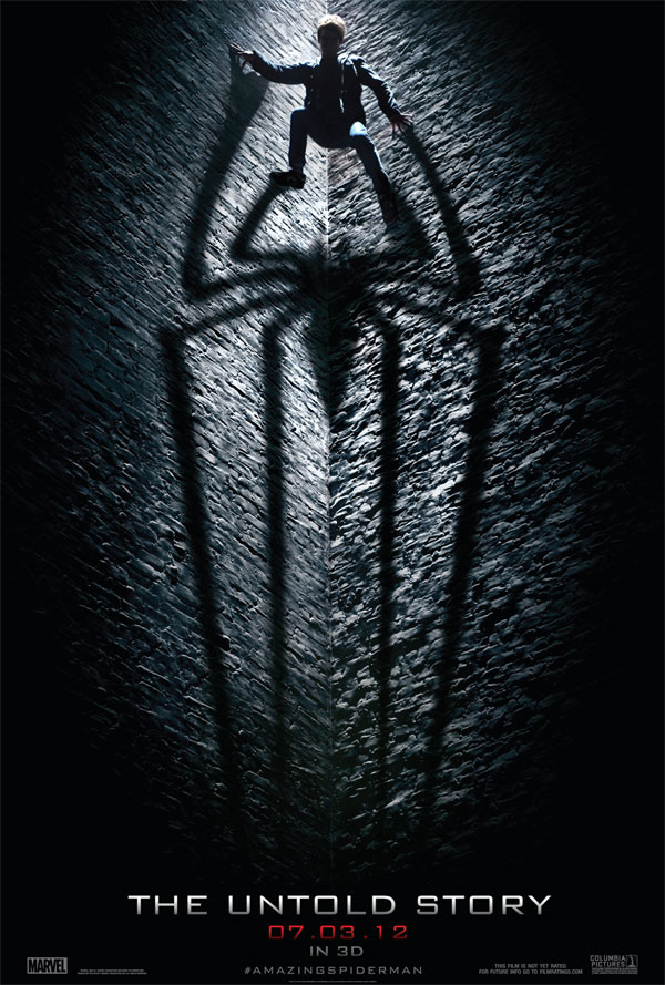
7. The Amazing Spider-Man More symbol play with this one, and done quite well! I like the minimal amount of text, which really allows the bold shadow to stand out. I wish I could climb walls in sneakers. This next venture in the “Spider-Man” series will actually be more of a prequel and will feature a younger Spider-Man. The “Spider-Man” series seemed to become a bit of a snooze when “Spider-Man 3” hit the screens, which is probably why Sony is switching it up. I have high hopes though, because “Spider-Man 2” was a quality comic action romp that actually captivated me until the end. Grade: B
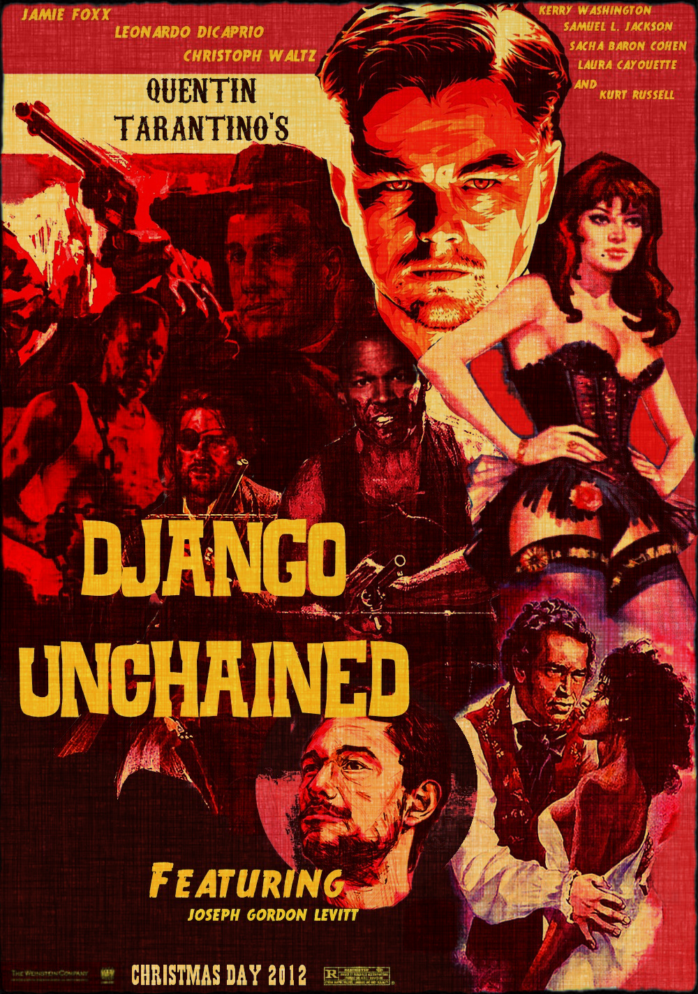
8. Django Unchained The classic collage look suits this poster well, and I can appreciate the artistry of the paper effects applied to what must be shots from the movie. Some portions are obviously illustrated, which adds to the overall feel of the poster. The design certainly has the Grindhouse feel with a Western flair and fits perfectly with Quentin Tarantino’s past productions. This poster, by artist Christopher Marc, is not the official movie poster, but it has a lot more character than the official version. “Django Unchained” will be a Western film starring Jamie Foxx as Django, a freed slave who treks across America with a German bounty hunter to retrieve Django’s wife from a sadistic plantation owner played Leonardo DiCaprio. Grade: B+
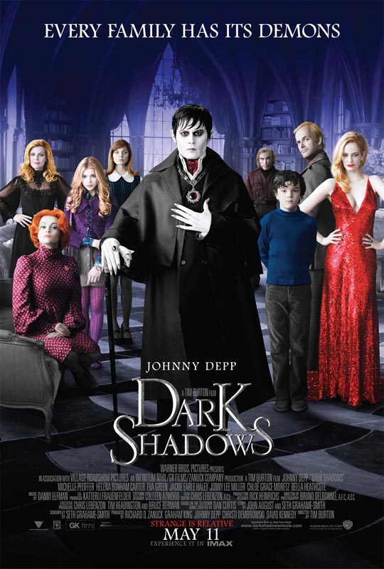
9. Dark Shadows Based on first appearances, "Dark Shadows" is looking pretty cheesy. It’s like “The Addams Family,” but more blond hair? Maybe I have a sour taste in my mouth from Tim Burton’s underwhelming remake of “Alice in Wonderland” that also featured Johnny Depp. I’m not really feeling the overall poster design, either – it seems plain and reminds me of Disney. Interestingly enough, the cinematographer is Bruno Delbonnel, known for his work on “Amélie” and “Harry Potter and the Half-Blood Prince.” Perhaps he will be the saving grace? Grade: C+
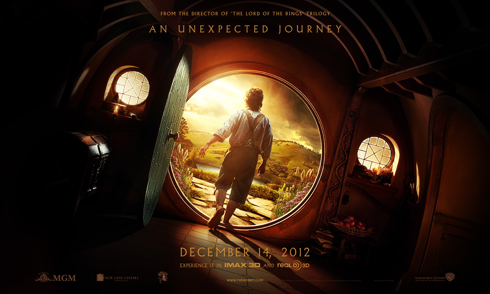
10. The Hobbit Though I don’t doubt that "The Hobbit" will be epic, the poster is — simply put — boring. With such an awesome array of options for the poster they could have chosen a better shot. I suppose this particular scene sets the stage well for the premise of Bilbo, the O.G. Hobbit, stepping out into the world for his unexpected journey. Perhaps since the film is quite far off they will eventually release a more exciting poster. Grade: C-
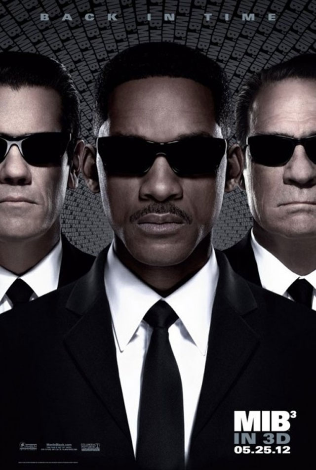
11. Men in Black 3 No, just no. I thought “Men in Black” was buried 10 years ago with “Men in Black 2,” which I don’t think I bothered to see. Who knows – maybe "Men in Black 3" will be a good time. There’s just something about Will Smith’s comedic acting that seems played out. The poster just seems overly “cool,” and the repetitive background print seems like a failed attempt to represent going back in time. I don’t get it. Grade: D
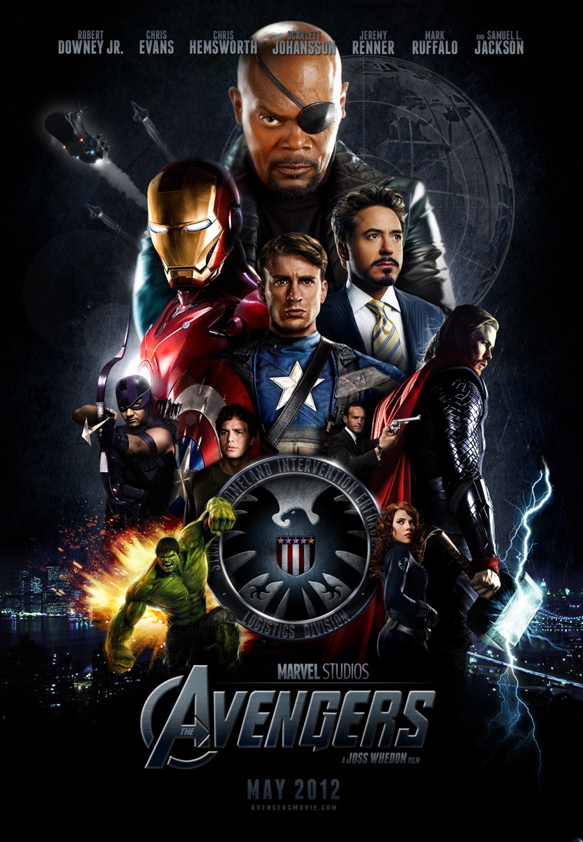
12. The Avengers This poster just looks messy and all over the place. There doesn’t seem to be any unity between the characters, and instead it just looks like a mash of random cardboard cutouts. I wasn’t particularly impressed by any of the recent Marvel films with the exception “Iron Man,” so maybe I’m just not hyped on all of them coming together. The ominously cheesy image of Samuel L. Jackson at the top bugs me as well. I am, however, somewhat stoked for the addition of Hawkeye, being that he was my favorite Marvel character as a kid. I’m rooting for a good outcome for “The Avengers,” but not holding my breath. Grade: D-
All in all 2012 looks to be a pretty good year, so get the popcorn ready! About the Author:
 | Paul Smith is the newest addition to PsPrint’s blogging team, filling a new role as content writer after establishing his roots with PsPrint’s Customer Service department. Although new to blogging, Paul is no stranger to writing, having had a crush on words and books for as long as he can remember. With a love for the environment, food and music, Paul can be found after work cooking up a storm of healthy mouth-watering vegan food (yes, it’s possible!), reading an epic sci-fi novel or expanding his quirky eclectic music collection whilst watching a nature documentary! Email him today at paul@psprint.com. |


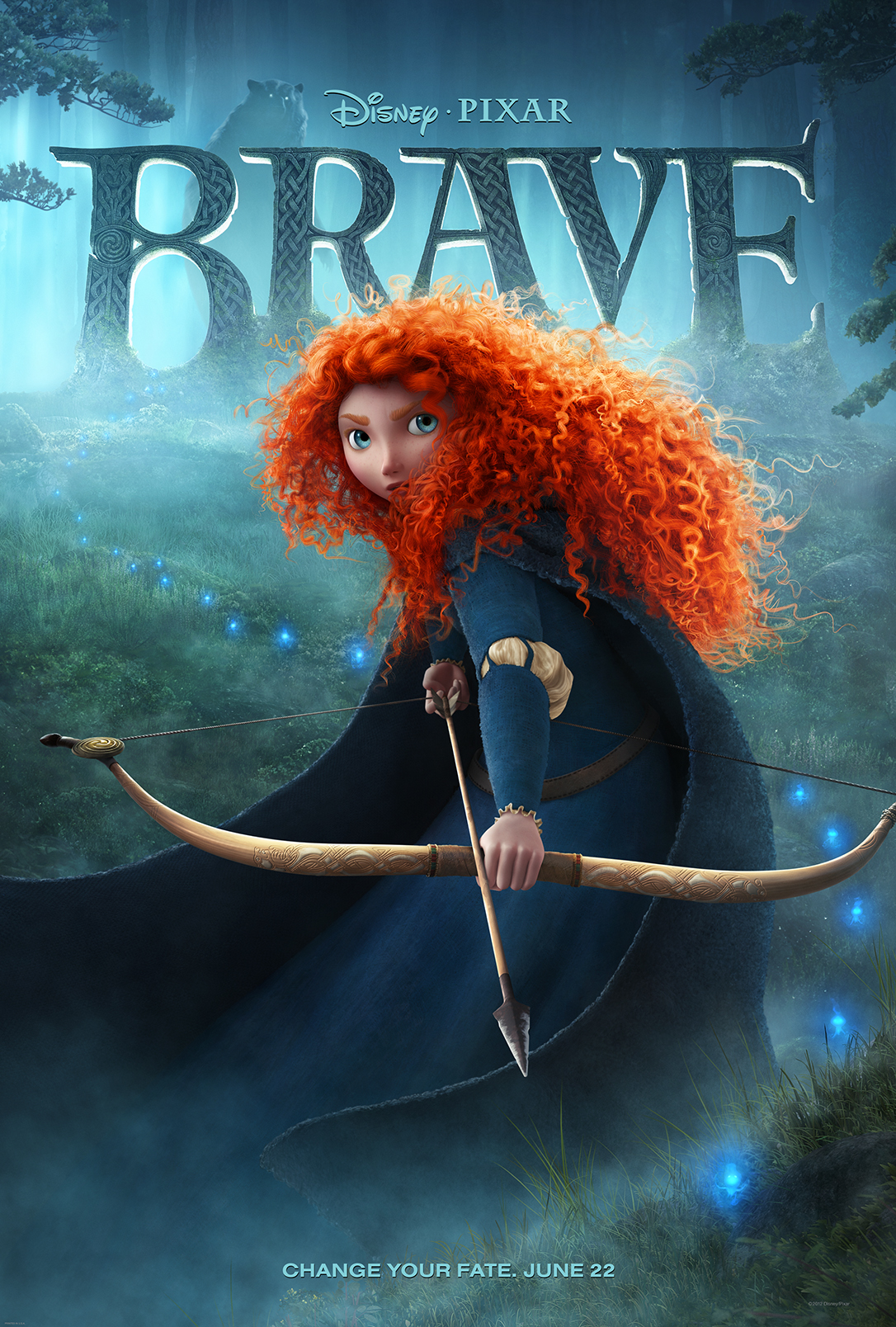


I love the poster for "Brave." That one is definitely my favorite.
Even though the poster is a little lackluster, I have high hopes for "The Avengers." It's written by Joss Whedon, the man behind "Buffy the Vampire Slayer" and "Dr. Horrible," so it should at least have some clever dialogue.
And on the flip-side to that comment, I'm more excited about the design for the Total Recall poster than the movie itself.
If the Avengers is as half as good as Whedon's Waterworld and Alien: Resurrection then whoa nelly!
I think the "Total Recall" poster is trying to remind us of how much we liked "Inception."
"Hey guys, you liked Inception. We're kinda like Inception."
Inception looked really cool, but it seemed a little all over the place. Maybe I just wasn't enough attention, ha!
I sure hope Total Recall is good. They must do Kuato justice!
I'm all about the Dark Knight poster... and the Spider-Man poster is wicked cool too!
Is this movie about that crazy redhead Sonia chick?
Linda, I think you are thinking of "Red Sonja."
[...] like stupid things. After all, low-brow comedy represents some of the highest grossing movies after year. Stupid makes us smile and laugh, and it makes us feel good. Miguel de Cervantes said, [...]
[...] done two posts dedicated to posters for upcoming movies, I decided it was time to revisit some classics. Surprised at my own excitement over the [...]