In honor of Valentine's Day I've put together a roundup of designs that I love. These are images that I've come across while putting together other blog posts or reading other blogs. Some of the pieces are insanely creative, some are funny and some are just really clean, well-executed designs. The samples include wrapping paper, business cards, book design, letterhead, brochures, posters and more. Enjoy and please vote for your favorites or link to designs that you love in the comments.
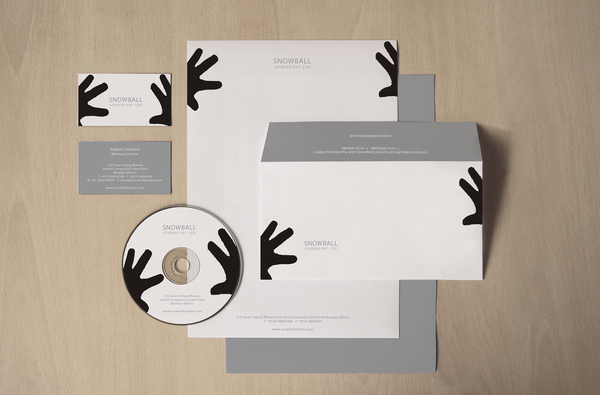 What are those two black cartoon hands "cupping?" A snowball, of course! A clever corporate identity for Snowball Studios. Click through for more images of how they use the design concept on a T-shirt, a truck and other materials. [Designed by Sachin Bavkar. Image via www.behance.net.]
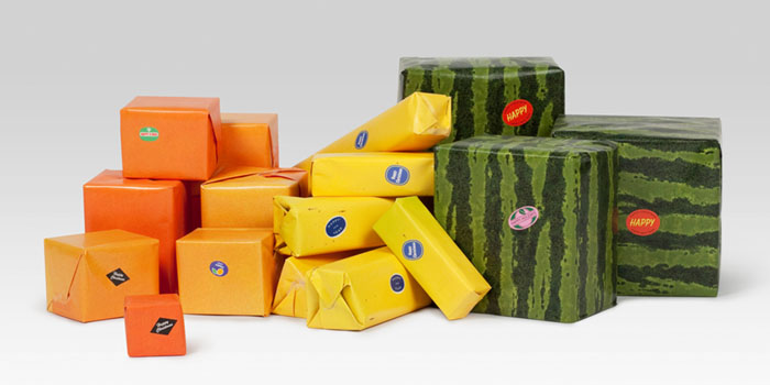 The sticker seals add just enough real detail to drive this fruit wrapping paper design. Also check out this previous post on wrapping paper inspiration. [Designed by Happy F&B. Image via www.thedieline.com.]
 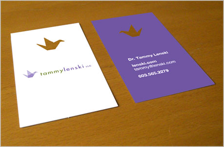 David Airey designed this business card for a client. I love the elegant logo, the use of the paper crane and the repetition of the crane in the die cut. Sometimes a die cut can overpower a card, but I think this works really nicely with the overall design. On his blog, which is linked below, Airey goes into great detail about the concept and design process for this piece. [Designed by David Airey. Image via www.davidairey.com.]
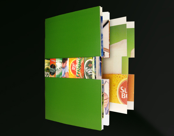
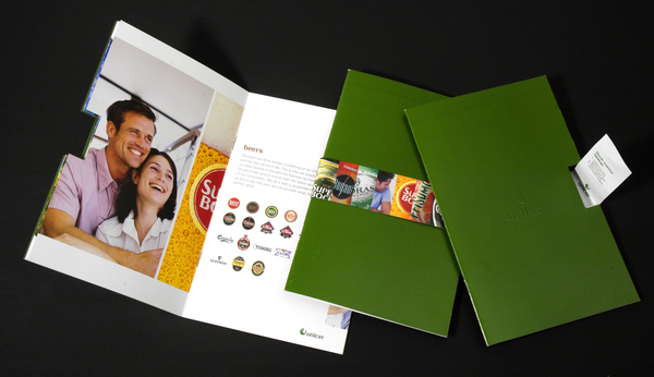 This corporate brochure for a European beverage company uses a belly-band on the front cover to show snapshots of each brand identity. The band wraps around a die cut through all the pages of the book, and this technique adds a lot of interest to the piece. [Designed by Hugo Vicente. Images via www.hugovicente.com.]
 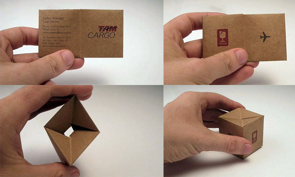 I love 3-D business card designs. This one is perfect for advertising a cargo company. You can also watch a quick video of how the business card folds into a box . [Image via www.comunicadores.info.]
 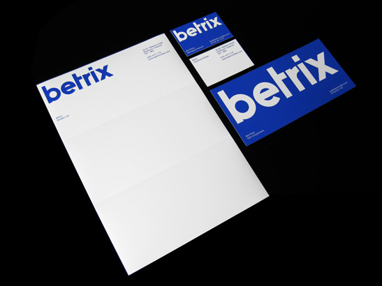 Sometimes color and font can carry a corporate identity. The cut-off "t" turns the company name into a logo or "mark." For me, this design is memorable and full of electric-blue energy. [Designed by Matt Keers. Image via www.mattkeers.co.uk.]
 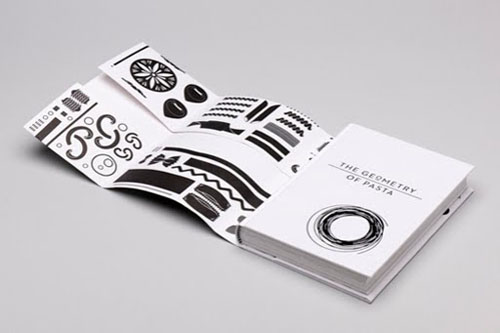 "The Geometry of Pasta," is a joint effort by chef and author Jacob Kenedy and graphic designer Caz Hildebrand. The dust jacket folds out to show the different shapes and sizes of the noodles. [Designed by Caz Hildebrand. Images via www.dailyicon.net.]
 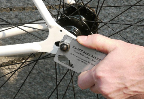 A creative metal business card that takes die cutting to a whole new level. If you're an accountant put a tip chart on the back of your card. If you're a bike mechanic, turn the whole card into a wrench. [Designed by Rethink. Image via www.cardonizer.com.]
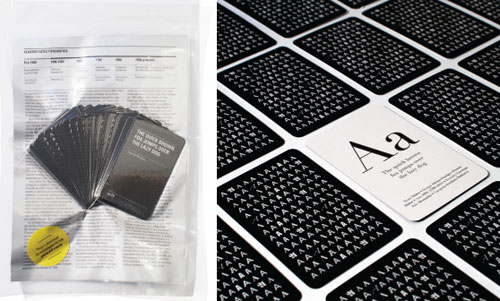
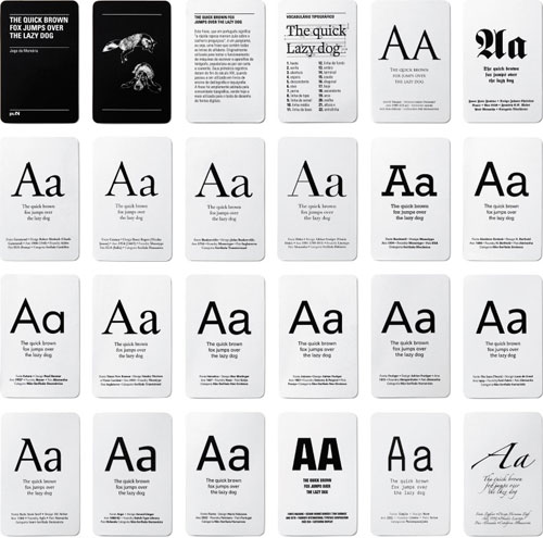 ps.2, a Brazilian design studio, came up with a typography memory game as a self promotion. The deck of cards comes with a type glossary and each card contains a brief history of the font. [Designed by ps.2 Images via www.twigandthistle.com.]
 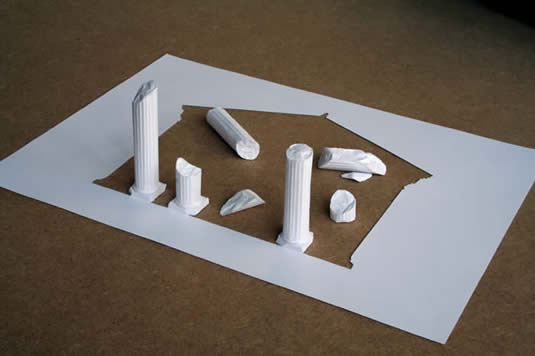 These are more fine arts than graphic design pieces. But I think that artist Peter Callesen's works on A4 paper can really jolt us to think about the medium differently and inspire some fantastic 2-D designs. Shown above is "Little Erected Ruin." [Designed by Peter Callesen. Image via www.petercallesen.com]
 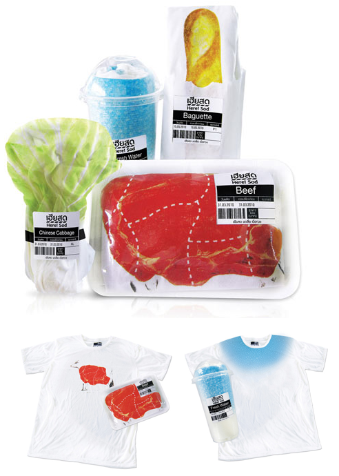 Hey nice meat shirt! A fun twist on T-shirt packaging that makes you stop and think. [Designed by Prompt Design. Image via www.inspire.2ia.pl.]
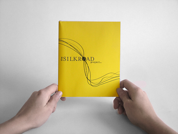
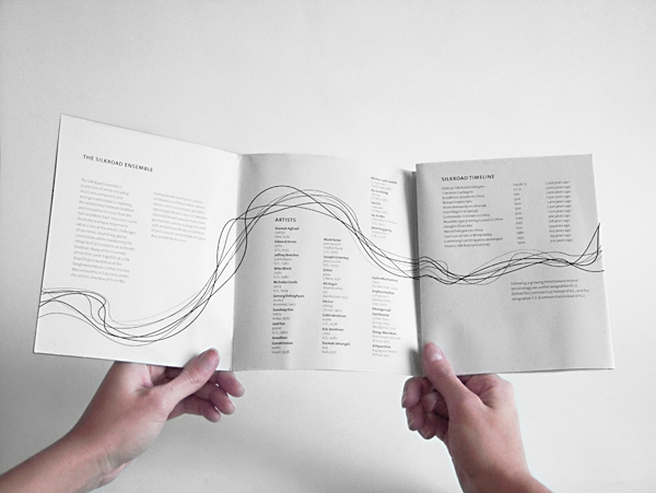 A brochure for a music ensemble that folds out into a poster calendar. The splash of yellow on the cover is enticing and the simple design inside, with the elegant silk threads weaving throughout it is lovely.[Designed by Megan Brock. Images via www.behance.net.]
 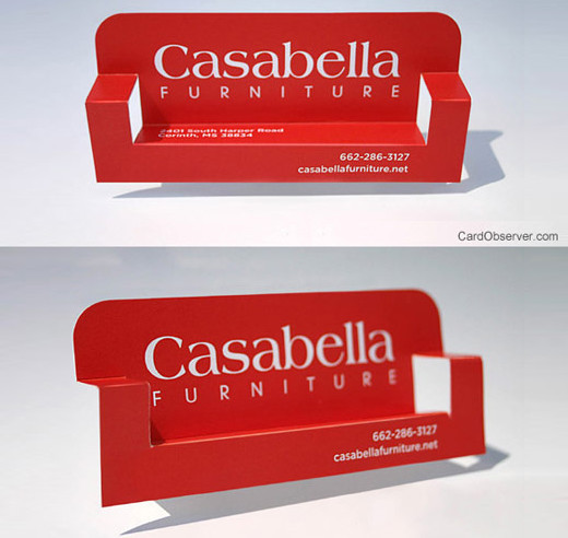 This card has made its rounds on all of the design blogs, but it's so simple and so memorable that I had to include it! I like that the design is the focal point and the card uses a crisp font and features very little text or contact information. [Designed by Amanda Casabella. Image via www.cardobserver.com]
 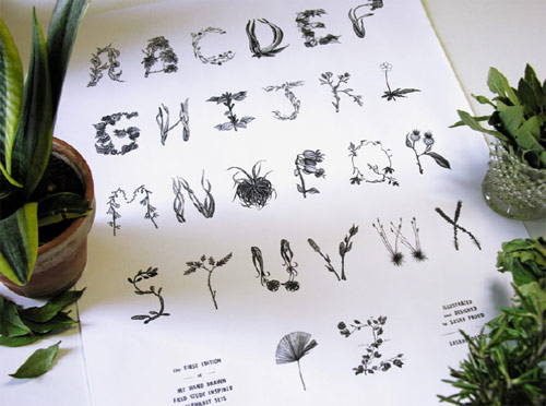 A gorgeous poster exploring type design. This is a great idea for a designer or illustrator's self-promotion. [Designed by Sasha Prood. Image via www.booooooom.com.]





No comments yet.