4 Best Practices for Brochure Design

Britt
September 9, 2010

Brochures really epitomize the challenges of graphic design: They are communication devices that need to be attractive and user friendly. Let's review some of the best practices for designing successful brochures, using real examples from around the web: *(all images are copyright of the owners).

1. Use interesting images Stale stock images will make your brochure look run of the mill. At the very least, use a stock image in a creative and new way by cropping it, changing the colors or taking out a background layer. In this set of collateral brochures for a client, Folk - A Creative Collective, uses photos of everyday objects to create interesting covers for each of the corporation's different business branches. The images are all branded with a citrus orange color so they work together. The image on each brochure cover relates to the nature of each type of business. For example, the direct-marketing brochure has an image of a cheese wheel, which looks like a pie chart.

2. Use subheads to break up copywriting In a brochure readability is key. Just as I have scannable, numbered list in this blog post, designers need to add subheads within a brochure to make it more user friendly. Subheads break up large chunks of text, making the copy look easy to engage with. Subheadings also tend to reiterate the most essential points of the brochure. For example, in a sales brochure, the subheadings might layout each of the benefits of the product or service. In this sample brochure from www.Stocklayouts.com, the subheads are brightly colored and make the copy very scannable and user friendly.

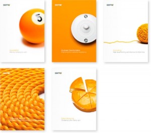
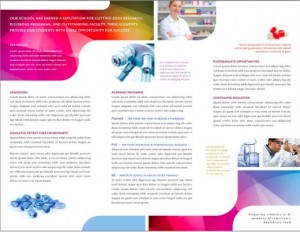
Image via Logix Studios.

3. Include a map Ever get to the last panel of a tri-fold brochures and say, "Now what?" It can feel like you've run out of things to say, but does your brochure have a map? For retail stores or any kind of service or consulting industry, a map showing the location of the business is a great element to add to a brochure. If customers are reading the brochure and see that the business is conveniently located, then they will be more inclined to visit. In the example to the left, Logix Studios created a brochure for an architectural conservancy company that serves as a walking tour. A map on the inside middle panel shows where all the historical buildings are and the sides of the brochure list information about each site.

Image via InDesign Auhtorwiki.

4. Pay attention to folds and bleeds A bad bleed and off-centered folding can derail a brochure design. Designers should ask ask for brochure templates directly from the printer they will be using for the project. The printer will have the exact measurements needed for their cutting and folding equipment. It also helps to give the borders of each panel a generous bleedor to have a design that flows between panels and makes the brochure more seamless. Never use a border around a brochure panel, there's no need to do this as the fold will create the same effect. Also, a border that does not fall directly onto a fold will look awful. The image to the right shows an example of a good bleed from InDesign Authorwiki. For more tips on brochure design, check out this related post about marketing with brochures.

(intro thumbnail image by Flickr user uitdragerij)

No comments yet.

Leave a Reply

Plain text

  • No HTML tags allowed.
  • Web page addresses and e-mail addresses turn into links automatically.
  • Lines and paragraphs break automatically.

What is the PsPrint Blog??

The PsPrint Blog is a resource for graphic designers, freelancers, small business owners and fans of print marketing. You'll find helpful techniques on printing everything there is to print, including business cards, postcards, brochures, stickers, invitations, greeting cards, door hangers, magnets and more. The PsPrint Blog shares creative ways to improve your design and layout skills, and useful tips for marketing your business in any medium. We also like to have a little fun, sharing design inspiration and spotlighting some our favorite customers' printed pieces in our "Hot Off the Press" series.