Color isn't always better. So says fellow blogger Jennifer Moline in a guest post on Fuelyourcreativity.com. I agree with Jennifer that a two-color design can be just as engaging, influential and emotional as a full color design. Moreover, a predominantly black-and-white or sepia design with just one splash of an accent color can be really memorable. Here are some links to inspiring black, white and sepia business card, logo, and website designs from around the web. Inspirationfeed.com's 100 Refreshing Black and White Business CardsInspirationfeed.com (Images via Inspirationfeed.com)
Graphicdirt.com's "Design" Category Graphicdirt.com ( Image via Graphicdirt.com)Black, White and Sepia Design Inspiration
July 25, 2010
Itevenhasawatermark.com's "Brown" Category Itevenhasawatermark.com (Image via Itevenhasawatermark.com) Logoblog.org's Black and White vs. Color Logos Logoblog.org (Screenshot via Logoblog.org) Abuzeedo.com's Web Design: Brown Sites Abuzeedo.com (Image featured on Abuzeedo.com) Inspiredology.com's 30 Black-and-White Websites Inspiredology.com (Image featured on Inspiredology.com)
Celebrating American Artist Appreciation MonthPrint marketing: 7 benefits to leverage in your business


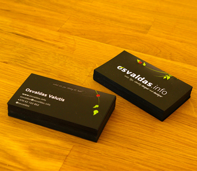
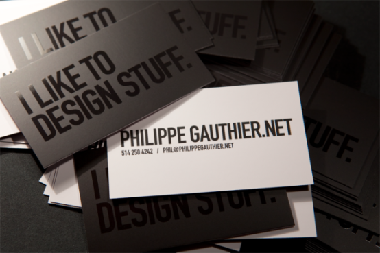
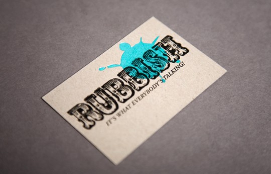
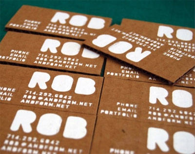



[...] PsPrint blogger Britt was inspired by fellow PsPrint blogger Jennifer’s guest post “Color Isn’t Always Better” on Fuel Your Creativity. Britt shares some creative business cards, web designs and logos that use a black, white and/or sepia palette with just a splash of color in her post, “Black, White and Sepia Design Inspiration.” [...]
[...] Sometimes less is more. Here are some examples of powerful black & white & sepia-toned design… (read more) [...]
[...] rolex daytona 116520 rolex daytona gold rolex dealers rolex explorer rolex forum rolex gmt master 2 rolex men watches Filed under: Uncategorized Leave a comment Comments (0) Trackbacks (0) ( subscribe to [...]