

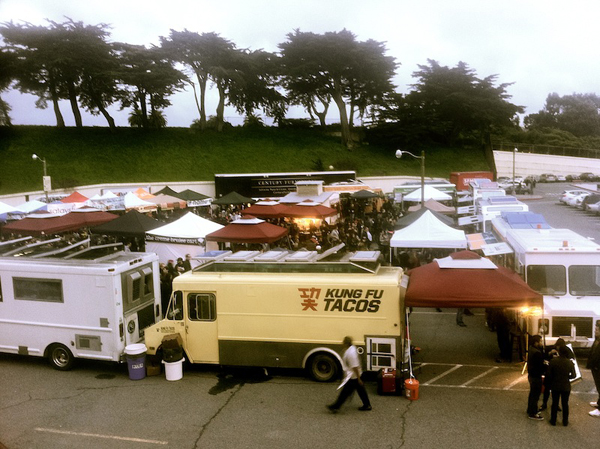
A Friday evening Off the Grid event at Fort Mason in San Francisco.
Lately there’s been a real zeitgeist of food truck cuisine in San Francisco. It’s taking the long tradition of East-coast dirty-water hot dog vendors and halal trucks and the West coast taco truck and taking it to a whole new locavore-hybrid level.
There’s all kinds of exotic menu options rolling out daily — from crème brulee to Korean burritos. No food style is too precious, and no ethnic cuisine too sacred to cross-pollinate. Well I, for one, salute the advent of the new-school food truck. It’s evidence of one of the things I love best about my hometown — that when you conveniently have a melting pot of wonderful variety at your disposal, you should feel free to experiment and mix-and-match to create something new and maybe better. And being a San Francisco phenomenon, in a city where you could casually toss a rock in the air and hit a designer, these trucks are eye-catching and distinctive with nicely designed graphics and clever logos. Nobody rolls out a new food truck concept without creating a fully-formed brand identity to help them stand out from the crowd. Here are some of my favorites. Chairman Bao Bun Truck 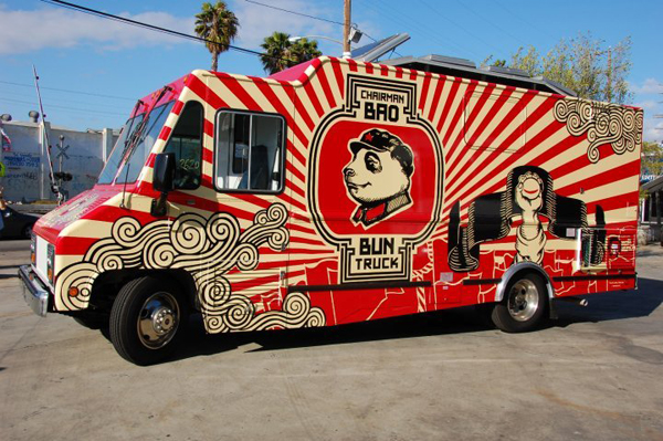 OK, let me just say that this is a beautiful truck. It’s graphic and bold using a limited three-color palette (thanks to artist James Jean). It’s distinctive, memorable and looks legit.
 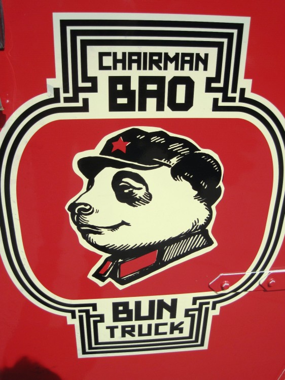 And the classic pen-and-inky portrait of the “Chairman” with a heroic far-sighted gaze is hilarious and really puts it over the top for me. Curry Up Now
 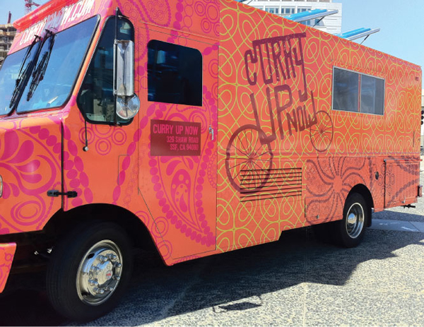 Here’s another bright, bold, un-ignorable truck. Once again, there’s a great use of color and pattern to give a clear Indian vibe. The riot of big patterns gives the whole truck a feeling of energy and celebration.
 ![]() Their logo has actually undergone a transformation (thanks to Nicole Lafave at designwomb.com). It maintains much of the spontaneous handmade quality of the first logo while successfully melding the ideas of India (with the Sanskrit-like top line on “curry”) and street vendor by putting the wheels on the words themselves and allowing them to form the picture. There’s no longer a need for a subhead.
Their logo has actually undergone a transformation (thanks to Nicole Lafave at designwomb.com). It maintains much of the spontaneous handmade quality of the first logo while successfully melding the ideas of India (with the Sanskrit-like top line on “curry”) and street vendor by putting the wheels on the words themselves and allowing them to form the picture. There’s no longer a need for a subhead. 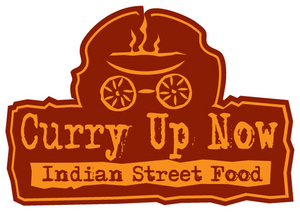 Here’s the original for comparison’s sake. The Brunch Box
 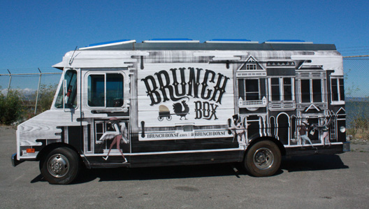 I love the shades-of-gray wood grain and stacked Victorians by designer/illustrator Michael Jeter of IShotHim.com
 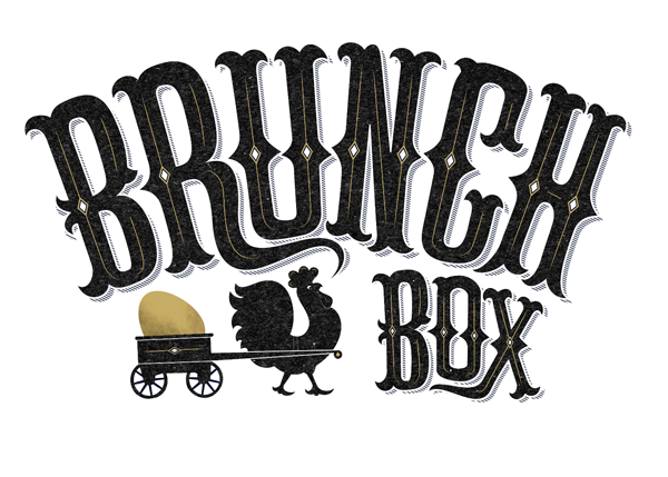 The logo by itself is fantastic as well. The shading and distressing detail in the lettering and illustration really adds a lot of personality.


No comments yet.