 Who says watching TV isn’t inspirational – especially when beer is involved? While watching an episode of “Brew Masters” a couple of months ago, I noticed that the font used on the show looks like something churned out by a broken typewriter. I love the beer that Dogfish Head – the star of the Discovery Channel show – produces, and I was already planning a pilgrimage to the brewery in Delaware, so a blog post idea was born. I’ve become a little obsessed with Dogfish Head beer in the past year, and the taste is only one reason. Sure, the Chateau Jiahu has a taste unlike any other beer I’ve tried, but have you seen the label? Dogfish’s motto is “off-centered beer for off-centered people,” and its graphic design matches that. Sam Calagione, founder and president of Dogfish Head, was kind enough to chat with me about his company’s philosophy on design, marketing and creativity. TYPOGRAPHY Calagione and I first talked about that font I see all over the beer labels, the website and the brewery itself. Seriously, I noticed on my tour of the the brewery that even the behind-the-scenes signage on the tanks, etc., is in that distinctive typeface. He explained that when he first started up the brewery in the mid-’90s, he wanted to create a branding voice that had the same voice and feel as the message: off-centered beers that were rustic and unpasteurized.
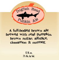
Punkin Ale label with the doggie font.
Calagione explained that he was at a flea market when he found a 19th-century stamp set. That stamp set was scanned, cut and pasted with each letter off-centered – that became the “doggie” font that distinguishes Dogfish Head branding. “We wanted it to look DIY and homemade,” said Calagione, “but we were also a tiny startup with little money.” So even if Dogfish Head wanted sophisticated design at the time, it wasn’t going to get it. “We didn’t want to hire outside marketing and advertising. We wanted to do it ourselves,” Calagione said. “I designed the logo and did an unintentional, intentionally imperfect shield.”
LABEL DESIGN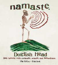
Namaste label by Sam Calagione.
One thing I was pleasantly surprised to hear when I started digging into Dogfish’s design roots is that Calagione himself is responsible for a number of the distinctive beer labels. The former English major-turned-business owner also boasts an art talent. He designed many of Dogfish Head’s oldest beers, such as the 60 Minute IPA, Punkin Ale and Chicory Stout. Other beers feature his paintings – Calagione said he’s most proud of the labels for Namaste and Noble Rot. But as the brewery grew and became more financially viable, Calagione said he was able to reach out to artists whose work he admired, and he commissioned them for the occasional beer label.
Jon Langford (from the band the Mekons),
Marq Spusta and
Tara McPherson are just a sample of the people whose artwork adorns Dogfish Head labels. “Only recently do we have an in-house graphic artist, Tim Parrott,” said Calagione. “Artists that we love – we’ll ask them to do a painting for one of our beers, and Tim and I will work with them to add in the logo.”
MARKETING
Fort label design by Tara McPherson.
In the documentary “
Beer Wars,” Calagione is seen in a supermarket discussing the competition among breweries for shelf space. It made me realize just how much purchasing decisions are made by packaging. When I visit the liquor aisle of any store, I find myself drawn to eye-catching, interesting packaging. I may drink craft beer and wine, and I have my favorites, but I’m no connoisseur. So how much of a role does merchandising play in Dogfish Head’s packaging design decisions? “There’s very little we can do design-wise to entice the retailers to choose where to put our beer,” Calagione said. “But we take the time to care about how our labels and six-packs look and make them as interesting as the liquid within them.” Calagione said that if the customers care about Dogfish Head beers, then he hopes they will ask their local retailers to stock their favorites.
CREATIVITY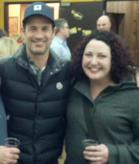
Sam and I on my trip to the brewery.
Dogfish Head’s work with artists extends beyond print form. A few years ago, Calagione was surfing the web when he came across the
Steampunk Tree House, which was built in 2007 just down the street from PsPrint’s Oakland, Calif., location. “We reached out to the
Five Ton Crane art collective and told them we loved it,” Calagione said. “We told them if they had an event coming up that we’d donate beer to it, because we call ourselves an analog brewery for a digital age.” The members were already fans of Dogfish Head and said what they really needed was a home for the tree house. “We bought the tree house for a dollar and then spent $75,000 to bring the artists out to Delaware, house them and also reinforce the tree house,” said Calagione. “It represents our creative philosophy real well.” The looming tree house is now one of the first things a visitor sees upon turning onto the road for the Dogfish Head Brewery in Milton, Del. While it’s a liability to have the tree house open to the public, Calagione said Dogfish Head staff hold many meetings – marketing, beer recipes and so on – inside. “It’s great to get out of a boring ol’ conference room and be in a creative environment,” he said. A beer probably doesn't
hurt, either.
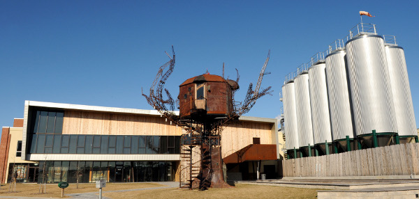
The Steampunk Tree House at Dogfish Head's Milton, Del., brewery.
 Who says watching TV isn’t inspirational – especially when beer is involved? While watching an episode of “Brew Masters” a couple of months ago, I noticed that the font used on the show looks like something churned out by a broken typewriter. I love the beer that Dogfish Head – the star of the Discovery Channel show – produces, and I was already planning a pilgrimage to the brewery in Delaware, so a blog post idea was born. I’ve become a little obsessed with Dogfish Head beer in the past year, and the taste is only one reason. Sure, the Chateau Jiahu has a taste unlike any other beer I’ve tried, but have you seen the label? Dogfish’s motto is “off-centered beer for off-centered people,” and its graphic design matches that. Sam Calagione, founder and president of Dogfish Head, was kind enough to chat with me about his company’s philosophy on design, marketing and creativity. TYPOGRAPHY Calagione and I first talked about that font I see all over the beer labels, the website and the brewery itself. Seriously, I noticed on my tour of the the brewery that even the behind-the-scenes signage on the tanks, etc., is in that distinctive typeface. He explained that when he first started up the brewery in the mid-’90s, he wanted to create a branding voice that had the same voice and feel as the message: off-centered beers that were rustic and unpasteurized.


Awesome post Jennifer :) That's Tree House is so cool!
Even the art is "Craft" I love it! Screw you big beer! DFH is doing it how it should be done!
This blog post is making me thirsty!
[...] the company tagline: “off-centered beer for off-centered people.”In an interview with PsPrint, Calgione said, “We didn’t want to hire outside marketing and advertising. We wanted to do [...]
[...] an interview with PsPrint, Calgione said, “We didn’t want to hire outside marketing and advertising. We wanted to do it [...]
[...] an interview with PsPrint, Calgione said, “We didn’t want to hire outside marketing and advertising. We wanted to do it [...]