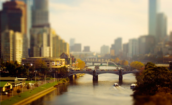
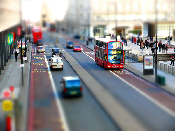
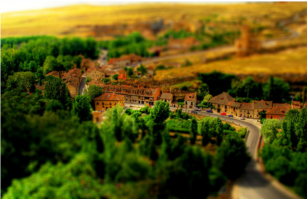
You know you've seen them. Photographs of crowded plazas taken from a great height that for just a second make you wonder, "Is this a really elaborately assembled miniature reproduction of a crowded plaza or is this some kind of Photoshop trickery?" The answer more often than not is that it's actually in-camera trickery (even though you can somewhat successfully fake this kind of shot after the fact in Photoshop.)
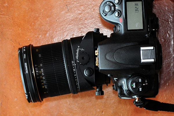
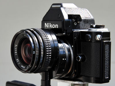
The technique is called tilt-shift and, unsurprisingly, it's because it employs a lens that can tilt forward or back and simultaneously shift up or down. (see below the very useful images from the Wikipedia entry on tilt-shift)
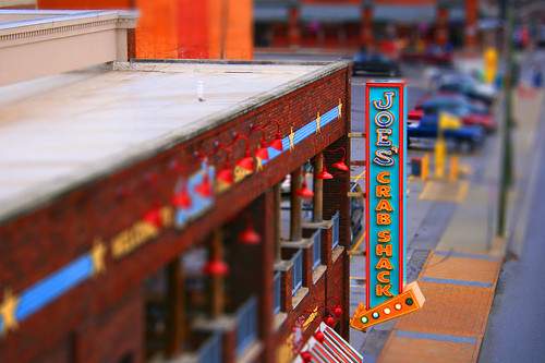
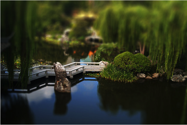
The technique was originally developed with view cameras — they're the kind that look old-fashioned where the lens is on a track with extending bellows like the one below. With a lens set up on a plate with a flexible accordion sleeve to allow for movement, it's quite easy to adjust for both tilting and shifting of the lens. The main benefit of this is that when taking pictures of architecture it's possible to counteract the distorting effects of tilting your lens up at a building by shift the lens so that all the lines of the building line up perfectly perpendicular. The chart below — also from the Wikipedia entry — explains it nicely.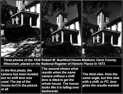 So now that there are fancy SLR cameras with fancy interchangeable lenses you can purchase a tilt-shift lens for this purpose. The side effect of this is that photographers have been employing their tilt-shift lenses to create faked miniature dioramas. Technically only tilt is used to achieve this effect since all that's required is a very tight selective focus where only a sliver of the entire scene is in focus while the rest falls out of focus very dramatically. The technique is probably called tilt-shift simply because that's the lens style most commonly used to do this. At any rate it's a stunning effect that's been used to good effect in photography. But enough with the talky-talky. Lets look at some cool pictures.





This is really cool!
EXCELLENT INFORMATION AND INCREDIBLE IMAGES AND TECHNIQUE.