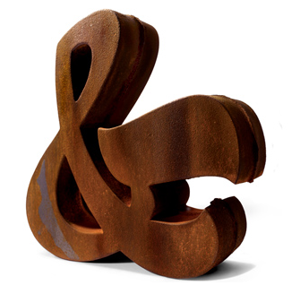
Let's start with a company that's actually a type foundry that happens to sell type-related merchandise on the side — House Industries. Above is a decorative iron ampersand.
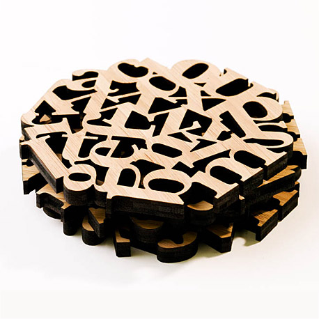
Another site that's primarily selling fonts with a few products on the side is Veer.com. This is a set of laser-cut wood coasters.
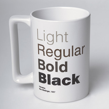
This is a typography + coffee joke. The designations work both to describe the font weight and the coffee strength. [Helvetica mug by Veer.]
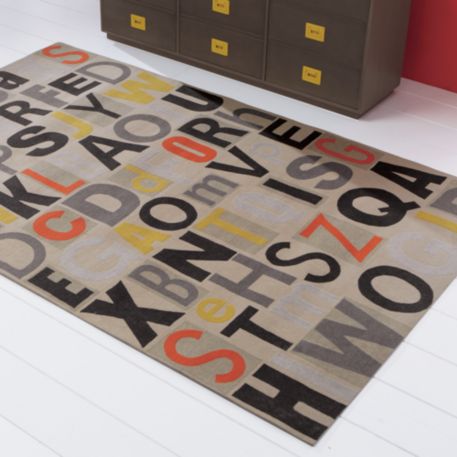
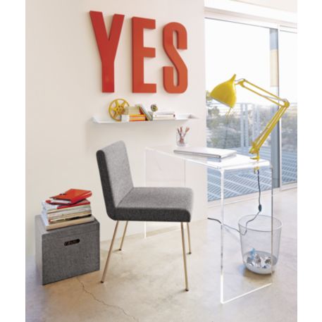
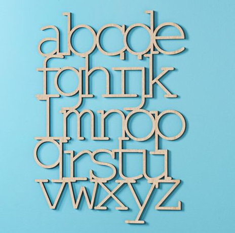
This is a wall piece from Land of Nod (they're basically the kid's branch of CB2). I don't see why this should be something meant only for children. I'd gladly hang this on my wall.
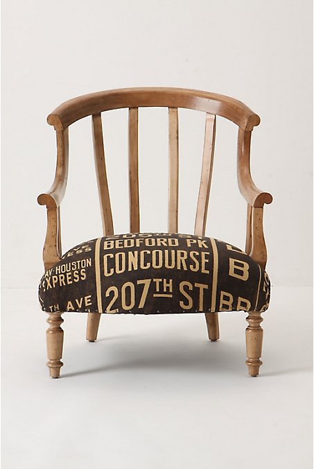
Garvey Chair by Anthropologie. The upholstery is covered in names of New York subway stations.
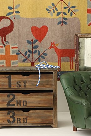
This one comes from a British company, Kent and London, via Design Sponge.
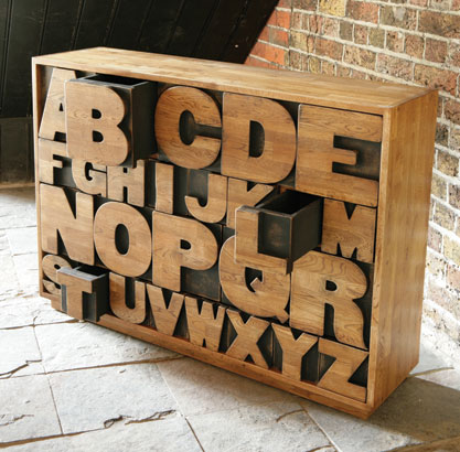
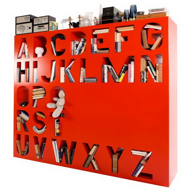
Now this is a bit of a rare piece designed by Finnish furniture designer Lincoln Kayiwa. It's ostensibly a book shelf but acts more like a room divider.
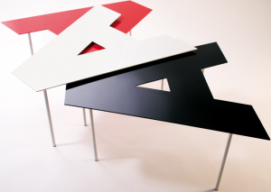
These are Fontables. They're designed by a pair of Italian designers and come in all the letters of the alphabet, lower and uppercase, and any numeral. Their height is adjustable so they can be arranged to overlap each other.
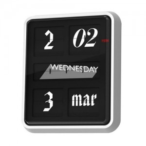
This is the Font Clock from Established & Sons. As the day/month/date and time flip over they change font.
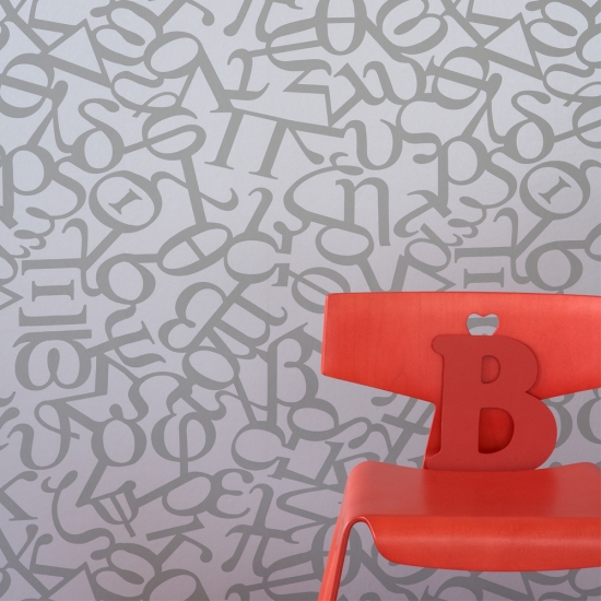
Graham & Brown alphabet wallpaper. It's the Greek alphabet but that's typography as well.
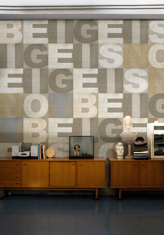
This wallpaper is by Italian company Wall and Deco and is called Sans.
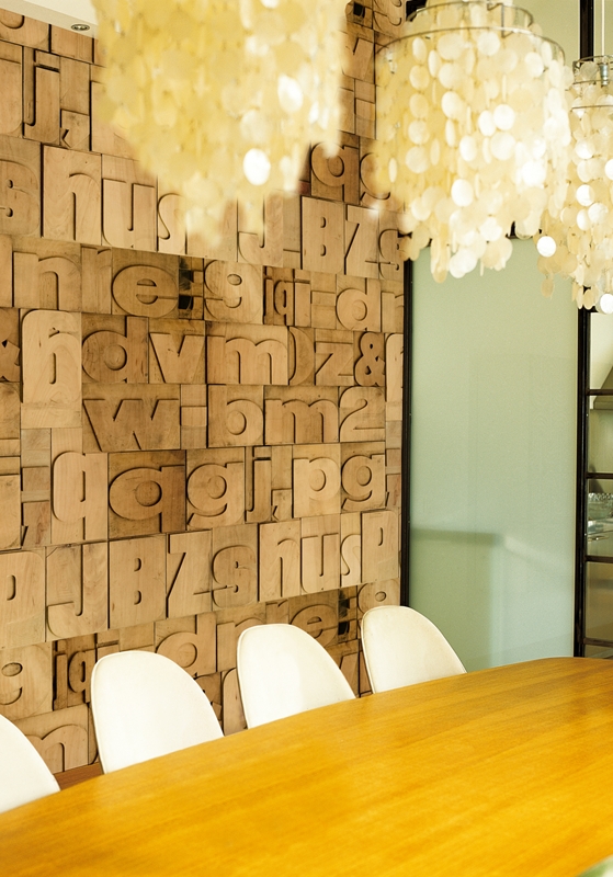
Also by Wall and Deco this one is called Typology.
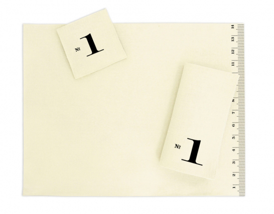
This set of linens is from Heather Lins Home. There are numbered coasters and napkins and the measurement placemat completes the set.
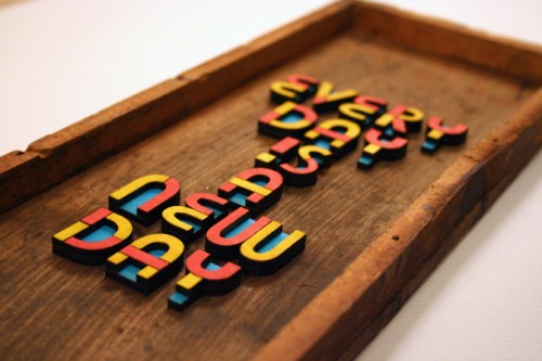
Scott Albrecht is an artist who creates these colorful typographic shadow boxes with different phrases.
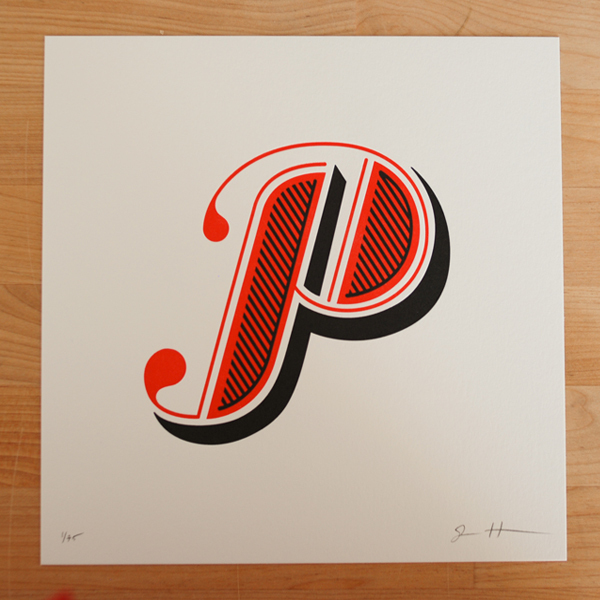
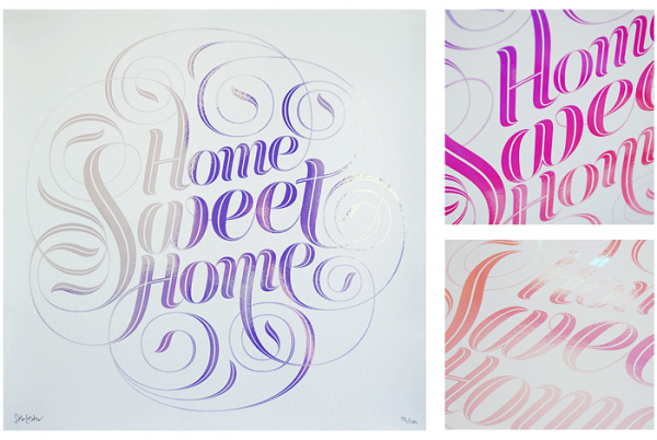
Jessica Hische, an illustrator and typographer started a Daily Drop Cap project for herself in which she would create a different decorative letter each day. She sells letter-pressed prints of these elaborate characters.
John Boardley of the I Love Typography blog is a talented typographer and letterer who sells a limited number of prints through his blog.
Ork Posters' typographic interpretation of a map of San Francisco neighborhoods.
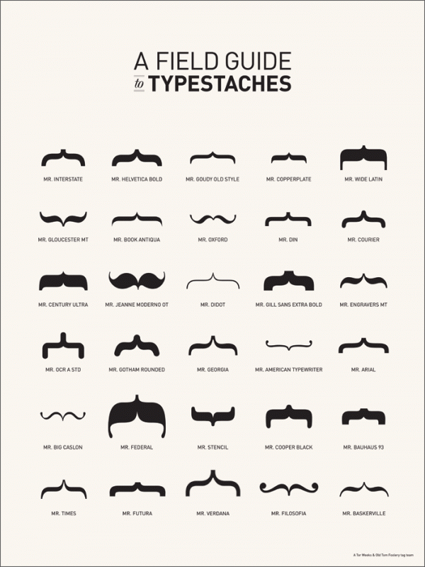
This is a poster by Tor Weeks (who was also responsible for the Bikes of San Francisco poster in an earlier post). Here she takes one the more obscure typographic bits — the brackets — from different fonts to build her chart of typestaches.





HA! love this post. thanks for all the interior design inspiration!
Thanks Britt! I'm all over the decor blogs constantly coveting the typography-related stuff. (It's easier than actually clearing up the clutter piling up in the corners.)
[...] funky distressed images as wallpaper. You may have seen their typography wallpapers in the “Shacking up with Typography” post. Elliptical forest Geisha Send Your Thing Striping [...]
This is great! l really like the moustache typefaces - made a couple of friends laugh. I'm definitely coming back for inspiration! :D
Glad you liked it PB. I aim to inform and delight.
[...] and creative ventures, there is something more explanatory in movement. Watching someone making typography or using programs such as Photoshop to make new fonts is a great way to learn in a more direct [...]
[...] and creative ventures, there is something more explanatory in movement. Watching someone making typography or using programs such as Photoshop to make new fonts is a great way to learn in a more direct [...]
[...] and creative ventures, there is something more explanatory in movement. Watching someone making typography or using programs such as Photoshop to make new fonts is a great way to learn in a more direct [...]