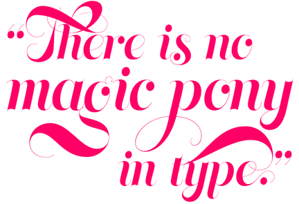
Like correct spelling and grammar, there are certain details in typography that make you look polished and professional instead of sloppy and amateurish. While it’s easy to run a spell check it may not be as cut and dry to fine-tune your typography. Here are a few baseline tips to keep you looking sharp. 1. Use “smart” quotes and apostrophes. Smart quotes are also referred to as curly quotes, unsurprisingly, because they are curved (or, in same cases, slanted.) Straight quotes look more like tiny, un-dotted exclamation points. Those straight or “dumb” quotes are actually not quotes at all. They’re called primes, and their only typographic purpose is to denote inches (like when you write 18" by 24"). Likewise the straight apostrophe or single prime is only used to denote feet (like in 2' by 4'). In those cases using a curly quote is incorrect. So knowing the difference between smart and dumb quotes, and when to use them, makes you look smarter. In MS Word under preferences you can set the auto correct to swap out straight quotes with curly quotes. This will work most of the time unless you write about furniture dimensions a lot. I've turned them off in my preferences since I know the Mac keyboard command for curly quotes. Instead of Shift+" for open quotes, type Option+{ and for close quotes type Option+Shift+{.On a Windows machine the open and close quotes are ALT+1047 and ALT+1048 (hold down the ALT key and type the numbers in order on the keypad). Now you have more control, and you'll quickly become the quotes guru in your office.  This quote is set in Memoriam with curly quotes. Memoriam is a typeface by Canada Type font foundry, which is available through Myfonts.com 2. Don't be quick to push the B and I buttons When typing in any application, be it Word or InDesign or Photoshop, try to avoid using the bolding and italicizing buttons for formatting texts. There are certain faces that don't have a bold and italic option, I know. It's always better to pick a typeface from the beginning that has a range of weights and italic. The B button will bold anything but even if you've picked a font with a bold option it's not necessarily turning your text into Clarendon Bold. Sometimes it's just adding thickness in a not-so-careful way that can make the font look fugly. Same goes for the italic button. It will angle your text in an ungraceful way. So just use a little forethought, and pick out a font ahead of time.
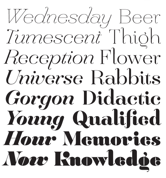
  Hera is a nice big font family by Lucas Sharp available here. 3. Use an em-dash instead of two hyphens
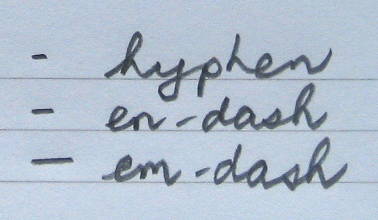
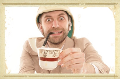
  When you want to use a dash there are actually three options: The hyphen, the en-dash and the em-dash. Each is longer than the last and they have different purposes. First, to explain terms. The en and em-dash are called such because they are either the width of an uppercase N or an uppercase M. En dashes are pretty much only used as range separators say, if you're writing 9 a.m. – 5 p.m. When you're writing text and using two hyphens as a pause, you should be using an em-dash instead. The only reason two hyphens are used is an artifact of writing on old-fashioned typewriters that didn't have an em-dash key. It's the same problem as double-spacing after a sentence but we'll get into that later. Once again, there's a keyboard shortcut for that. The Mac key combination is Shift+Option+Hyphen. The Windows version of that is ALT+0151 as before holding down ALT and typing the numbers on the keypad. 4. Never make a script face all caps It looks crazy-pants. Don't do it. It's like a very fancy monocle-wearing gentleman screaming at you.
  Maybe this one. 5. Don't double-space after a sentence. Now I didn't know this was so controversial until I read this Slate article and the following comments. People are creatures of habit. So the habit of double-spacing after every sentence is something taught in high school typing classes across the nation even though those classes are taken on computers now. The funny thing about old-fashioned typewriters is that they were set to be mono-space. What that means is the numeral 1 would take up the same space as a capital M (the widest letter in the alphabet). So there would be a lot of wide holes of uneven spacing between letters and to make it abundantly clear that one sentence was ending and the next one was beginning extra space would need to be added. In the modern day, computer fonts have relative spacing so that letters automatically sit closer to each other for a nice even text block. It's easier to read text when the lines of words are an even gray line when you squint at them. When you add double spacing behind every sentence you build big ugly moth holes into your text. It may be an institutionalized habit that still gets taught and perpetuated but so was foot binding. It's time to let go of this anachronism.
5 Type Tricks That Make You Look Good
May 24, 2011
Bookplate design: 3 tips for graphic designers Print marketing: 7 benefits to leverage in your business


No comments yet.