A pattern is a risky element to add to a design. If the pattern is too retro, whimsical or futuristic it can pigeonhole an entire poster or brochure in unexpected ways. That's because patterns tend to evoke emotions and responses in the viewer that simple type and color do not. So if you do use a pattern in a design, use it wisely and sparingly. Make sure it's relevant to the message the piece is trying to communicate. For all the lucky designers out there who are working on projects for fun, young, funky companies, here are some inspiring patterns taken from the graffiti world: 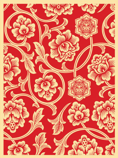 This Shepard Fairey design evokes a 1950s vibe. You can see the tiny little OBEY logo inside certain flowers. [Image via www.graffart.eu]
 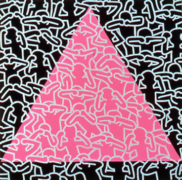 Keith Haring filled canvasses and walls with his signature repetitive body patterns. The work, titled "Silence = Death," also has a layer of social commentary. Image via [www.thebodyvisualaids.com]
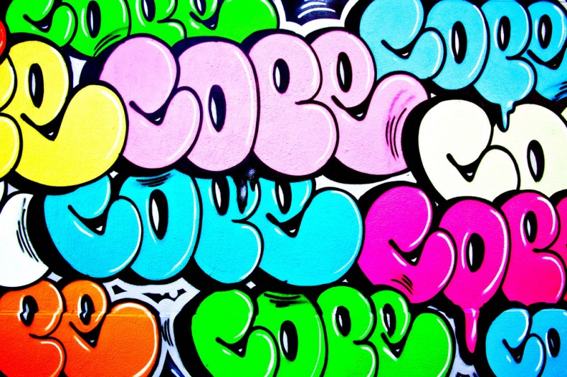
This layered, repeating tag by Bronx graffiti artist Cope 2, creates an unsual pattern with a lot of movement. [Image via www.calibersf.com]
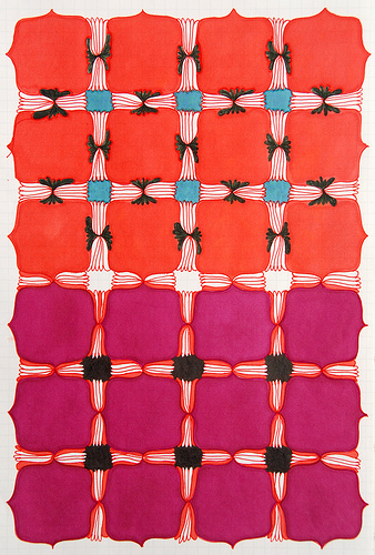 Graphic designer Anika Mari says on her blog that graffiti she saw in Mexico City inspired her to create this pattern above. I like the gradation in color and how the negative space, filled with lines and patterns, becomes the focal point of the design. [Image via www.anikamari.com]
 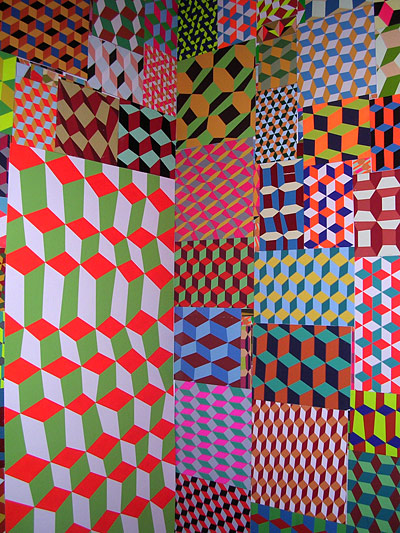 "Advanced Mature Work" is an installation by graffiti artist and painter Barry McGee for a 2007 Los Angeles. show. The dizzying patterns are reminscent of the boards in the 1980s video game" Q*bert." [Image via www.davidj-visualstimuli.blogspot.com]
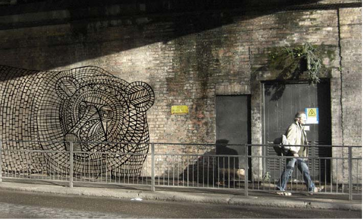
Keitaro Sugihara's graffiti bear is built from several different repeating shapes that look much like the wrought iron surrounding stained glass. Sugihara is a London-based artist and graphic designer. [Image via www.keitarosugihara.com]




Recommeneded websites...
[...]Here are some of the sites we recommend for our visitors[...]…...
[...] are some cool patterns perfect for your color banner [...]