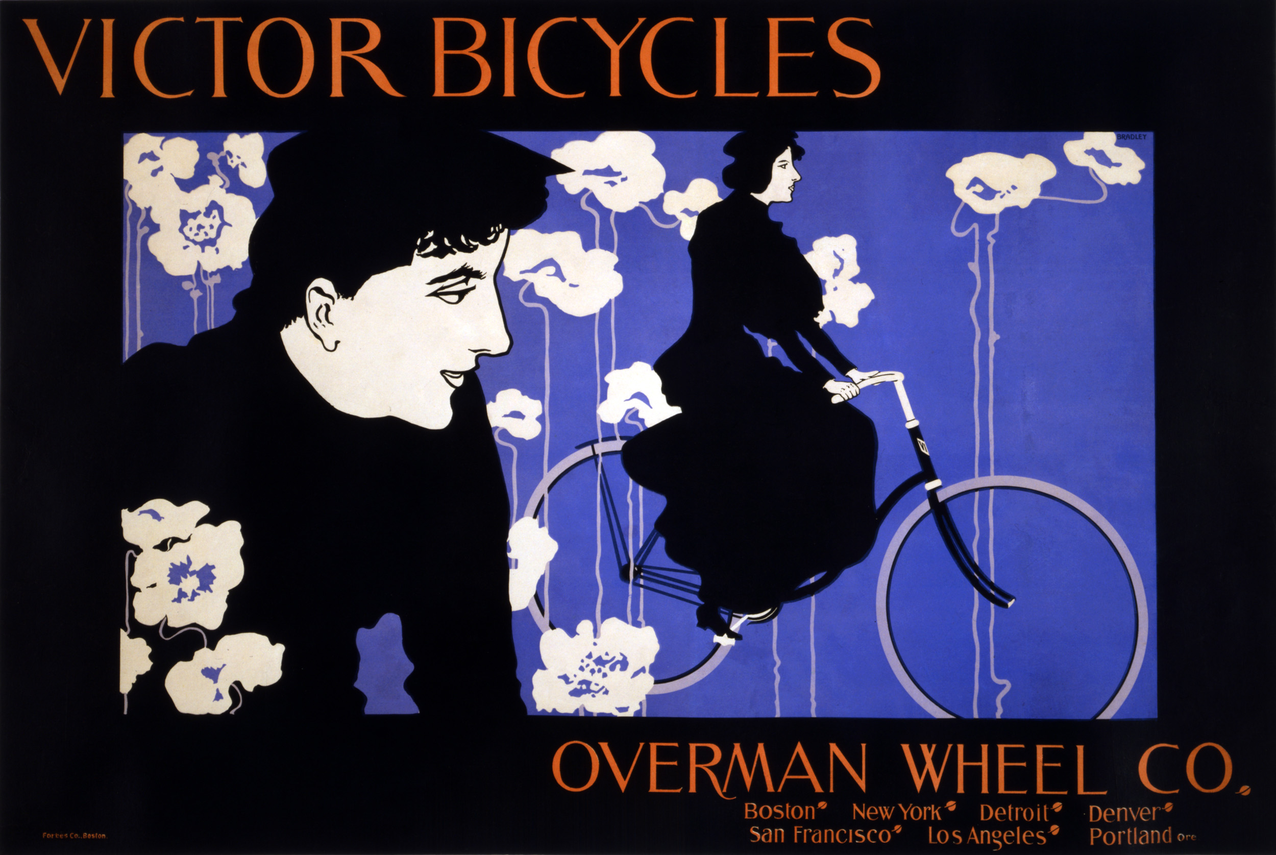
Since today is Bike to Work Day I thought it would be a good moment to take a look at some fun posters, invitations and ephemera using bikes. In the late 1800s two technologies were developing at the same time — bicycles and color lithography. By 1890 artists such as Jules Cheret, Toulouse Lautrec and Alphonse Mucha were taking advantage of advances in printing to really push the medium of the poster while the bike was at the very height of fashion and novelty. The result is that the bicycle became the focus of a lot of great advertising posters of that era.
This poster is by American artist William Bradley is in the art nouveau style. Even using only three colors and the white of the paper Bradley makes a beautiful composition. The bicycle itself is almost abstracted to the point of being two white wheels. 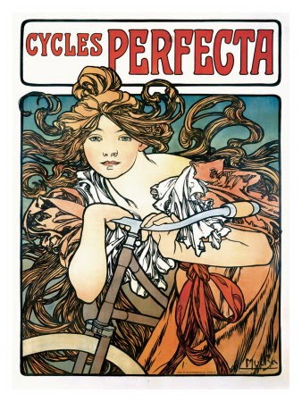 This is one of a couple of bicycle posters created by Alphonse Mucha. The bicycle here is mostly just hinted at. Even at the turn of the last century advertising used beautiful women to sell product.
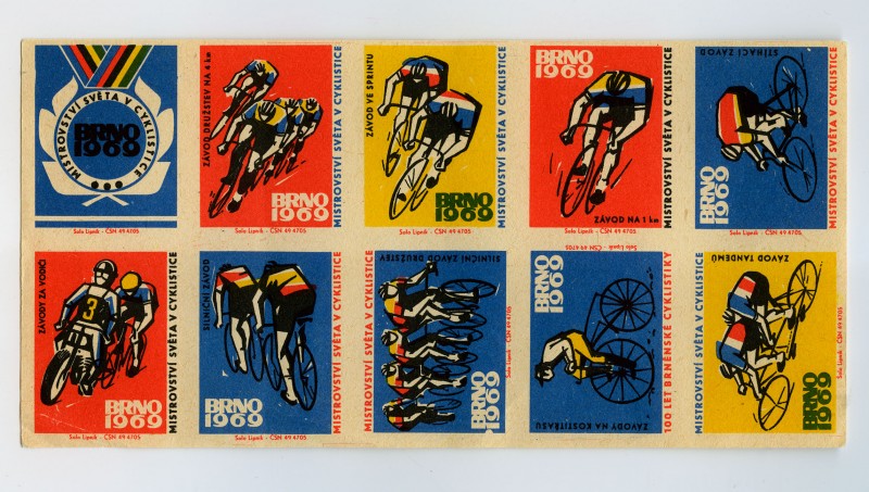
This is a set of Czech matchbook covers commemorating the 1969 BRNO World Cycling Championships. Nice use of a limited color palette and energetic gestural illustrations. 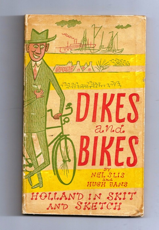 This is the cover for a mid-century book. Stop giggling. It’s about the Netherlands. The original post about this book can be found here.
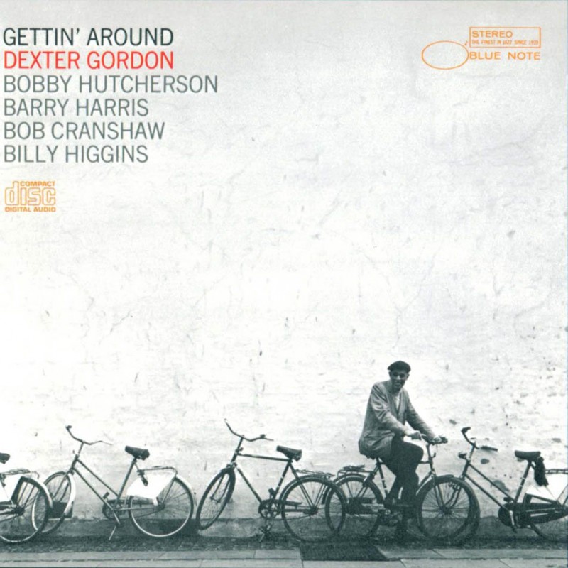
A great Blue Note Jazz album cover.
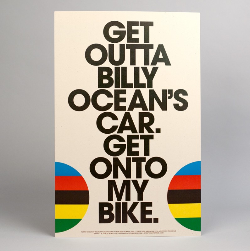
On a slightly more modern note …This poster is by Stump Town Printers. Fun use of big bold typography with only the bicycle wheels hinted at. You can purchase it at buyolympia.com 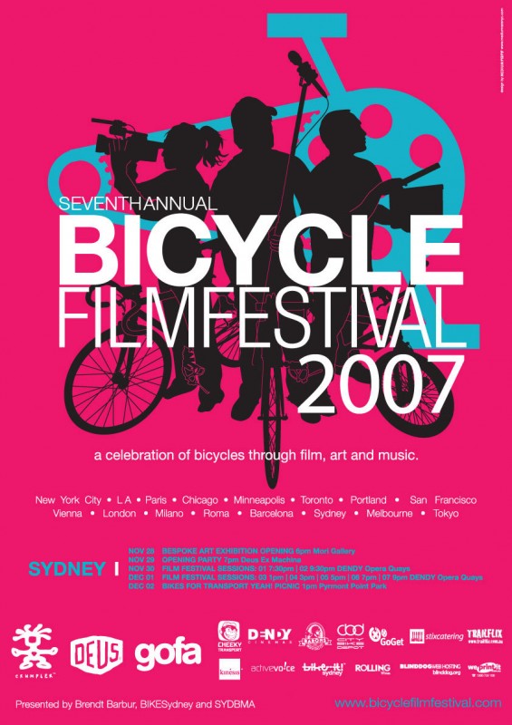 Considering how much information had to go on this poster (and how many sponsor logos!!!) its hierarchy of information is really easy to navigate and, as with any good poster, the imagery is what arrests the viewer first.
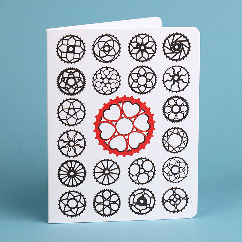
Here’s another piece by Stump Town Printers. Here they took the shape of the chain ring from different, historical makes and models of bicycle just to show how individual and beautifully geometric they are when taken out of context. 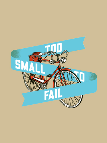 A poster by Aesthetic Apparatus: They do great poster work in general — often for concerts.
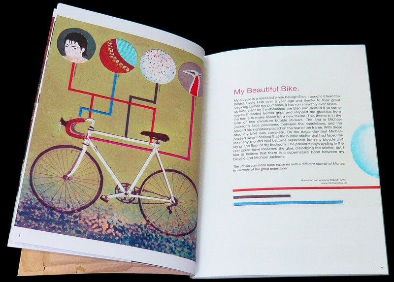
Here’s a spread from Bone-Shaker Magazine published in England. It’s a bike enthusiast magazine with a great design aesthetic.
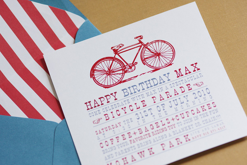
Here’s a great invitation from Lemon and Lavender.
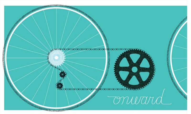
This poster from Man vs. Ink deletes the frame of the bike and uses a nice one-word rallying cry. 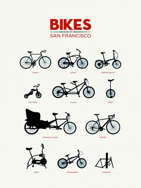 Last, but hardly least, is this poster by Tor Weeks (who sells through BigCartel.com as “A Girl named Tor”). She pinpoints San Francisco bike culture with a keen and witty eye. Reading from left to right and top to bottom: Mission, Sunset, Financial District, Noe Valley, Marina, Haight, Fisherman’s Wharf, Presidio, Castro, Embarcadero and Tenderloin. You can purchase her poster here.




[...] is a poster by Tor Weeks (who was also responsible for the Bikes of San Francisco poster in an earlier post). Here she takes one the more obscure typographic bits — the parentheses — [...]