In previous posts, Letterhead Possibilities: Part 1 and Part 2, we took a look at some considerations for how you want to brand yourself. (It's not called identity design for nothing.) But sometimes your business or what you do requires some specialized extras. You'll want those extra odds and ends to be just as tightly integrated into your identity system as your letterhead and envelope. Let's take a look at some examples. 1. Hans Bennewitz: Letterhead + Envelope + Business card + Invoice 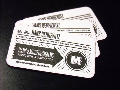 As a designer working freelance jobs you're going to have to send invoices to clients. Hans Bennewitz designed his system with this in mind. It always pays to look professional and like you're thinking ahead instead of using a default form.
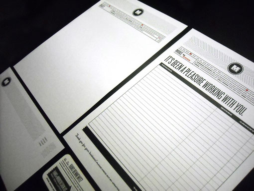
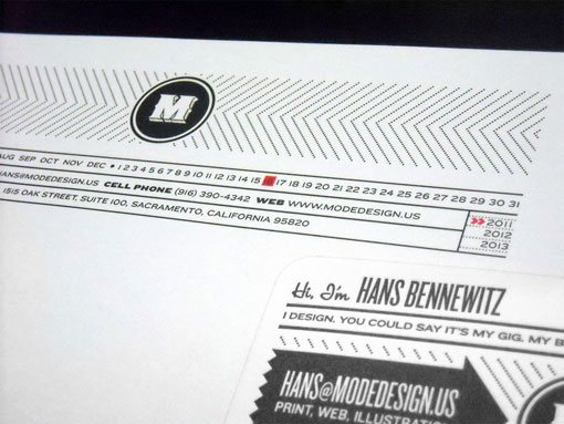 The letter and invoice even share the same clever method of marking the date in the head of the letter. A red stamp is applied to the current month, date and year. 2. Imagehaus for Schmidty's: Letterhead + Envelope + Business card + Appointment card + Menu of services
 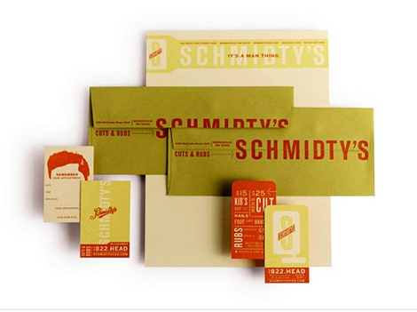 Schmidty's is a hip yet no-frills men's barber shop and as such they needed a manly identity.
 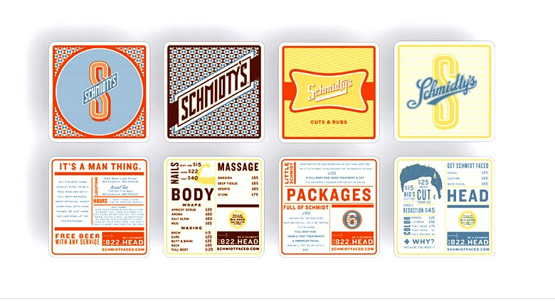 When it came to their menu of services Imagehaus developed a series of logos based on beer, sports and cigars and turned them into bar coasters. How much manlier can you get? 3. Heydays for ITI: Letterhead + Envelope + Business card + CD label + Folder + Pen + Packaging
 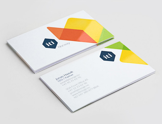 The core of the identity system is a folding/unfolding abstract box shape to show how ITI's automation technologies are versatile for many different applications. There's an animation of their magic box here.
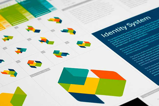
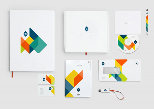 After that it was a matter of applying the right shape to the right piece of collateral to frame the logo and information bits in a pleasing way. 4. Marque for Nemaworkshop: Business card + Mailing labels + Note pads + Blank cards
 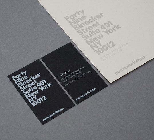 Nemaworkshop is a collection of architects, designers and thinkers creating innovative spaces. They wanted a bold, young look that highlighted their Lower East Side location.
 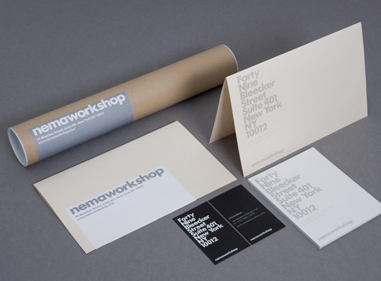 As a company that plays in several fields, including architecture the need to ship plans and large documents in tubes meant creating a shipping label for that purpose. 5. The Official Manufacturing Company for Frances May: Business card + Hang tags + Gift cards + Postcards + Stickers + etc.
 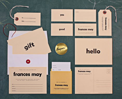 This project was a rebrand of a fashion boutique in Portland. The visual idea came from the store's namesake — the great-grandmother of one of the principals who used to be a school teacher, hence the nostalgic classroom feel.
 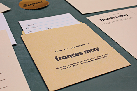 Naturally a boutique would need hang tags for the clothing and gift cards.
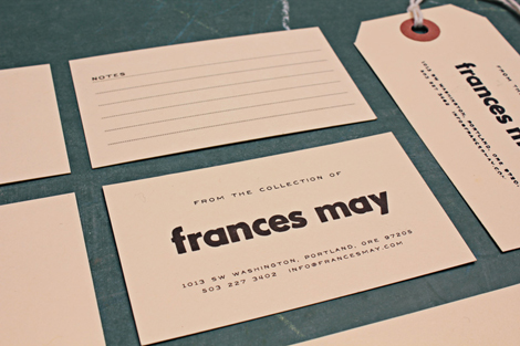
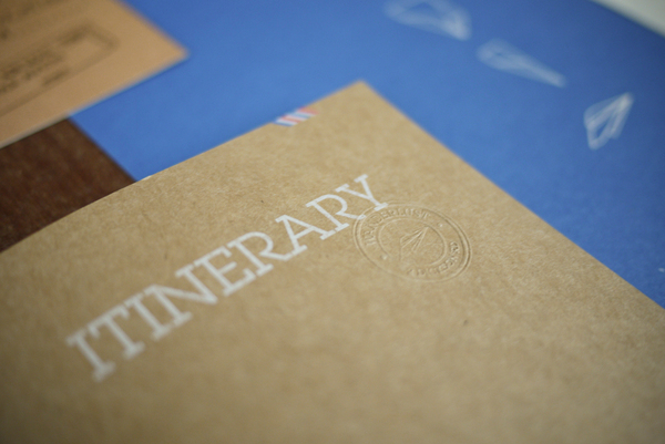
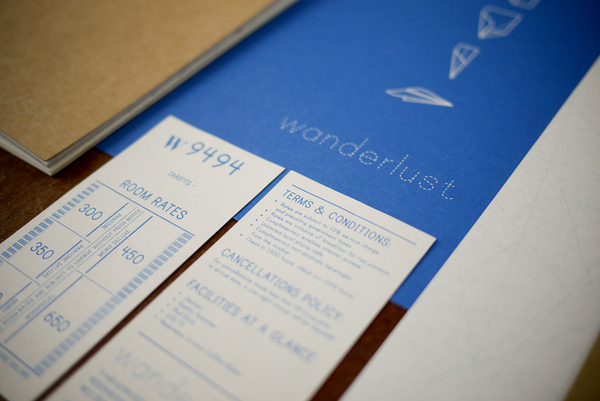
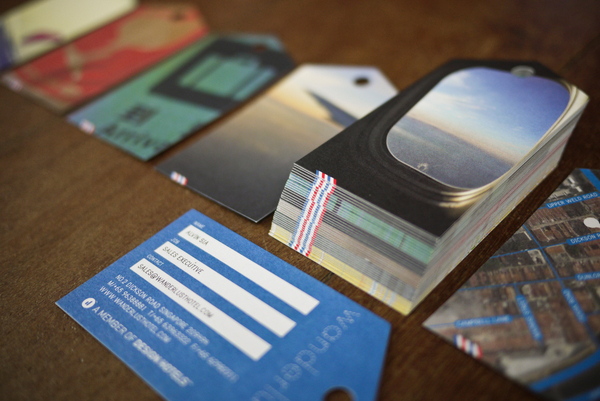
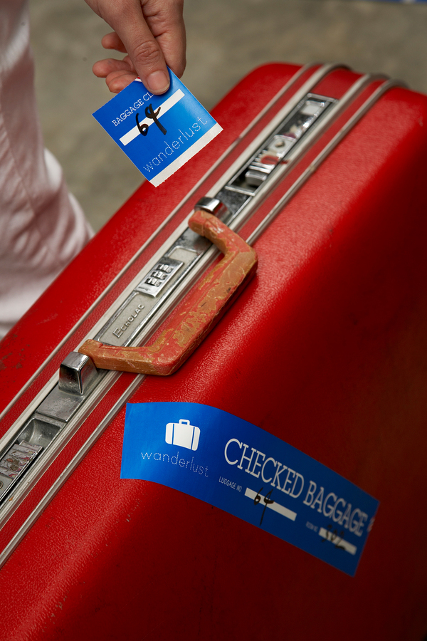
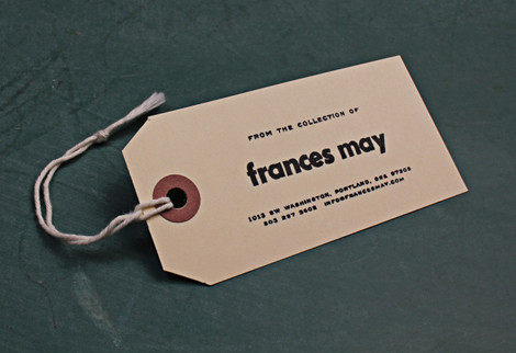 A closer look at the hang tag. 6. Foreign Policy for Wanderlust Hotel: Letterhead + Envelope + Business card + Postcard + Luggage tags + Luggage stickers + Itinerary notebook + Room rates and policies card
 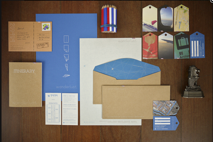 This is a spectacularly multi-layered identity system for a hotel encompassing all aspects of printed material that the guest will touch. The pieces were each designed to evoke other travel ephemera: bus tickets, airline boarding passes, passports and air mail envelopes.
 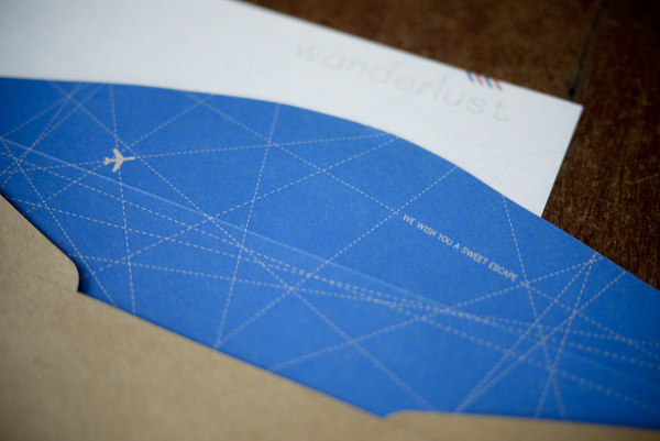 Every piece has a personal quality to it with messages like this one above tucked into unexpected places.
 Your business may not be one that needs to convey this many kinds of information, but it's great inspiration to think about your projects on a grander scale. What can you add to your identity system that will be useful and delightful at the same time?
Letterhead Possibilities: Completing the Set
June 13, 2011
Bookplate design: 3 tips for graphic designers Print marketing: 7 benefits to leverage in your business




No comments yet.