Last time we talked about type on business cards in Part 1, the ideas were pretty basic. Choose a distinctive font; use the different type styles from one big-family font; and use type at smaller than usual sizes. Of course, there’s so much more to designing a business card than that. So now that you've picked your font and started playing with type styles and sizes lets try out some more ideas. Some things may seem contradictory but it’s really a matter of what approach speaks to you and what you’re trying to convey. 1. Don’t be afraid to think big I know I said to think small last time, but usually you will want something on your card to be a focal point. This can be the logo, your name (especially if it’s a card just for you individually instead of an office full of people), the website, anything really. As long as you’re only trying to emphasize one or two things you should be able to keep the messaging pretty clear. When I say big, I mean that you can take something and make it so big that it runs off the sides of the cards. The trick is that great variations in scale (big to small, thick to thin, etc.) always look more interesting. What this means for your design is that it’s great to take one element and make it big, so long as everything else is kept nice and small to create contrast and tension. Any time the sizes of two things are different than each other, but not by much, there’s an ambiguity about where the eye should go first. So a difference between 12-point type and 14-point type looks more like an accident than a conscious choice to emphasize one thing over another. So if you’re going to go big, go really, really big. 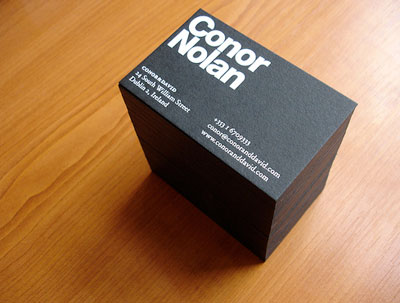 Here there’s no question where your eye is supposed to go first. Conor Nolan definitely wants you to remember his name. Also notice that not only is his name much bigger than the contact info, it’s also a heavy sans-serif as opposed to the book weight serif he used for the small type.
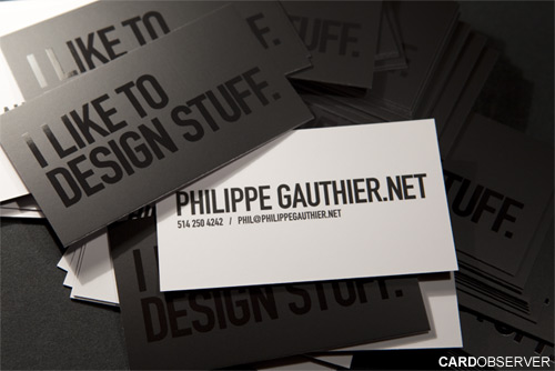
Here Philippe Gauthier wanted to highlight his portfolio site that, conveniently, contains his name. Even more than that, he made an explicit statement about himself that conveys his passion in life.
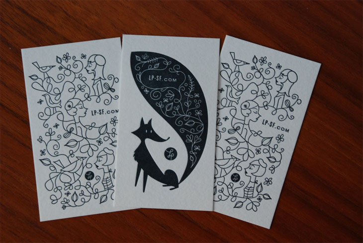
Oddly enough, on this card, the largest thing on each card is an intricate illustration. The only other information is a URL for Lab Partners — though even that isn’t spelled out on the card. What this does is set up the expectation that what you will find at this site is something as creative and whimsical as what’s on the card and that everything else you might need can be found there. The site itself is tiny but by making it the only piece of information it’s as important as if it was the largest. 2. Uniform doesn’t have to be boring Now just to be contradictory I’m going to do an about-face. You don’t have to emphasize one thing on your card at all. You can have everything be a uniform size without it being boring. Confused? Understandable. The funny thing about design is that once you know the rules, if you have the skill to do it, you can break them. And an artfully broken rule is a high-difficulty move that can get you high marks from the judges.
Uniform can mean all small. Here the name, title and contact info are all on one line, and all the same tiny size. 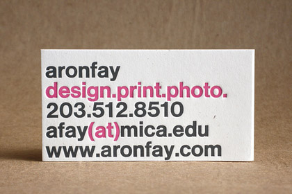 Uniform can mean all large.
 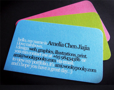 Uniform can mean treating all the information on the card like it’s a paragraph of text.
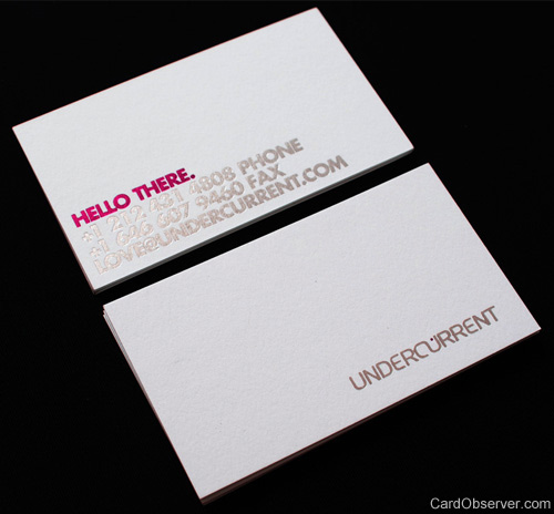
Uniform for Pablo Alfieri meant magenta and silver foil stamping acting as the only differentiators. 3. Use your words Content is king (or queen). Even if your card is simple and doesn’t have any sexy spot varnish or die cuts you can still be memorable, even funny. It’s easy to think of business cards as being dry and straightforward. It’s not only about what you’re saying but how you say it. And with such a small landscape every word counts. If this is a personal card you have all the freedom in the world to decide what you want to say about yourself and what you do. You can turn pieces of information on your card (job title, email, site name) into hidden messages about who you are. Never underestimate the influence of delight or a smart joke. If someone reads your business card and has that moment of connection with it, you will be cemented into their minds forever.
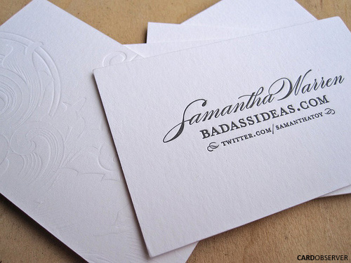
The fonts and embossing are very graceful and fluid but the site name says it all. Bad ass ideas are what Samantha Warren believes she does best. That’s confidence.
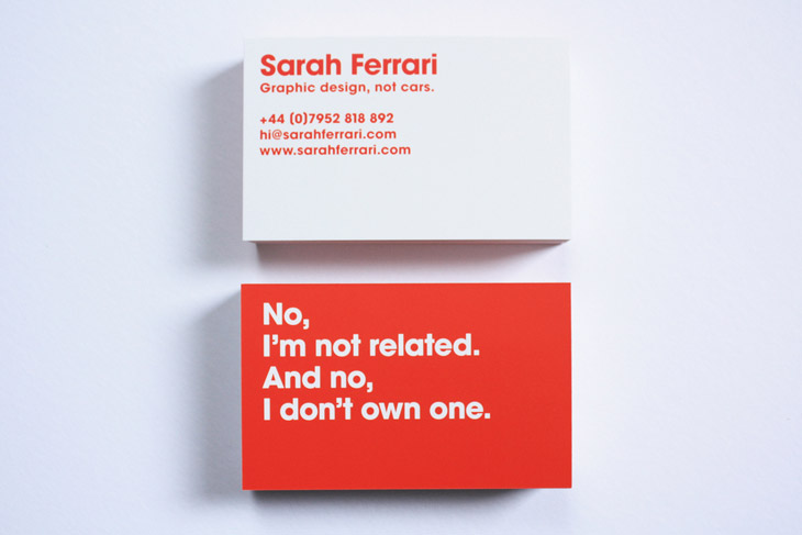
Thinking two steps ahead of her audience is what sets Sarah Ferrari’s card apart. After seeing this you will never think to yourself, “Sarah who?”
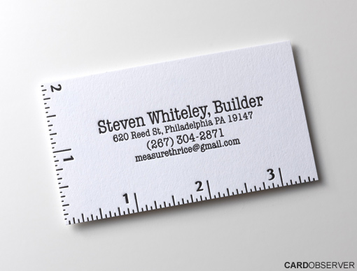
Designers are expected to have a cleverly designed card — it’s nearly a tiny résumé. But a carpenter or builder can benefit from a smart design, too; maybe more so. Besides the convenience of turning his card into a wallet-sized measuring tool, his email is a clever carpentry joke. It takes the old adage “Measure twice. Cut once” and does it one better. His email reads “measure thrice @ gmail.com.” Anyone who gets the joke will understand that he’s going the extra mile to get the job done right the first time.





No comments yet.