In my previous post, "Great Font Combinations for Your Wedding Invitations", I broke up the typographic styles into classic, modern and quirky. I'd like to delve a little further into each style. Today I'm going to focus on the classic wedding invite.
This invite by Bella Figura is a perfect classic archetype. It's a centered copperplate and script combo on thick paper with no other ornamentation.
Classically good looking Classic means an invitation that looks like it was created by expensive/antique methods that only aristocrats and royalty could afford in a bygone era. Copperplate fonts and bank-note style fonts emulate engraving that leaves a super-finely detailed raised impression of the lettering and, which, even now, can be a prohibitively costly method that requires the making of custom metal plates for printing. Likewise, script fonts emulate hand calligraphy, which is obviously a painstaking one-by-one process using a dip pen and ink. Since the classic invite tends to avoid ornamentation the quality of the fonts is what sets the tone.
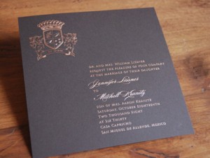
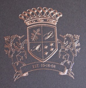
You can see the play of light on the raised, engraved lettering on this beautiful custom invitation by Sarah Drake Design
It's even easier to see in the closeup of the crest. Good fonts are hard to find and, if you're doing it all yourself (and on a budget), you probably don't want to pay a lot to license a font you're only going to use for this one occasion. On the other hand, you don't want your wedding invitation design to look like a work memo because it's designed with default PC fonts. Luckily, there are some good resources for free and low-cost fonts that won't ruin the luxurious effect of a typography-centric classic invite.
Free font options
1. The League of Movable Type is a foundry of open-source fonts. There isn't a whopping selection but the ones that are there are of high quality. It's mostly nice serif fonts with one delicately casual script font. 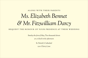
This invitation uses Sorts-Mill-Goudy in regular all-caps and italic from League of Moveable Type.
2. Exljbris Font Foundry has some free serif fonts to combine with script faces. Tallys is probably the most classical.
3. Da Font has the spottiest quality but also a really large selection. Make of that what you will. Some winners:
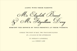
This invite uses a combination of Champignon and Ecuyer Dax from Dafont.com and Tallys from Exljbris.
4. My Fonts ends up bridging both categories since it's a paid site that has a few fonts that are downloadable for free. The free fonts are often the wackiest but there are a few gems in there. 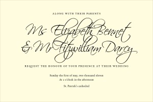
This invite uses Scriptina and Espinosa Nova from MyFonts.com. I created these examples to show that it's possible to use free fonts without sacrificing the look of a classic wedding invitation. You have to do some digging, be selective about your fonts, and combine them at the right sizes, but it can be done.
Low price font options
1. Veer has a plethora of attractive script fonts at very low prices.
2. You Work for Them not only has fonts of various kinds it also carries collections of silhouettes and decorative elements that can be used for borders or as a background image.
3. Canada Type is a clearinghouse for various individual type designers to sell their fonts. There's a lot of great talent out there
4. Font Bros. is similar to Canada Type and carries a handful of free fonts though they aren't the best options the site has to offer.





[...] don’t want to repeat the lush, romantic wedding they had the first time around. So maybe the classic wedding invitation isn’t for them (or for you). The natural evolution is to move towards something sophisticated [...]
[...] BBQ. That’s where quirky wedding invites come in. Unlike our previous posts on classic and modern wedding fonts there are few guidelines with quirky fonts. There are a few common [...]
[...] I’ve told you about these guys for patterns and fonts too. They aren’t free, but you shouldn’t pass them up, because they have some really great packages for less than $40 that will save you time and look amazing. [...]