On your next project try this experiment. Try limiting yourself to only type. Yes, type for your headline and body copy, of course, but also for your image.
Sometimes I find that the more limited I am in scope, the more creative I become. I remember when I was first starting out as a designer. Sometimes I was so overwhelmed by the possibilities that it was hard for me to narrow down the elements that I wanted to use, and it took me longer to find a solution. Graphic designers work with type day in and day out. Sometimes I think we stop seeing the beauty in its forms. Type carries with it style and personality. Not only do I want you to explore a type-only solution with type as a headline solution, I want you to actually create an image out of the letters in the type as well. Here are a few great examples of this kind of solution: 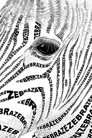
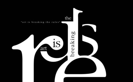
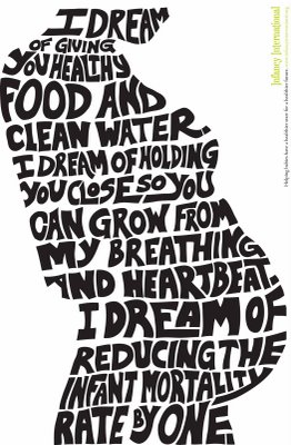
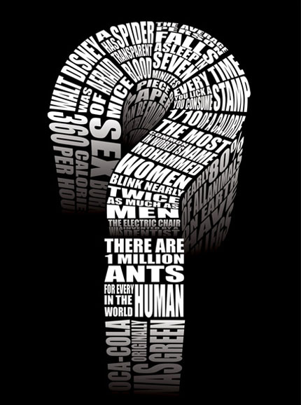 So now it’s time for you to step out of your type box and get creative with type as image.




No comments yet.