I've never lived by the old maxim of "Don't judge a book by its cover." I am a huge reader, and I still judge the cover designs - it's usually what draws me in to the store shelf, unless I know I am looking for a particular author or title. In the age of e-books, if you are going to take the trouble of carrying around a physical copy of something, you want it to look good and advertise your good taste to the eyes of the world. I'd even argue that the days of trade paperbacks are gone and that printed books are starting to become fetishized, luxury objects. While visiting galleries and museums, I've also noticed the book has become a frequent medium for sculpture, painting and collage. That's where I am headed in this post; the book as art. From new award winners, to young adult fiction, science fiction and re-designed old classics, book design seems to be getting better and better! Check out these 10 amazing book cover designs:
"Linger" and "Shiver," both by Maggie Stiefvater, have lovely cover designs. I really dig the all lowercase typography, silhouetted illustrations and the catchy red dot over the "i" in each title. Check out this blog post about the cover designs. 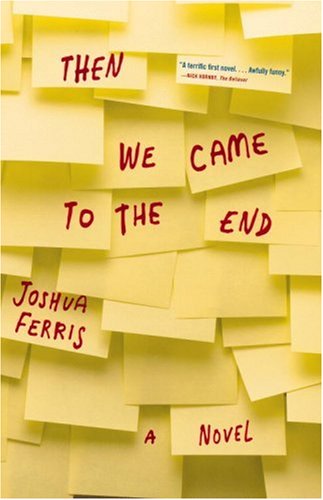 "Then We Came to the End," by Joshua Ferris employs some inventive design. I've actually read this one. The reason I picked it up in the first place? Why all of those Post-it notes of course! I mean, have you ever seen a book like this before?
  I love it when a designer takes a book that's been on every syllabus of every college literature class and re-invents it with a smashing design. This black and white sun burst on the cover of "The Stranger," by Albert Camus, is sparse and elegant. Would you have used two different fonts to separate the title and the author? I am not sure if this design would work in only one font.

 I enjoy the simple lines of these covers for "Alias Grace," and "The Blind Assassin," both by Margaret Atwood. The combination of illustration and collage and the interesting color choices make these plain-Jane covers work. Little Brown Book Group, a subsidiary of Hachette UK, redesigned Atwood's ourvre. Here's a link to the entire backlist.
A friend of mine was reading "Stiff: The Curious Lives of Human Cadavers," by Mary Roach. I saw the book on her coffee table and even without reading the subhead on the front cover, I immediately knew what it was about. This is an example of great design work because it's interesting and draws people in, but it also does a great job of communicating the message. For more book cover designs that use human body parts, check out this post on Flavorwire.com.
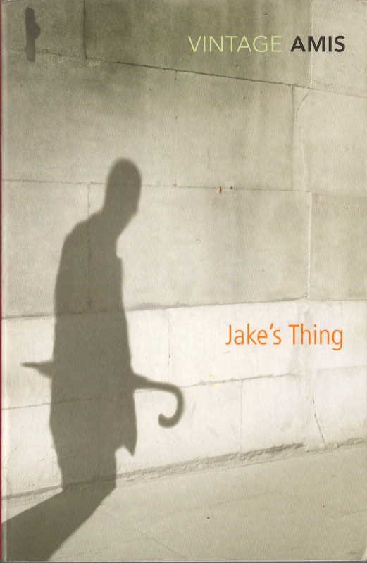 These vintage editions of Kingsley Amis novels, "The Old Devils," and "Jake's Thing," artfully use photography to communicate with readers. I also enjoy the simple lettering set in earth tones, which really goes well with the sepia-tone of the photos. Check out this post about these and other cover designs on NotVoodoo.blogspot.com.
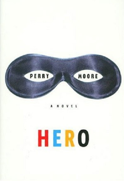 My favorite book covers are the ones that look "new," and unlike any of the other books on the shelf. I also like a little bit of playfulness and mystery. The cover for "Hero," by Perry Moore, does just that. The author's name is inside a whimsical mask and the title flashes across the bottom in block type and primary colors.
What are your favorite book cover designs? Add links to any images in the comments please.








I agree that books ( as in the real books) can be judged by its cover. In marketing your book, like all other products being sell in the market the first thing that people look at or consider is the book cover. Book covers give the readers a hint of its content.