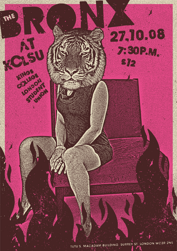
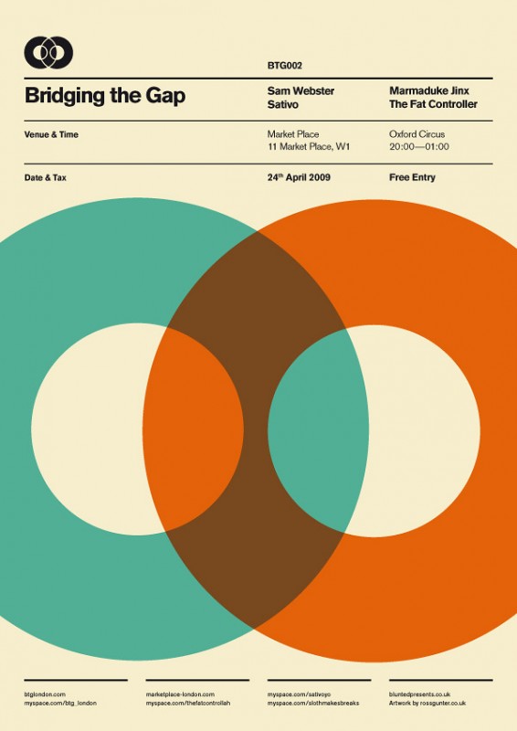
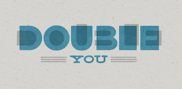
The key to faking screen printing is to be imperfect. As you can tell from the above poster (which was created digitally) someone went to a lot of trouble to make everything a little off-kilter. The type is placed at cockeyed faux pasted-on angles, and there are holes in the "ink coverage" of the solid areas. This poster is actually part of a great little tutorial and if you look at the number of steps involved and the repeated tweaking of elements you'll see that it was actually a lot of effort to make this poster look spontaneously thrown together. You should check it out here. There are a few small ways that you can give the impression that you spent many sweaty hours bent over a screen with a gloppy squeegee clutched in your hands. Overlapping color When printing multiple colors, often one color will be less opaque than another and there will be show-through from the color underneath where they overlap. This is perhaps one the easiest effects to fake with the opacity and multiply functions in InDesign and Photoshop.
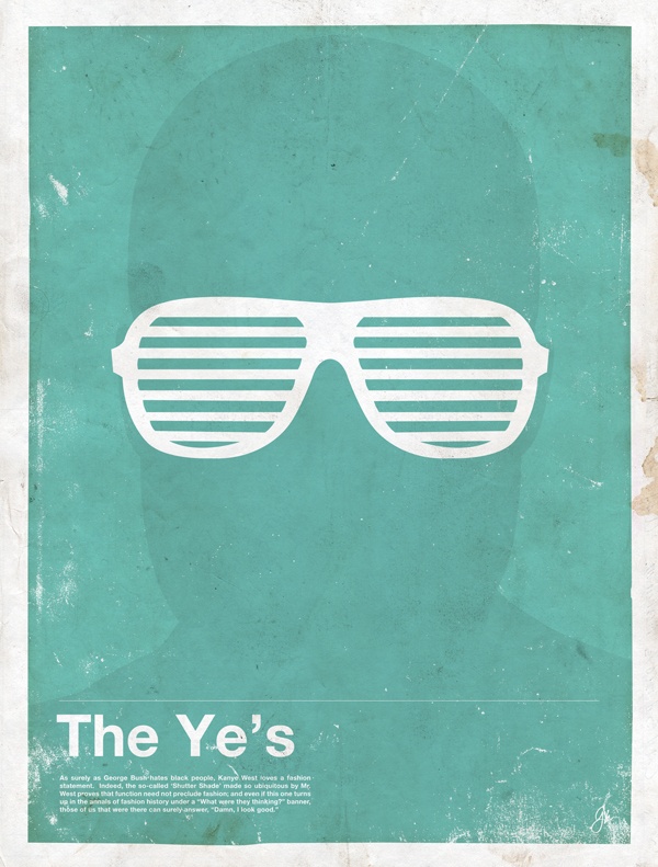
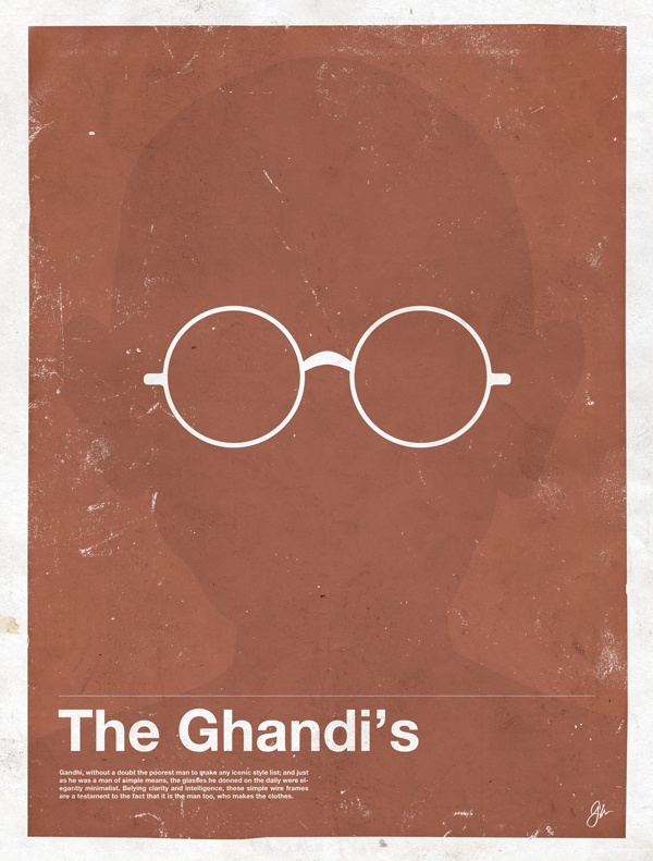
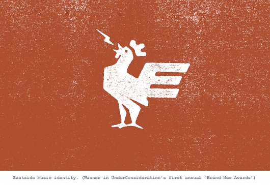
Various logos and icons by Ed Nacional Flat, bold graphics Since the screen printing process uses a lot of ink there's a danger that fine line details might lose integrity if too much ink is pressed through the screen. So it's more agreeable to the process if the images used are bold, have large areas of flat color and no fine details. Famous Frames posters by Moxy Creative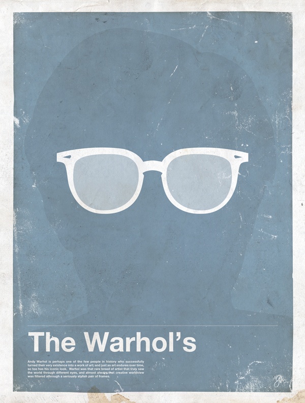
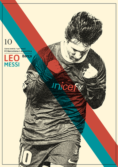
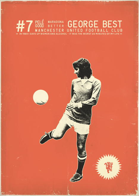
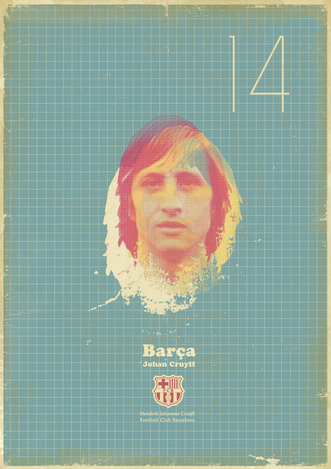
 Posterized Images For photographic imagery the same hold true: Fine details are problematic so the photography must go through a process that coarsens its details. The end result is that highlights are blown out and shadow areas plug up leaving and image that's high-contrast and coarsely textured. Zoran Lucic's Sucker for Soccer posters are a great example of using the screen-print look to evoke a retro feel. He has a ton more from this series in his behance portfolio here.






No comments yet.