Time for another eye-catching sticker post! This one takes on a bit more of a serious and modern theme than my prior posts about using critters or adventurous typography to create an attractive sticker. I wanted to do a showcase of minimal bold stickers using strong typeface and simple color schemes. I really appreciate these designs for being straightforward yet artistic at the same time. It goes to show that sometimes less is more, and leaving clutter out of sticker design can be a great technique for presenting a modern and professional brand. Major props to the creators of the following sticker designs – you hit it right on the head! Drum roll …  Awesome name for a website, and I love the type style for the web address. The use of the bold extended “V” for the logo is perfect! It looks like Vibe to This is a pretty awesome music blog as well. Check it out if you’re into futuristic underground hip-hop, electronic or bass music sounds. Thanks Patrick for letting us feature this!
  I have a lot of respect for the aesthetic approach of many skateboard artists, such as Brian from Earth Wing Skateboards. This design may not be quite as complex as Earth Wing’s skateboards – which are awesome - but it suits this sticker perfectly! I love the way the “E” and “W” mirror each other and the chunky type makes the “W” look like an “E” that fell over backwards – nice! The simple two-color approach is perfect and tilted stars are always cool.
  This one is right on the money! Kudos to the Mesa Crew for putting this custom typeface together. If it’s not custom - still kudos to the Mesa Crew for using such an awesome typeface! It makes me think of a crew of star ship pilots or something – or just a bunch of futuristic designers. The “E” and “A” are especially cool, and the dot at the bottom left corner with the graffiti style tag inside it is the perfect accent to the overall design. Keep up the great work Kiefer and the entire Mesa Crew!
  I love the angled 3-D effect here and how it makes it look like the logo just arrived from a warp speed journey. Sorry, nerdy reference there. Solid, bold and all caps typeface make the company name stand out below the logo. Also, the SOLOSHOT technology itself actually looks pretty amazing, giving you ability to film or photograph yourself while in action. For example, if you were surfing the Solo Shot could be attached to your camera set up on the beach where it would use tracking technology to film you. The future is now!
 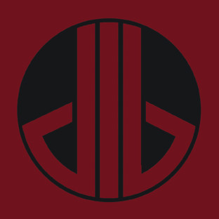 Perfect logo design from illustrator and 3-D modeler Deacon Bishop; awesome custom bold type making a solid logo for a sticker! I love the creative presentation of the “d” and “b”. The logo overall is super futuristic and reminds me of something out of “Star Wars.” I could totally see this on the side of Boba Fett or an X-Wing fighter pilot’s helmet. Deacon Bishop is a pretty awesome name for a designer, too – somehow the double religious reference works perfect. Great minimal eye-catching approach here!
 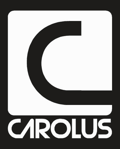 Great design here from Carolus, a surf apparel company from North Carolina. I think the modern and simple design suits the company well. The connected “C” and “A” adds a great flair to the overall typography. Strong chunky type with a two-color black and white approach give this sticker a bold look! The name Carolus is the Latin word for Charles, and also the derivative for Carolina – a colony named in honor of King Charles the first. I wonder what King Charles would have thought of surfing? About the Author:
 | Paul Smith is the newest addition to PsPrint’s blogging team, filling a new role as content writer after establishing his roots with PsPrint’s Customer Service department. Although new to blogging, Paul is no stranger to writing, having had a crush on words and books for as long as he can remember. With a love for the environment, food and music, Paul can be found after work cooking up a storm of healthy mouth-watering vegan food (yes, it’s possible!), reading an epic sci-fi novel or expanding his quirky eclectic music collection whilst watching a nature documentary! Email him today at paul@psprint.com. |




[...] that PsPrint has printed recently. For more design inspiration, check out our collection of minimalist stickers with bold typography and ones with more adventurous typography. Of course, if you’re not into stickers right now, you [...]