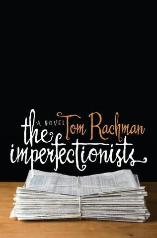
With the advent of the Kindle (and the Nook and the Kobo and the iPad, etc.) fewer and fewer people will be toting an armful of books on summer vacation. It already gives me a pang of sadness for the book cover. I've always loved books, and I've always judged a book by its cover. I've fallen in love with book covers I've never read and never intend to read. I think it's a thing of beauty to be able to condense down the essence of a 300-page story to a single 4-inch by 6-inch surface. It's like visual poetry. While we're in the high season for summer reading let's take a moment to appreciate the rare skill of book cover design that makes us pull this book, and not that book, off the shelf.
Some of my favorite series of books from recent years.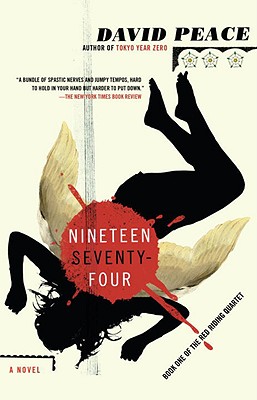
 Covers for the "Red Riding Murders" series designed by Gregg Kulick.

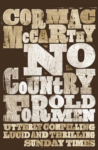
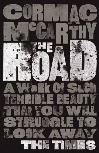 Some beautiful purely typographic covers from David Pearson for Cormac McCarthy's body of work.
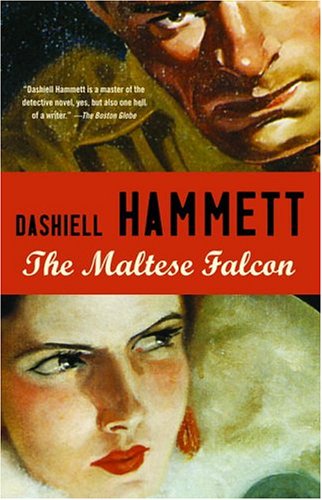
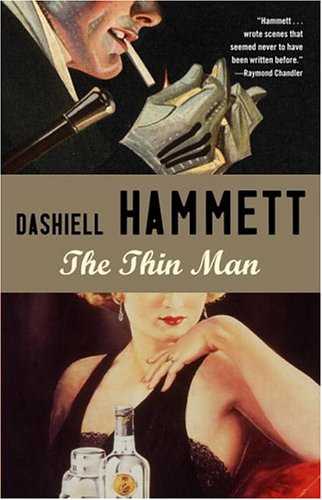 Great retro-flavored covers from Meagan Wilson for Dashiell Hammett's body of work.


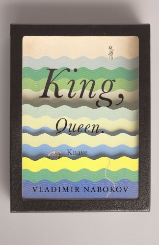
 Penguin put out a series called "Great Ideas" from some of the seminal thinkers in literature, politics and philosophy. These covers were done by a few different designers but they're held together by the very restrained color palette of black, white and purple. Another series of books covering Nabokov's oeuvre designer by a slew of great designers, held together thematically by the shadow box.
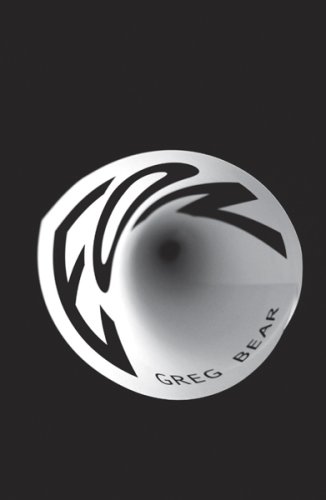

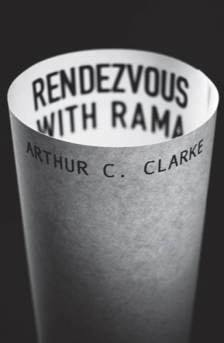
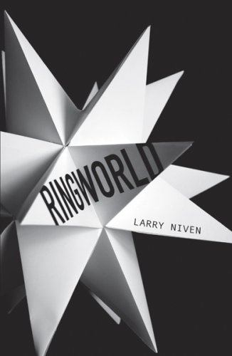
 Probably my favorite series of covers from recent years are these by Sandra Zahirovich, and there are a lot more than what I have here. The sheer ingenuity of manipulating paper in a different way each time is mind blowing. Book cover design = torture Book cover design is really a difficult thing to do. When Grace Bonney of Design*Sponge, her home decor and craft blog, put out a DIY home design book she had to go through the process of picking a cover. The good people of Also Design went through 30-plus iterations of the cover under eight completely different design concepts to land on the perfect cover. She dedicated a blog post to the process here. It's a fascinating look at the process and very much increased my appreciation for the mental gymnastics it takes to keep churning out creativity in order to craft the right solution. Here are some of the abandoned covers:
  Some great resources (that were a great help in assembling this post):







[...] pushes authors to pen an entire novel in 30 days), and even though we’re admonished to never judge a book by its cover, we all know novel cover design directly influences sales. Thus, I felt it would be fitting to [...]