
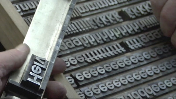
If you are a designer that lives and breaths type, then you shouldn’t miss the documentary “Helvetica.” I’m old enough that I can remember hand-rendering type and being down right anal about letter spacing — two things that have really lost their importance for some of today’s designers, who have known nothing but the computer as a design tool. I see it in my students. They seem to be unaware of the impact of well-spaced type. The movie starts by illustrating how prevalent the typeface Helvetica is in our surroundings. So much so, some argue that it has almost become generic. A brief history of how the font was created: In 1957, Max Miedinger and Eduard Hoffmann at the Swiss Haas foundry introduced Neue Haas Grotesk. In 1960, the typeface’s name was later changed to Helvetica. Helvetica has a large x-height, slightly condensed letters and clean design, which makes it a very readable typeface. It’s personality is perceived differently by everyone. The movie consists of interviews with type designers, graphic designers and other renowned people in the industry, including: Massimo Vignelli Wim Crouwel Matthew Carter Michael Bierut Jonathan Hoefler and Tobias Frere-Jones Erik Spiekermann Neville Brody Lars Müller Paula Scher Stefan Sagmeister David Carson Marieke Stolk Michael C. Place Manual Krebs & Dimitri Bruni These designers express their opinions, and they’re all over the map. From “Helvetica is the type of the establishment” to “Helvetica is the generic type of all mankind.” If you have any interest in type or are interested in any of these designers, then it’s worth a look. You get to see the studios and agencies of these designers as well as some of their work. The movie left me more aware of type in my everyday environment. For a few days after seeing the movie, I found myself looking more closely at signage and printed material. I downloaded the movie from iTunes. You can rent it for $2.99 or buy it for $9.99. Also, “Helvetica” has been on PBS recently. If you watch it, we want to hear what you think. What did you come away with? Did it change how you see type in your world? Let us know.

A glimpse of ‘Helvetica’
March 2, 2009

About Lennis
Leave a Reply
What is the PsPrint Blog??
The PsPrint Blog is a resource for graphic designers, freelancers, small business owners and fans of print marketing. You'll find helpful techniques on printing everything there is to print, including business cards, postcards, brochures, stickers, invitations, greeting cards, door hangers, magnets and more. The PsPrint Blog shares creative ways to improve your design and layout skills, and useful tips for marketing your business in any medium. We also like to have a little fun, sharing design inspiration and spotlighting some our favorite customers' printed pieces in our "Hot Off the Press" series.


I enjoyed this movie too. I can't believe there isn't more buzz about it. Thanks for talking about it.
[...] 50th birthday in 2007) as part of a larger conversation about the way type affects our lives.” There’s a psychology aspect, as Helvetica is the most popular font in the world and therefore the typeface we see more than any [...]
[...] is a simple kinetic typography clip that uses voice-overs from the design informational film “Helvetica.” There isn’t anything special here, but the basic concept is solid. They also use some [...]