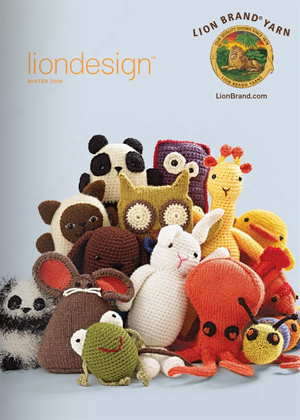
When I was a girl I loved getting things in the mail. I always wanted to subscribe to magazines and request catalogs so that something would show up in the mailbox with my name on it every day. Now it's the future, and most people looking for a specific retailer will either visit them in-store or find them online. The funny thing is I still find the catalog a supremely useful piece of intel in the modern age. Brick & mortar vs. web vs. print Stores are great for browsing but depending on the way the store is configured and how the shelves are stocked you could easily overlook the very item that would be most useful to you. And after hours of wandering around a mall maybe your concentration is waning and merchandise overload is fast approaching. The Internet, on the other hand, is great if you know what you're looking for. You can type "bedspread" into a search field and see every bedspread a retailer carries. Which is great, but if you want to do an "I'll know it when I see it" search for inspiration the Internet can be tedious. That's where catalogs step in. A catalog comes at the beginning of a new season of merchandise and gives you something imminently browse-able that doesn't require you to get off of your couch. Flipping through a catalog will often goad me into seeing the item in-person in a store and trying it on. I'll use the Internet later to see when it goes on sale but the original impetus to track down that perfect vacation blouse will be the catalog that gets dropped in the mail slot. I'm gonna share a few of my favorites. (I'm cheating here a little by showing you pages from the online versions of these catalogs) Lion Brand Yarns
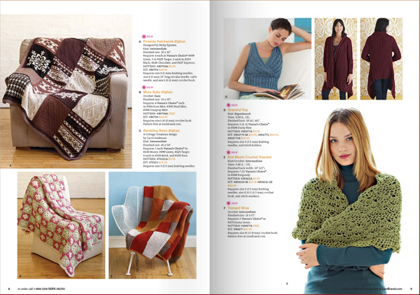
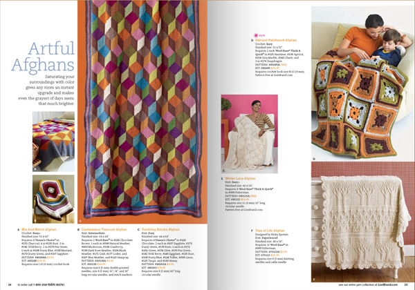
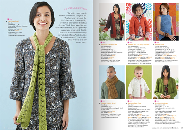
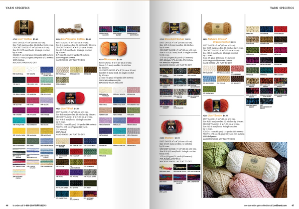
Though it's a really specific hobby catalog I think there's a nice layout at play that can be applied to many different uses.
The photography is colorful but very clear. There's good amount of white space, and a dominant image in every spread.
The visual rhythm gets broken up every so often with a full-bleed image on one side of the spread and the pages that have to do the heavy lifting, such as the product color and style listings, are still clear and visually interesting.
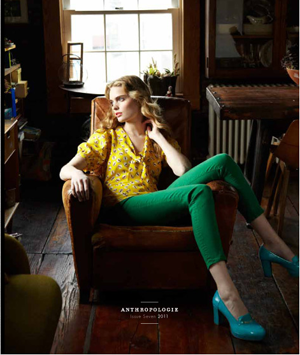
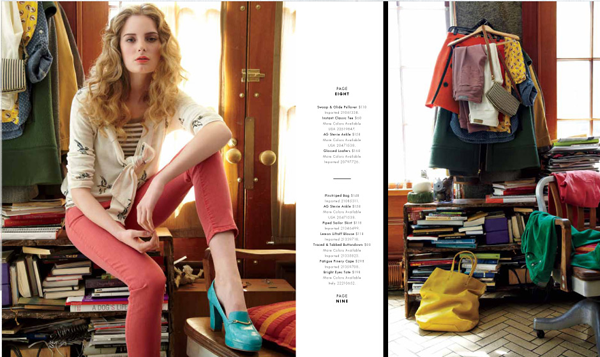
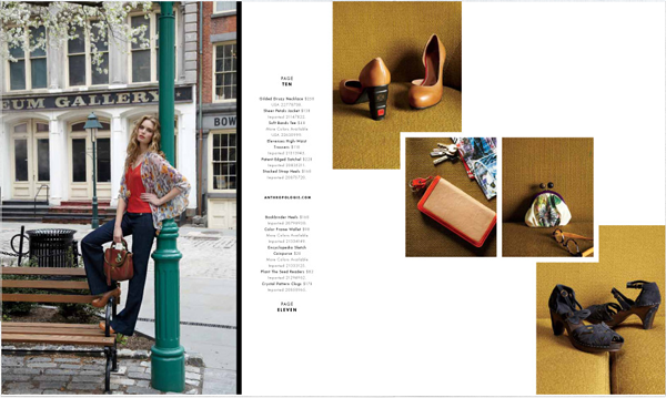
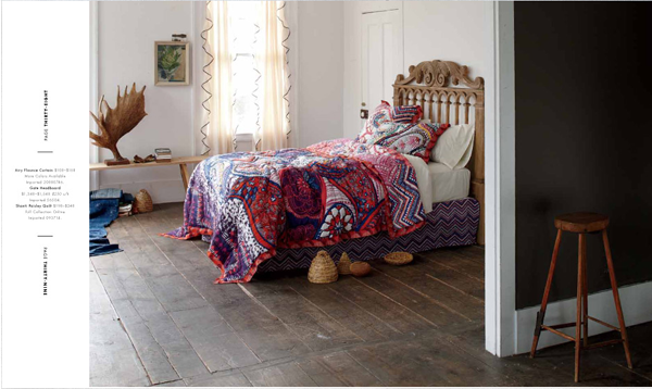
Anthropologie catalog A lot of similarly good things are happening in the Anthropologie catalog. The layouts are clean and clear, and gorgeous saturated photography doesn't hurt either.
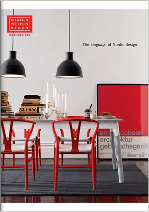
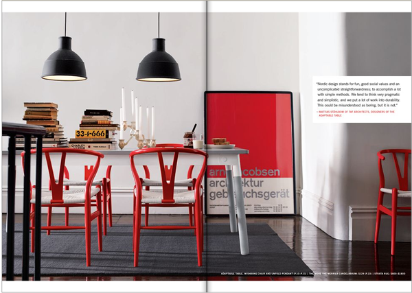
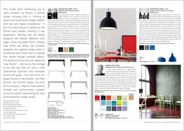
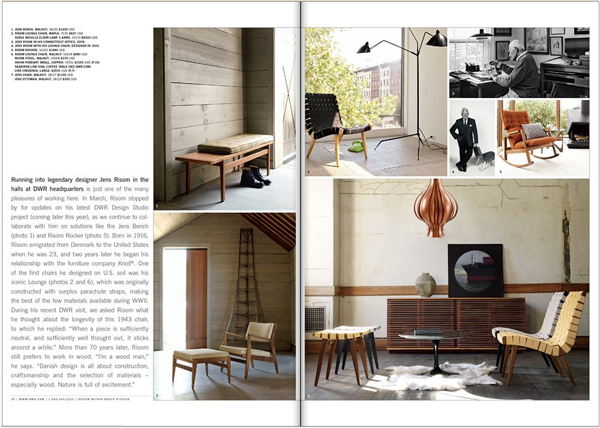
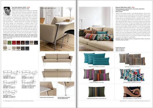
Design Within Reach catalog The spreads alternate between large images of beautifully appointed rooms and all the product information for all of the pieces contained in that room. Some spreads highlight a specific furniture designer, and others just elegantly lay out the details of one couch and all of its cushions.




[...] of just being a basic container for any book, it comes completely custom made to fit the books and catalogs it [...]
[...] of the best strategies for designing a great catalog feature page is to show the products in use. This company sells products that are both functional [...]