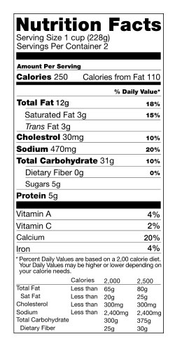
Sometimes we, as graphic designers, forget the ascents of our role. We get caught up on the trends and the techniques. Trying to produce cutting-edge work or award-winning work is fine, but when it comes right down to it, what is it we are supposed to be doing? Plainly put, we organize information so it’s easy to take in and be quickly absorbed. Honestly most of our projects aren’t glamorous and are more about squeezing as much information into an area as possible and still making it digestible. Anyone who has ever had health or weight concerns is probably well acquainted with the Nutrition Facts on packaged foods. Most people probably never give it a second through, but I’m here to salute it. When you stop and consider that there are 30 pieces of information in a legible, easy-to-understand manner in a space that is sometimes less then 2 inches high, I think you would agree that there is something going on here. The information is set in Helvetica with thin and thick rules. The information is simplified and given a hierarchy of importance. You find pertinent details such as serving size without having to search around.  In 1924, the Federal Food and Drug Act gave the FDA ability to police misleading labels and force manufacturers to list their names and addresses on packaging. In 1973, they were required to list the amount of vitamins and minerals inside the package; however, there were no clear guidelines as to how the information was to be presented so it was often inconsistent. It wasn’t until 1990 that uniform guidelines were set out. Finally in 1994, the current-day Nutrition Fact labels were launched. And yes, it was an un-named graphic designer that came up with the graphic layout of these facts that touch our lives everyday. Un-named graphic artist, I salute you. I bow down to your powers of informational organization.
Easy consumption design and nutrition facts
March 12, 2009


No comments yet.