Our PsPrint bloggers are a talented bunch. Check out their guest appearances on other graphic design and marketing blogs around the World Wide Web.  10 Reasons Your Business Card Sucks Speckyboy By Brian Morris August 5, 2012 Do you view your business card as a simple formality, or a powerful sales, networking, and marketing tool that can embed your person and brand in customers’ minds, motivate callbacks and generate sales? Unfortunately, most professionals are in the former group. They print business cards that are less inspiring than tiring. And chances are you’re in this group. Thus, I present 10 reasons why your business card sucks and what you can do about it.
  15 Fantastic Fantasy Movie Fan Artworks Inspiredology By Brian Morris July 30, 2012 No other genre seems to inspire so much fan art as fantasy, as evidenced by following designs culled from the web. Be inspired to design your own fantasy movie fan art and print your own posters!
  10 Incredible Rat Pack Album & Poster Designs Inspiredology By Brian Morris July 9, 2012 Nostalgia, intrigue, mystery and hundreds of delicious tales, some told and others not, surround the mid-20th century performers known as the Rat Pack. Their classy playboy attitudes, incredibly groovy beats, made their lives the stuff of legends; at some point, every man fantasizes about having such power, influence, money, fame and all the women. These guys were cool cats, for sure, and here are 10 incredible designs that commemorate the Rat Pack, which you can use as inspiration for your own prints and posters.
  10 Dazzling Designs Featuring Dead Musicians Inspiredology By Brian Morris June 20, 2012 Despite the successes of so many talented artists, the world of popular music is rife with tragic tales: here’s a look at great designs of some of our favorite musicians past. Those musicians who died far too young, leaving a legacy of great music and unfulfilled wonder at what works were left undone. Such celebrity personalities, their music, and the stories behind their music, have inspired countless artists to commemorate dead musicians with their own stunning creations. The following 10 dazzling designs featuring musicians past will make perfect posters for your own commemorative collection.
 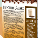 How to Design Your Own Sales Data Sheet Squidoo June 6, 2012 By Brian Morris Sales data sheets are versatile marketing tools you can use to illuminate key benefits face-to-face, send via direct mail to motivate direct purchases, and place inside press kits to earn media coverage for your company, products and services. The following details how you can design and print your own sales data sheets without any design knowledge or software training, thus maximizing your return on investment.
  How to Design Your Own Invitation Cards Squidoo June 6, 2012 By Brian Morris Designing your own invitation cards for holidays, birthdays, anniversaries, graduations, fundraisers, and business events can be a ton of fun and save you a ton of money. The following details what you need to know to design and print your own invitation cards, and presents free resources you can take advantage to make your own invitation cards in as little as 15 minutes.
  10 Sizzlin' Sexy Summer Designs Inspiredology May 30, 2012 By Brian Morris Sex sells is the cliché, but it would be more appropriate to say the suggestion of sex sells. So we think our suggestion to see these Sizzlin’ Designs is a must. Some of the world’s best-recognized brands employ that suggestion from online and television ads to billboard marketing and poster printing – whether or not the product or service is even sexy.
 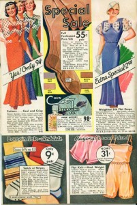 Old Catalogs Mark Evolution of Graphic Design Feedgrids January 22, 2012 By Jennifer Moline I love vintage – clothing, movies, music and, yes, design. I’m the person at the history museum who takes joy in observing the changing typography of old-timey signage. So you can imagine my joy when I came across these images taken from the 1934 Montgomery Ward "Wish Book." Along with Best, Ward’s catalog, which debuted in 1872, was the book from which many of my childhood Christmas lists were culled. Judging by these ads from almost 80 years ago, a lot of women were also poring over the pages – so many shoes! From a designer’s perspective, I notice a lot of script fonts and serif fonts. I also wonder: Who did all the illustration? How much time must it have taken to reproduce all these products? Also, the item descriptions are so wordy – it makes for cumbersome reading. At least the prices stand out.
  5 Reasons To Take a Risk and Start Your Own Business Fuel Your Creativity November 13, 2011 By Jennifer Moline Owning one’s own business has often been associated with the American Dream. Along with owning one’s own home, the Dream is to prosper while not being under anyone else’s rule. But while so many of our ancestors immigrated to the United States and started from scratch by building a business, more recent generations tend to take the “safe” route and work for someone else. However, since our country has entered into economic turmoil, it’s not necessarily the more risky route to start up a company.
 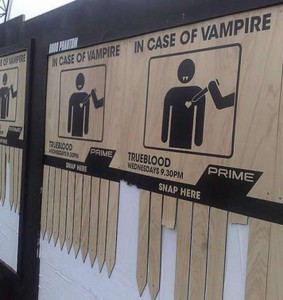 10 Vampire Ads That Don't Suck Inspiredology October 26, 2011 By Jennifer Moline Halloween is a frighteningly wonderful time of year for graphic artists, because they can get away with so much more than usual in their designs. While normally an electrical socket doesn’t provide much opportunity for a creative edge, October means you can add some dripping blood, and that’s not only OK but makes energy ads striking! Even with zombies creeping up in popularity, vampires are still sexy, scary and sometimes funny – all aspects that can make up an exciting marketing campaign. The following are just 10 examples of vampires in promotions – sink your teeth into the variety and draw some inspiration for your own design jobs!
  Sink Your Teeth Into 13 Vampire Designs Feedgrids October 23, 2011 By Jennifer Moline Never has it been hotter to be a vampire than now – between the second-to-last “Twilight” movie coming out next month and Halloween just days away, the undead are everywhere. That’s why graphic artists would be wise to look to vampires to incorporate into their design jobs, whether they’re for websites, invitations, greeting cards or newsletters. The following is just a smattering of the different types of vampire design I’ve seen, including gothy, sexy, traditional and humorous.
  10 Bookmark Designs for Inspiration Feedgrids October 5, 2011 By Jennifer Moline Bookmarks are often overlooked as marketing tools. Sure, they may not get the same number of eyes a billboard, flyer or bumper sticker can attract, but bookmarks pull off a different feat: They are seen by a more select audience. Bookmarks are picked up and used by readers, and those readers will see your promotion each and every time they pick up a page-turning book.
  Why I Left The Design World Fuel Your Creativity September 14, 2011 By Jennifer Moline I haven’t always just written about design. No, back in the day, I designed for magazines and newspapers. The following is my story of why I left the graphic design world. I also chatted with other former designers about their varied reasons, ranging from disinterest in the business side to physical ailments.
 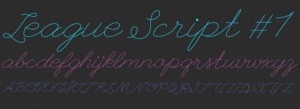 44 Websites to Find Free Fonts Fuel Your Creativity August 14, 2011 By Jennifer Moline If you’re a graphic designer who can’t bear to see Helvetica used for one more postcard or Times New Roman on another newsletter, then it’s time to expand your font library. But what to do when you’re a freelancer on a budget? Find free fonts!
 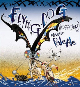 Crowdsourcing the Best Beer Label Designs Feedgrids.com September 1, 2011 By Jennifer Moline I love package design, and I love beer, and when I went away to college at Humboldt State University, my introduction to good beer was through Lost Coast Brewery, whose labels have long been designed by artist Duane Flatmo. It’s no wonder, then, that when I asked followers on Twitter and Facebook for their favorite beer labels and packaging, I received a lot of shout-outs for Lost Coast and other Northern California breweries. That being said, I received responses for different states and even faraway countries. Labels in this collection include gothic imagery, blocky typography as well as artwork worthy of hanging on a wall.
 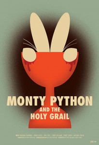 21 Reimagined Cult Movie Posters Speckboy August 4, 2011 By Jennifer Moline There’s something about cult films that begs for interpretation. Whether it’s their odd themes or quirky actors, cult movies are great fodder for artists’ imaginations. I think it’s because B movies, horror slapsticks and fantastical tales just get better over time – as we watch these films over and over, we pick up more imagery as we memorize the dialogue. A seemingly unimportant scene all of a sudden stands out on the 11th viewing.
 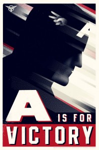 17 Captain America Designs Inspiredology July 20, 2011 By Jennifer Moline With a name like Captain America, naturally, the hero is symbolic with U.S. patriotism. His uniform is red, white and blue, and his consistent main weapon is a shield. Take a look at the following works by a variety of artists – some well known in the variant movie poster industry and some who create for themselves. While their styles vary, the color scheme mostly stays the same – no matter how many liberties are taken in Captain America redesigns, the patriotic theme remains.
 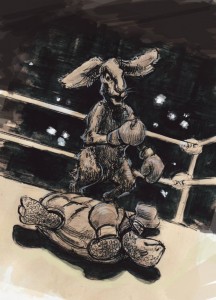 14 Twisted Children's Tale Designs Feedgrids.com July 18, 2011 By Jennifer Moline Most of us grew up on fairy tales and nursery rhymes – stories of princesses and pots of gold and happily ever after. But many of those stories have a dark side; they were often meant to teach a lesson or a piece of history. The early versions of Little Red Riding Hood were thought to warn women of the advances of men, while Humpty Dumpty has been tied to various battles throughout history. It makes sense, then, that graphic artists have reinterpreted many of these classic tales as dark, twisted or scary.
  The Secrets Behind Successful Design Podcasts Fuel Your Creativity July 15, 2011 By Jennifer Moline In a time when designers are often too busy to network and seek further education, podcasts have become available to teach so we can learn while we go about our business. I recently “met” Kitty Florido on Twitter when I asked for graphic design podcast recommendations. Florido is a graphic designer who owns Asterisco, a design and photography business in Guatemala.
  California Academy of Sciences Feedgrids.com June 21, 2011 By Jennifer Moline The California Academy of Sciences is technically a museum, but you won’t find Picasso on the walls or Rodin’s Thinker in a sculpture garden. Rather, animals, the cosmos and other parts of natural history are the stars at this San Francisco institution. But that doesn’t mean the Academy doesn’t have artistic tastes – just observe the clean lines, sans serif fonts and minimalism used in its promotions, from its logo to exhibit marketing to advertising. I’ve even considered framing an Academy postcard or two.
  What Is It With Bad Restaurant and Bar Websites? Just Creative Design June 8, 2011 By Jennifer Moline What it seems web designers are missing is that people look up restaurants and bars on their smartphones. They happen to be in a neighborhood and are searching for a nearby place to grab a bite to eat or have a cocktail. Sure, they might go to Yelp first to find out what’s close, but when they link to your site, they want sample menus, a phone number they can click on through their phone and an address they can copy and text to friends.
  Tattoo-Inspired Graphic Design Inspiredology June 1, 2011 By Jennifer Moline When I look at tattoo-inspired designs, I get a sense of hipness – something that caters to a 20- to 30-something crowd. Other times I think less of age and more of an old-timey theme, such as rockabilly and sailors in saloons. Take a look at the following examples of tattoo design that found their way onto marketing materials, packaging, attire and other gear, and think about how it makes you feel – does it turn you off, or are you drawn in?
 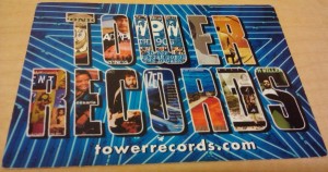 5 Examples of Images Within Typography Fuel Your Creativity May 17, 2011 By Jennifer Moline I’ve always been drawn to typography that incorporates images – I’m talking about that bold type that frames a series of photographs or illustrations. As a graphic element, this typographic style allows the designer to include more photos than would otherwise be permitted. The letters provide a natural frame for the photos. ... Here are five examples of images in typography.
  Is Crowdsourcing Ever OK? Fuel Your Creativity April 20, 2011 By Jennifer Moline Graphic designers for the most part are united in their disapproval of crowdsourcing. I formed this opinion based on Twitter conversations and comments on design blogs – mention crowdsourcing, and graphic artists immediately get huffy, insisting professionals deserve to be paid. “Crowdsourcing” occurs when a company asks outside people to contribute their work for consideration, and the company chooses a submission for use.
  27 Inspirational Web Cartoons Feedgrids.com April 14, 2011 By Jennifer Moline The following is just a sampling of the comics I’ve found on the web. They vary in design, from minimalism to highly digitalized. Some are funny, others are serious and others are just art. In addition, a LOT of them contain profanity and adult themes, so consider yourself warned. I’m grateful for the platform the Internet provides, because without it, I doubt we’d be exposed to so many comic artists. What are your favorite web cartoons?
  Do One Thing and Do It Well Just Creative Design April 6, 2011 By Jennifer Moline The old adage, “jack of all trades – master of none,” can apply to the graphic designer who tries to do it all: web development, letterhead design, logo creation, coding, etc. While designers who promote themselves as able to handle everyone’s needs may get a lot of inquiries, their work could suffer as a result. ... While I’m sure plenty of folks are capable of meeting lots of customer demands, there’s something to be said for the “expert,” the go-to person.
  6 Pinup Girl Tutorials Feedgrids March 17, 2011 By Jennifer Moline Pinup girls were a big hit during World War II, with their posters and magazine advertisements adorning many a soldier’s locker. Their popularity evolved but never really faded, and today, retro is hotter than ever, with pinup girls appearing in devil form in Chris Cooper’s art, in advertising for burlesque shows, on merchandise marketed toward nostalgic people and, of course, tattoos.
  7 Woes of the Freelance Creative Pro Fuel Your Creativity March 16, 2011 By Jennifer Moline When you work for yourself – as a designer, a writer, a photographer or some other creative job – you seem to have it made: no boss to answer to! You can set your own hours! You’re living the dream, doing what you want to do! But there is a downside to freelancing – seven that I’ve listed.
  Kinetic Typography: Design in Motion Speckyboy March 13, 2011 By Jennifer Moline As a graphic design blogger, I subscribe to Google Alerts for such terms as “typography”, and practically daily, a post pops up containing “kinetic typography” in the headline. Is this a new trend? Its popularity has been rising rapidly, prompting Vimeo to create an entire channel dedicated to it. Videos include motion typography to go along with, for example, famous movie monologues. Here you will find six beautifully crafted examples of kinetic typography.
  Graphic Design Through the Decades: The '00s Inspiredology January 17, 2011 By Jennifer Moline As 2011 brings us deeper into a new decade, it’s easy to forget that 2000-2009 contained a full 10 years of graphic design innovation and trends. More and more design leapt from print to the web, and work was created not just on a computer but on iPhones and other handheld devices as well. All of a sudden, you had to ensure your typography would look as good on a widescreen monitor as it would on a smartphone.
 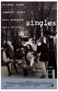 Graphic Design Through the Decades: The '90s Inspiredology December 8, 2010 By Jennifer Moline Compiling graphic design for the 1950s, the ’60s, the ’70s and the ’80s was easy. Just mention any of those decades, and iconic images pop into your head: cartoon-style housewives, bell bottoms, blocky, disco typography and neon lettering. But when it came to coming up with graphic design representative of the 1990′s, I was at a loss – nothing came to mind. It took a few friends to remind me of grunge music, whose flannel, Seattle style influenced everything from fashion to design that is still popular today. Though one blog, while reviewing an exhibition of rave flyers, dubbed it one of the “least subtle eras in graphic design history,” the ’90s, I think, have now had time to settle in as a comforting time of experimentation with design. After all, 1990 saw the birth of Photoshop 1.0, exclusively for Macintosh. Thus, graphic design was never the same again.
  Interview with PsPrint Designer Kevin Leong Business Pundit November 8, 2010 By Jennifer Moline Kevin Leong is like an integral piece in a Russian nesting doll – a designer at an online printing company that has a large percentage of designer clients. Making sure a website and marketing materials meet the standards of other creative pros puts pressure on a designer, but Leong has set himself up for the task since his childhood doodling days.
  Graphic Design Through the Decades: '80s Inspiredology November 8, 2010 By Jennifer Moline The 1980s were so totally tubular that it can be challenging to find authentic graphic design from that decade – so much of what is on the Internet is actually current and was only inspired by the ’80s. And why not? Carrying the brashness of ’70s graphic design over, the Me Decade was all about grabbing attention, with its bold, neon colors, jagged typography and hair-raising styles.
  So You Want To Go Freelance Freelance Folder October 22, 2010 By Jennifer Moline “I want to be my own boss.” How many times have I heard that? So many people fantasize about saying, “Take this job and shove it,” to their employers. They envision freedom through owning their business. But what’s the reality of going freelance? Being a freelancer means you’re not just doing what you love -- in addition to graphic design, you must wear all the hats of a business owner
  How Made With Awesome Evan Ferstenfeld and Roni Lagin Created a Successful Design Business Business Pundit October 15,2010 By Jennifer Moline Every once in a while, a bit of wit pops into your head and you think, “That would look great on a T-shirt.” Evan Ferstenfeld and Roni Lagin take that inspirational moment and run with it – they’re celebrating the one-year anniversary of their joint venture, Made With Awesome. Here, the business partners discuss how running Made With Awesome fits in with their other full-time jobs, how they’ve grown in the past year and where they get their design ideas.
  Lost Coast Brewery Branding by Duane Flatmo Feedgrids.com October 14, 2010 By Jennifer Moline We have already covered some cool examples of beer label branding here at FeedGrids and are now offering an interesting follow-up: a great sampling of creative and unique beer label branding by Lost Coast Brewery - a pure source of graphic design inspiration.
 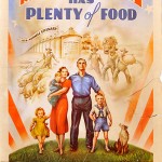 12 Food Propaganda Posters for Design Inspiration Daddu September 30, 2010 By Jennifer Moline While most people are familiar with World War I and WWII propaganda posters – Uncle Sam declaring he wants YOU for the U.S. Army is one of the most recognized posters out there – many others from that era focused on other issues that came about from the wars. One category is food. During the two wars, farmers went into debt, the Great Depression occurred, people didn’t have money, and there was a fear of running out of food.
  4 Myths of Social Media Marketing Pronet Advertising September 30, 2010 By Britt Brouse Would you say no to a free ad for your freelance business on television or in a local magazine or newspaper? Then you better be doing social media marketing! Social media marketing is a free way to advertise, yet only a handful of freelancers are using sites such as Twitter, Facebook and LinkedIn to market their services and increase web traffic. The only cost to doing social media marketing is the time you invest in creating a profile, crafting messages and engaging with other users.
  The Trend of Minimalist Graphic Design Speckboy September 23, 2010 By Jennifer Moline Our rendering technology is unthinkable, yet we still study Mondrian. Great minimalist work is striking, elegant, and classic. Within the colorful world of advertising, a minimalist ad stands out from the crowd. They can be a hard sell, though—a poorly conceived minimalist advertisement showcases its flaws and looks amateur to a client. Want to create a killer concept for minimalist graphic design? Here are five steps to get you started.
  Design Inspiration for 'Star Wars Geeks' Feedgrids By Sonia Mansfield September 21, 2010 No movie inspires graphic designers and artists as much as the “Star Wars” movies. Every day there is a new fan video on YouTube, a new T-shirt or funny bumper sticker for sale or a cool art design making the rounds on the Web. TV shows such as “Family Guy” and “Robot Chicken” have done entire episodes based on “Star Wars.” Weird Al even wrote a song about the “Star Wars” movies! Here are 11 different designs inspired by “Stars Wars,” and, of course, may the Force be with you.
  Beer Labels and Logos for Inspiration Feedgrids By Jennifer Moline September 10, 2010 People definitely judge a beer by its cover. Your local bottle shop is a sea of strange brews, each competing for your attention with its label. The plumage on that pilsner is no mere decoration. Microbreweries in particular know that beers with great graphic design are the ones that get sampled and remembered.
  Graphic Design Through the '70s Inspiredology September 1, 2010 By Jennifer Moline While psychedelic rock-concert posters carried into the 1970s, that decade also saw an evolution in advertising, with more people’s up-close faces declaring their devotion to a product. Cartoons and drawings were left to make-believe animals – the starkly drawn housewives of the ’50s were replaced with perky human beings.
  4 Ways To Get More Freelance Smashing Share August 30, 2010 By Britt Brouse Part of being a freelancer means being your own business development department, and going out and pursuing fresh clients. This is true for freelancers just getting started and for those who have been freelancing for a couple of years.
  Typography as Art Speckyboy August 27, 2010 By Britt Brouse Typography is one of the cornerstones of good graphic design. Selecting and manipulating typefaces is an art unto itself. Therefore it’s no surprise that classic typography regularly makes its way into famous paintings and sculptures.
 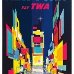 Vintage TWA Posters Design Crave August 24, 2010 By Sonia Mansfield Mixing destinations’ iconic images with bright colors, illustrator David Klein created some of the most influential advertising in the travel industry in the ‘50s and ‘60s and established himself as a true artist. Klein’s posters have won him numerous awards and his TWA poster for New York hangs as part of the permanent collection in the Museum of Modern Art in New York.
  Should You Change Your Logo? Business Pundit August 24, 2010 By Jennifer Moline It happens to all of us – that logo you spent hours, days, weeks working on with a graphic designer turned out beautiful. You slapped it on all your letterhead, business cards, signage, websites and other promotional materials. And once it was out in the open, you realized, “Maybe it’s not quite right.” Now what?
  Is There Such a Thing as Green Graphic Design? Graphic Design Blog August 20, 2010 By Britt Brouse When people think of businesses going green, they might picture Fortune 500 companies installing wind farms and solar panels, and reducing their packing materials; however, there are many ways for graphic designers to be environmentally responsible. Even one graphic designer or small design firm can make a big difference.
  6 Tips for Focusing When Writing Daily Writing Tips August 11, 2010 By Jennifer Moline As I struggle to keep deadlines, I realize that my work environment is filled with distractions – whether it’s other people’s conversations filling my head or the flashing of my instant-messaging window telling me a co-worker has a question. If I’m going to make this deadline, then I need to buckle down. Here are six tips that I’ve learned help me focus on my writing.
  Freelancing and Co-Working: The Best of Both Worlds Hongkiat.com August 9, 2010 By Jennifer Moline The core reason to be a freelancer is that one does not have to commit to full working hours that will destroy the joy of working and possibly putting personal life at stake. As a freelancer you can decide your own working hours and show up to work in your pajamas. However freelancing can be a lonely existence. You might find yourself not leaving the house for days and stalking everyone in your chat list just to feel humane. This is when co-working comes into play.
  The Pros and Cons of Giving Away Your Graphic Design Fuel Your Creativity August 9, 2010 By Jennifer Moline Tons of businesses and organizations are suffering in this economy, whether it’s graphic designers being laid off or nonprofits struggling to get funding. I’ve heard recommendations for unemployed people to use their skills to give back to the community, and in turn it’s an excellent opportunity to get their name out and possibly find some business for themselves. Of course, giving away for free the talent you’ve built up for years does court some controversy.
  How to Promote Your Design Business on the Cheap Web Design Ledger July 29, 2010 By Jennifer Moline Ah … the life of a freelancer. It’s not enough that you’re creative and technically savvy. No, you have to be a clever businessperson as well. No matter how talented you are, when starting out you probably won’t get clients unless you pound the pavement for them. But you likely don’t have the time or money to engage in any sophisticated advertising campaign. Fortunately, these days there are plenty of ways to market your business for little to no cash.
  Designers, Why Do You Do What You Do? Just Creative Design July 22, 2010 By Jennifer Moline Graphic designers are freelancing or working in-house at agencies, corporations, publishing houses and more. They create logos, lay out websites, design magazines, etc. But as any creative professional knows, graphic design isn’t necessarily glamorous like “Mad Men,” with Bloody Marys on hand at every meeting.
  15 Stunning Signs of Summer Feedgrids.com July 18, 2010 By Jennifer Moline Summer lovin’ may be a blast, but summer designin’ doesn’t happen so fast. During the long, hot, sticky days of summer, our brains sometimes melt, and inspiration doesn’t come easy. But clients don’t take the season off, and deadlines are still coming at you in waves. So here are 15 sensational sources for sunshine inspiration.
  Graphic Design Through the Decades: The '60s Inspiredology July 5, 2010 By Jennifer Moline The 1960s saw an evolution in graphic design. Like in the 1950s, you still had Saul Bass creating movie posters and a lot of earth tones dominating advertisements. However, changes were happening – from Paul Rand in 1960 modifying the IBM logo he designed in 1956 to LSD-inspired psychedelia adorning record sleeves and concert posters.
  Why Freelance Writers Need an Evergreen Stable of Writing Daily Writing Tips June 23, 2010 By Jennifer Moline Often in the writing world it pays to be on top of current events – to be the first to publish breaking news. But in order to land a contract or regular gig, freelancers should consider keeping a stash of evergreen articles – those timeless writing pieces that stand on their own.
  How to Make Money Off Your Graphic Design Designer Daily June 17, 2010 By Jennifer Moline Somewhere I believe there is an Island of Misfit Designs. It contains Moleskine notebooks filled with sketches that never found a home – graphics that didn’t match a company’s vision. But all that effort doesn’t have to be for naught. … Not only can you make some money off your rejected work, but you also might earn some new business!
  How to Protect Your Creative Work Online Fuel Your Creativity June 16, 2010 By Jennifer Moline Online portfolios are a key part of any creative professional’s marketing arsenal. However, displaying your hard work on the Internet puts it out there for thieves to exploit – those people might simply grab it.
  Interview with Greg Grigoriou of Van Paul Stu DesignM.ag June 11, 2010 By Jennifer Moline In the midst of juggling his own business, Van Paul, a family and a major relocation, Greg Grigoriou took some time to dole out advice to future designers, discuss outsourcing and explain why a fly swatter is essential in his office.
 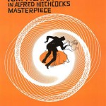 Minimalist Movie Posters Pique Interest Design Crave June 9, 2010 By Jennifer Moline It seems film companies are keeping track of poster trends, as the imagery for “Buried” evokes Hitchcock at his retro best. The new poster skips in on the heels of the minimalist poster trend that has seen graphic artists paying homage to cult favorites with reimaginings of their own.
  How to Land That Graphic Design Job Business Pundit June 4, 2010 By Jennifer Moline Competition for design jobs can be fierce these days. The trick to getting hired as a graphic designer in this environment is to not necessarily be the best but rather to stand out among your peers – offer something a little different. Here are some tips.
  Handling the Business Side of Design Hongkiat.com June 3, 2010 By Jennifer Moline One aspect of The American Dream is owning one’s own business. … But just because you love design doesn’t mean you’d be a good business owner. On the flip side, just because you have an MFA and not an MBA doesn’t mean you can’t open up your own design company.
  5 Alternative Methods for Typography Inspiration Speckyboy May 27, 2010 By Jennifer Moline Typography is the Jan Brady of graphic design – it doesn’t generate the rabid excitement of color nor cooing over flashy images. But typography can’t be ignored – in its basic form it’s what spells out a message, in its true and full form it can be used for optimum readability, impact, or even an artistic statement. Its this full form that elevates it to an art-form.
 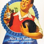 Father’s Day Design Inspiration Feedgrids.com May 16, 2010 By Jennifer Moline What comes to mind when you think of dads? Perhaps argyle sweaters, a pipe and a La-Z-Boy chair – if you were born during the last century. Every father is unique, but I’ll bet most parents and their children can connect with at least some of the following images compiled for your inspiration.
  Elements of a Successful Online Portfolio Just Creative Design May 13, 2010 By Jennifer Moline An online portfolio is a fast and far-reaching way to market oneself as a designer. It’s also cheaper, more versatile and more environmentally friendly than a print portfolio. But that doesn’t mean you can just whip out a website and call it a day – a designer will be judged not just for the pieces in the portfolio but also the site itself.
  Don’t Even Think About Logo Design Without These Tips Fuel Your Creativity May 10.2010 By Jennifer Moline The old saying “you only get one chance to make a good first impression” sums up the purpose of a logo. Often the first taste of the company, a logo can mean the difference between a person becoming a customer and the one who got away. …That’s why it’s vital to consider the following when you receive a logo-design assignment.
 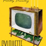 Graphic Design Through the Decades: The ‘50s Inspiredology April 21, 2010 By Jennifer Moline The 1950s donned a cloak of perkiness – smoking didn’t kill, Cuba was a vacation destination and women were pleased as punch to do housework in pearls and heels. … Today, tobacco products legally must carry warning labels, Americans must climb obstacles to travel to Cuba and women are as much of the workforce as men.
  6 Steps to Writing a Blog in 20 Minutes Flat Fuel Your Blogging April 14, 2010 By Jennifer Moline A well-read blog is one that is updated regularly. Search engines pick it up, and followers know to check in for the latest news. However, coming up with a post almost every day is a lot of pressure for bloggers. Follow these easy steps and you, too, can write a good blog post fast!
  The Evolution of Big-Name Logos Inspiredology April 14, 2010 By Jennifer Moline I was taught in graphic design class that huge companies continue to advertise because it’s important to keep their brand out there and in people’s minds. Despite the determination to be easily identifiable, a lot of these big companies have tweaked their logos throughout the years. Here’s a look at the evolution of some of them.
  Color Isn’t Always Better Fuel Your Creativity March 11, 2010 By Jennifer Moline While color definitely garners attention, there are times that black and white or a sepia tone will generate a different feeling. Think of how The Wall Street Journal, with its use of black and white, commands a serious, all-business sense, or how photos from the 1800s and early 1900s have an old-timey look with their sepia tone.
  Need Inspiration? Get Out Fuel Your Creativity February 7, 2010 By Jennifer Moline I know that when I’ve worked from home full time, I’ve experienced creativity block. I think that often has to do with the lack of interaction among co-workers. But there are other ways to be inspired, and they involve stepping away from your home office.
  15 Blue Logos That Evoke Precision Inspiredology January 10, 2010 By Jennifer Moline The color blue is considered to be nonthreatening yet instill confidence. Take a look at these 15 blue-heavy logos and decide if the color makes you feel what the designer likely intended.
Guest Starring ... PsPrint Blog
July 19, 2010
Celebrating American Artist Appreciation MonthPrint marketing: 7 benefits to leverage in your business




[...] PsPrint is all about spreading knowledge. That’s why our bloggers share their valuable insights on other graphic design blogs. Now, we have a page dedicated to our bloggers’ travels around the World Wide Web, “Guest Starring … PsPrint Blog.” [...]
[...] Be inspired by this magazine style theme. [...]