Primary Colors: Red
September 8, 2011
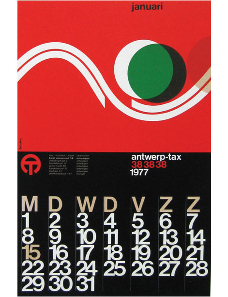
Part of good design is understanding color and what it conveys on a subliminal level. To have a successful logo, letterhead, storefront, etc., hinges on the obvious and not-so obvious cues you give off on a superficial level. People instinctively respond to certain colors, shapes and words at a gut level and good design capitalizes on that reaction. Color is one of the most visceral and instantaneous ways you can make an emotional impact on a viewer, and primary colors are the most elemental in the color spectrum. All the other colors are derived from blue, red and yellow. There is no ambiguity in the primary colors. They are as different from each other as they can possibly be. We already took a look at blue. Today, let’s focus on what the use of red says about you. Red’s meaning In nature, red is associated with blood, fire and ripeness (crops such as tomatoes and peppers change from green to red as they ripen). It can signal danger and death and is the opposite of neutral.
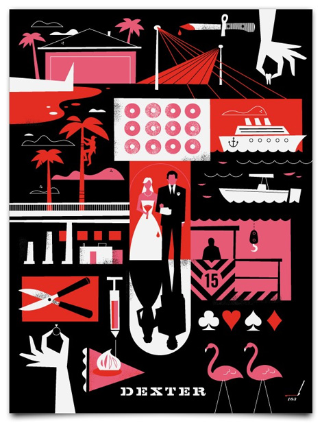
In terms of how the eye views red, it is a color that advances. Since it can signal danger, the eye picks red out of a landscape very quickly. It’s why stop signs, stop lights and fire engines are always easy to spot. It’s a color that raises blood pressure and heart rate. Red can also signal positive things such as energy, speed, power, passion and love.
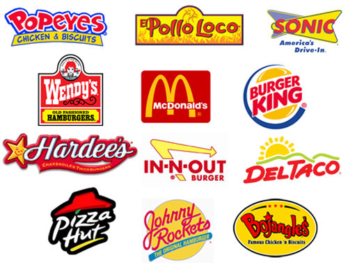
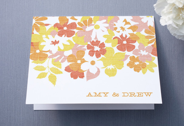
Red encourages conversation and boosts hunger. It’s the color of emotion and reaction. For these reasons red is used often in food packaging, restaurant logos and limited-time offer signs to create a sense of urgency. The disadvantages of red are very much the opposite of blue. Red is a power color and therefore should be used sparingly. Too much red can seem a little attention-seeking and aggressive. Since it’s also the color of emotion it’s not really appropriate to use a lot of red for businesses that want to seem stable and rational. Red in analogous palette Differing shades of red together can be just as pleasing as shades of blue together. They do vibrate and sizzle on a page but can seem very warm and organic like a cluster of cherries at different stages of ripeness.
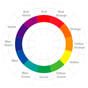
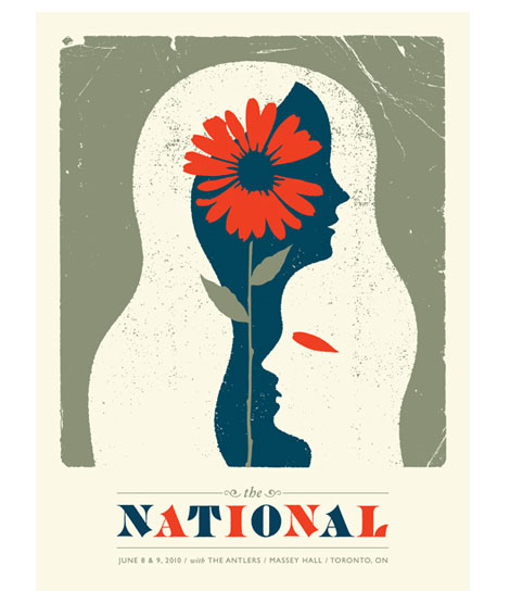
Red in complimentary palette Red’s compliment is green, which is on the other end of the color palette. Naturally, the combination of red and green instantly conjures Christmas for most people. It’s a very tricky color combination to use but it can be done. Either one of the colors has to be dominant or a significantly darker (or lighter) shade of one or both of the colors must be used.
Bookplate design: 3 tips for graphic designers Print marketing: 7 benefits to leverage in your business










These are some of the best intros to color theory ive seen. Keep up the great work!
Thanks El Jefe. Color can either be a paralyzing wide-open field of options or a powerful tool if you know how to use it. Just trying to help the color-phobic understand that it's not so mysterious.
[...] the graphic designer, however, red is not descriptive enough; and finding the perfect hue of red (or any other color) can make or [...]