

 Macro image of a bumble bee from eyekonic.net.
In nature, yellow is associated with flowers, sunshine and the warmth of firelight. When yellow is bright and saturated it can signal cheerfulness, freshness and youthful energy. When yellow is dull it brings out less positive associations of decay, jaundice and dirtiness. In the Gustav Klimt painting "Tree" yellow conveys warmth and energy. 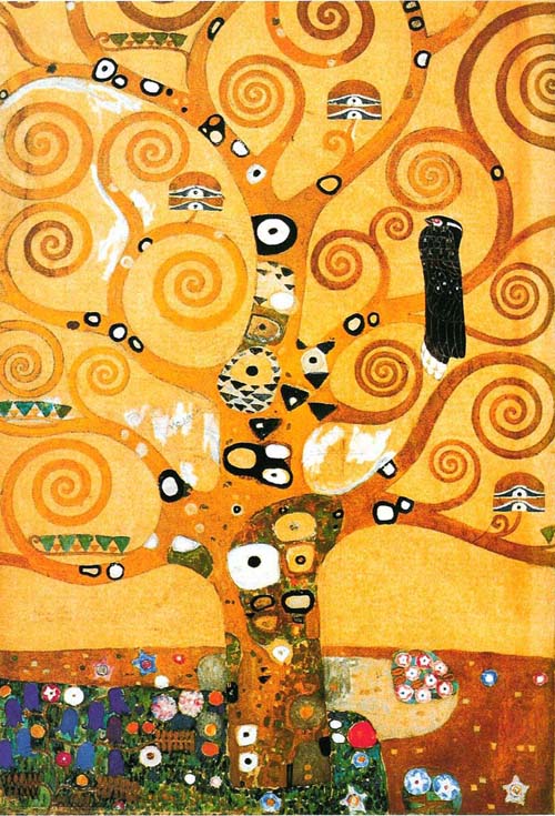 In terms of how the eye views yellow, it is a color that advances. Like red, yellow is a warm color, but it doesn't have the same intense visceral associations of blood and fire. When combined with black it's one of the most eye-catching color combinations, which is why it's ideal for caution signs. Yellow is ideal for food packaging and logos since its associations with warmth imply hearth, home and appetite appeal.
 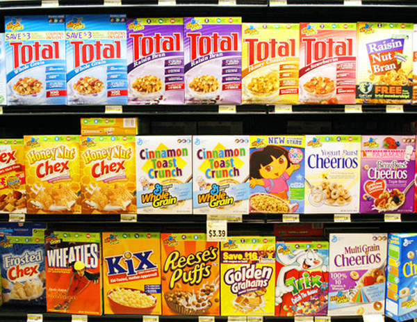 Just looking at the cereal aisle you can see how pervasive yellow is. (AP photo) Yellow in analogous palette Yellows, oranges and greens together make for a bright citrus-y palette. It comes off as youthful and optimistic but can read as juvenile and inexpensive.
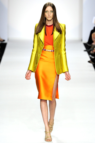
Photo from Style.com
Yellow in complementary palette Yellow's complement is purple. As always the proportion and shade of the two colors control the tone they convey. When both are bright and saturated there's a lot of pop that can either confuse or focus the eye. 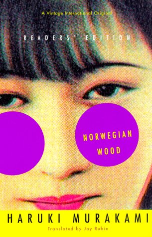 The approximated sunglasses in purple vibrate against the bright yellow band below, giving this book cover by John Gall a manic energy even though it's just a close-up illustration of a face.
 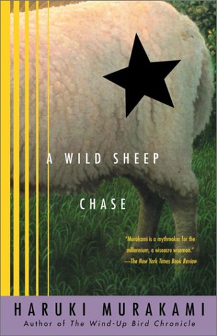 Here we have another cover by John Gall for a book by the same author, but the purple is muted and the yellow is darker. The energy from this cover is much more subdued as a result.


No comments yet.