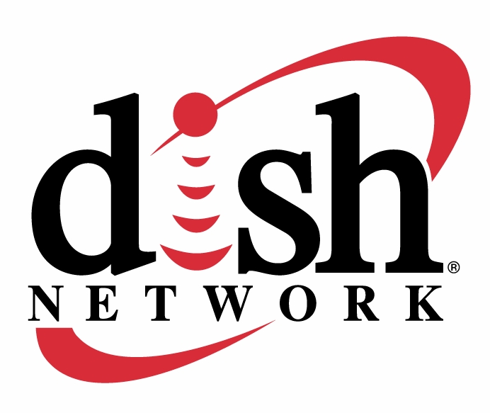
Ever looked at someone’s logo and thought, “I would never eat there! I would never shop there! I would never take my child there!” It saddens me when a company is completely oblivious to the type of vibe their graphic material gives off, and it all starts with the logo. When creating a logo, it should include these four elements: simple, memorable, relevant and creative. Simple: Don’t get me wrong here, simple does not mean plain. Simplicity is a concept more than a specific visual. A logo can be simple and interesting at the same time. One of my favorite logos is that of Dish Network. It contains the four elements. It’s not cluttered or crowded. It’s memorable (I remembered it!). It’s relevant due to the use of the satellite beams seeing as the Dish Network is a satellite service. And it’s creative because with all of these elements put together it gives an effortless look while getting the point across.
  Memorable: You don’t want a logo that people will forget, pass over or turn away from. Know who you’re designing for and who their target audience will be. Why does the pink ribbon for breast cancer awareness hold such an esteemed meaning? Breast cancer primarily affects women (pink), and it uses the symbol for remembering someone who is away or has passed on (ribbon). If they had used the words “BREAST CANCER” in bold black letters, no one would pay attention to that. Know your audience and know what touches them. That way when you add that memorable touch, they will be able to relate and more likely to participate. Relevant: A logo of a shoe wouldn’t be a good fit for a seafood restaurant. Point made. Make your logo something that relates to the business/organization that will be using it. Take time to understand what it is that business does, whom they service, and why they’re doing it. You might make a logo with a neon shrimp in it for that seafood restaurant. While that might be great for a hip, new sushi bar, it might not be a good fit for the mom-and-pop seafood hole-in-the-wall. Creative: I haven’t met one client of mine yet that wants his or her logos to look exactly like someone else’s. Everyone wants to be different, special and unique. The key here is knowing your client, your client’s competition and your strength. Think outside of the box and find inspiration in unlikely places. Use a play on words or a twist on an old idea. Change up a previous concept with a different color scheme or use color to show growth, aspiration, mood or specialty. Ask your client or people who are not designers to do a word association exercise and see what they come up with as it relates to your client’s business or product. You never know what will get those creative juices flowing! Your logo is your stamp. It’s your introduction. It’s your calling card. Make sure that people that see it are responsive and drawn to it. By sticking to the principles, that’s exactly what will happen with your next great logo! What are some examples of logos you think use all four elements? What logos do you think do not meet all four elements?
Characteristics of a great logo design
June 22, 2009
10 unique ideas to promote your graphic design businessPrint marketing: 7 benefits to leverage in your business


No comments yet.