Summer movie season is kicking off and movie posters can act as great inspiration. If you're making flyers for an event or stumped on fresh ideas for promotional posters there are some ideas you can steal from Hollywood. The posters I've picked out are not chosen for the quality of the movies or because they're the biggest blockbusters. I chose them solely based on their aesthetic beauty, creativity and graphic impact.
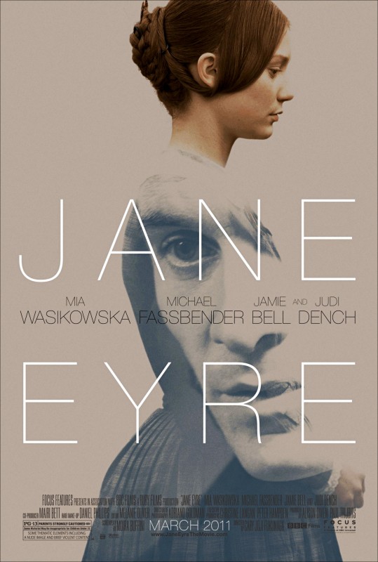
Jane Eyre Who doesn't love a story about two star-crossed lovers? This poster is a great mix of period costume and hair, super-modern typography and Photoshop trickery. Mr. Rochester's face becomes the body of Jane's dress. The subdued color palette of the photography captures a contemplative mood appropriate to the slowly unfolding love between them. Trick to lift: Pair vintage imagery with slick typography and subtle colors.
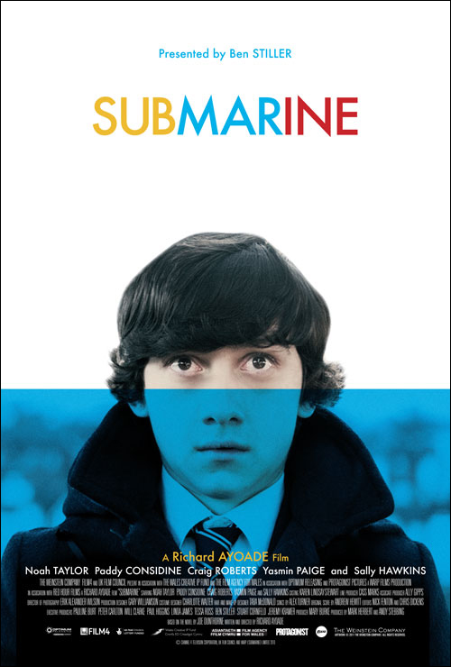
Submarine A quirky coming-of-age story needs a quirky poster. Using a portrait image is always interesting. The human face holds a natural fascination for most people and the expression written across it can speak volumes. Here the quirk factor comes with the color choices and the solid block of blue that makes it look like our protagonist is about to be in over his head Trick to lift: Use a face to draw the eye but don't be afraid to cover it with other elements to create tension.
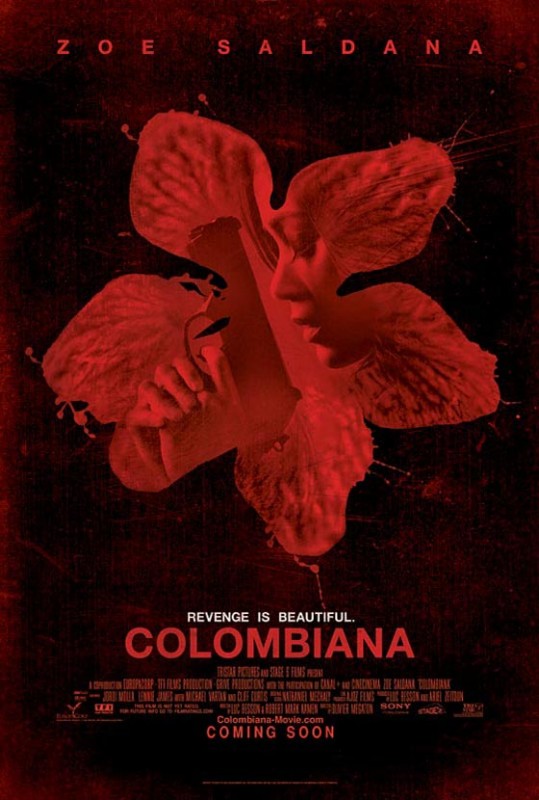
Colombiana Here we have an action movie with a very poetic poster. All the elements have a very organic feel from the distressed background to the spatter-flower shape that holds Zoe Saldana's silhouette. Even the type of her name and the title of the movie are a little distressed, which makes them meld into the background more naturally. The "Revenge is Beautiful" tagline ties the imagery together. Trick to lift: When you have a poster that calls for heart over intellect, imperfection can give it emotional resonance.
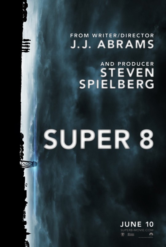
Super 8 Mysterious and beautiful photography is nice but when you take the natural horizon line and turn it upright this signals a story that will take the conventional and tweaks it. Using the sky as a field for the type is a nice trick, too. Trick to lift: Turn something on it's side! If you want people to stop and look, do the unexpected.
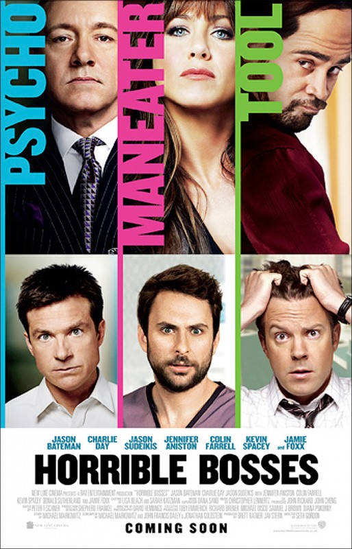
Horrible Bosses When dealing with multiple chunks of information that are equally important you've got a challenge on your hands. We actually have six actors within three story lines that this poster is trying to accommodate. The trick here is that the bosses take a larger proportion of the poster than the squirming underlings. Not only are their images vertically taller they're also cropped tightly on each face so that the bosses seem to loom larger than life. Trick to lift: Slice it up equally but play with scale inside of those slices.
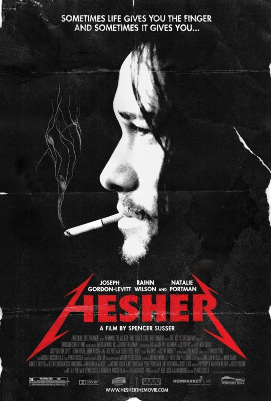
Hesher Another nice example of using the look of distressed paper to give a grungy, organic feeling to the movie. But the tricky bit that you don't notice at first is that the smoke coming from Hesher's cigarette is actually an illustration. It looks like roots and seeds sprouting. This may be a subliminal message about the core idea of the movie. Trick to lift: Try integrating line illustration into photography. You can add a layer of meaning.
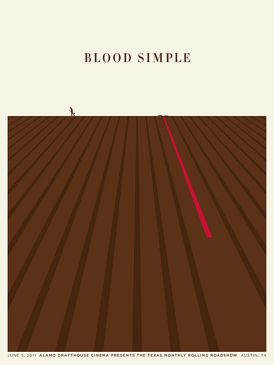
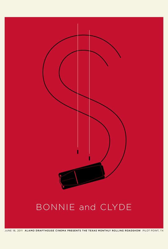
Alamo Drafthouse Rolling Roadshow Series I couldn't resist including these posters by Jason Munn for the 2011 season of the Rolling Roadshow. It's all about "free screenings of famous movies in famous places" as they say on their website. I love the economy with which he gets the plot of the movie across in each poster (I'm not even showing you all 10!). Illustration can be a really powerful medium where you can mash together elements to make a visual double entendre in a bold graphic way. Trick to lift: Take something symbolic (like the dollar sign in the "Bonnie and Clyde" poster below) and mash it together with something real world and familiar (the swerving car and flying bullets) and - voila - you have an arresting poster.


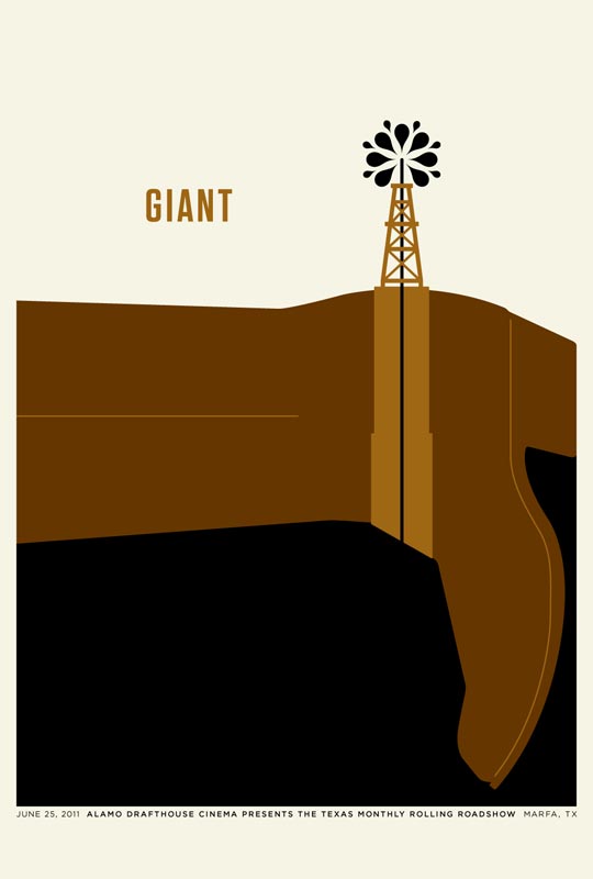
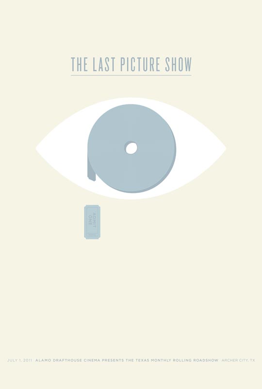
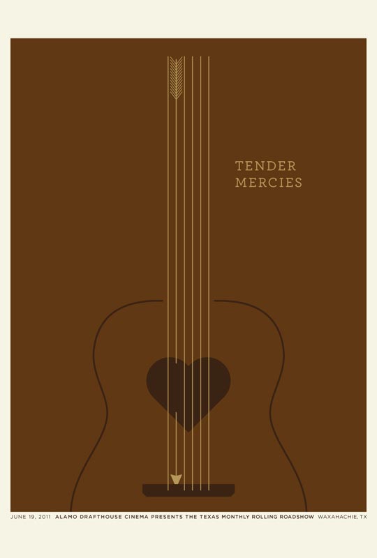



[...] Munn You may remember Jason Munn from the “Best Summer Movie (posters)” post. I know that it’s so hard to come up with such tightly crafted concepts and [...]
Hello there, You have done an incredible job. I will certainly digg it and in my view recommend to my friends. I'm confident they'll be benefited from this site.