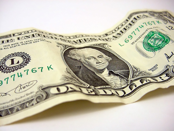
Our boring green money
Back when I was in school we had a project in Adobe Illustrator class to re-imagine American currency. It was technically a way to force us to apply all the previous lessons we'd learned and make complicated repeating patterns as anti-counterfeiting measures. What that one lecture did do was make me jealous of the Dutch. As a way of inspiring us our teacher showed us the modern redesign of Dutch currency. I've learned since that there are many countries in the world where their money is beautiful and colorful, but that first exposure was a shock. You may experience the same jolt as you scroll down and see what I'm talking about.
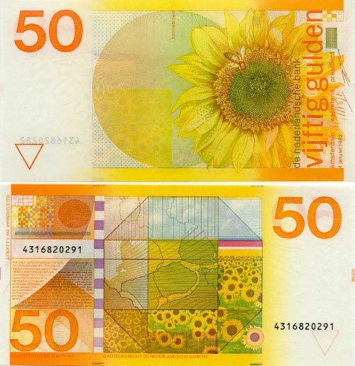
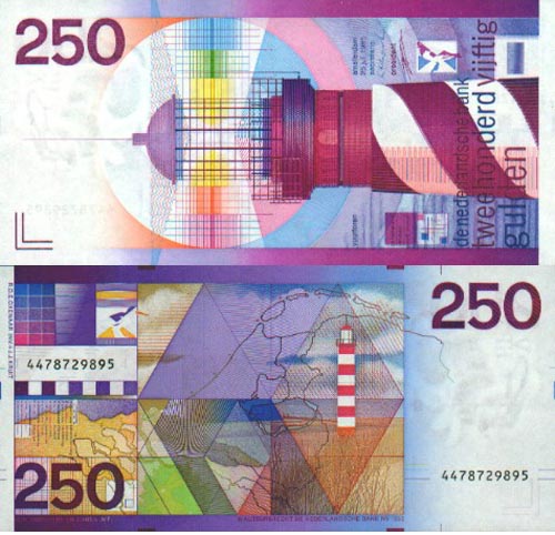
I mean, for heaven's sakes! You can't even really see the bumblebee watermark under the 50 on this bill! How great is a bumblebee watermark? Makes me wonder what the watermark is that I can't quite make out on this beauty below. Well played, Holland.
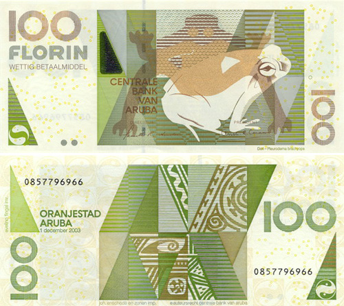
And just so that I can pass on the inspiration to you. I'm going to throw in more examples of gorgeous money from all over the planet. You're welcome.
Aruba 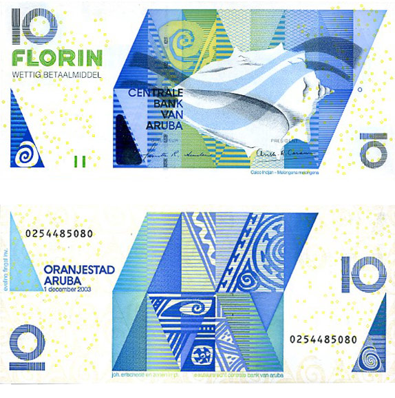
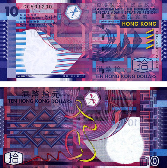
 Hong Kong
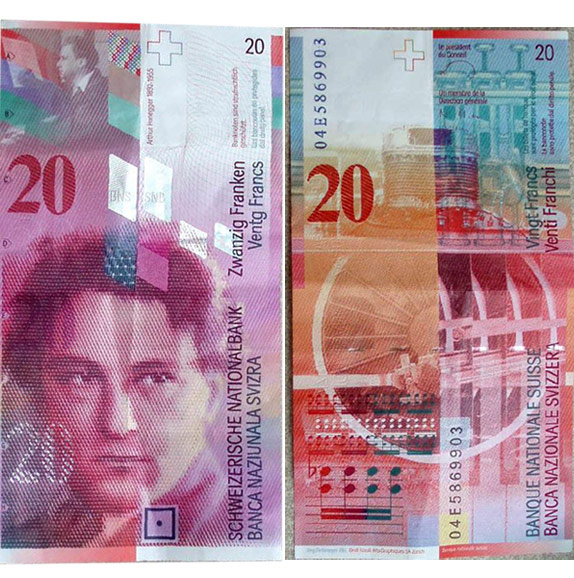
  Switzerland
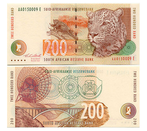
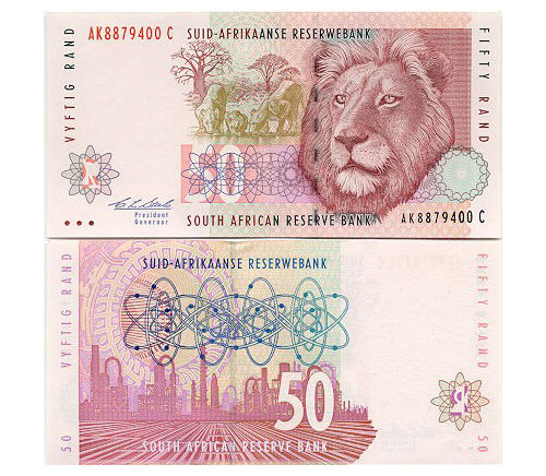
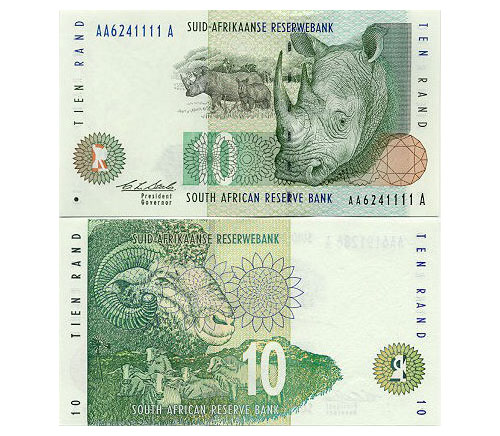
  South Africa
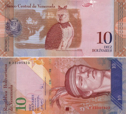
 Venezuela
  Money Makeover
 So just a few years ago a blog was started by Richard Smith called the
Dollar ReDe$ign Project. Designers and really anybody with a computer and the inclination to make our money cooler can submit their ideas for what each bill of U.S. money should look like. Some of the submissions are really stunning. And while The Huffington Post picked up on it and posted what they thought were
15 of the best, I can say they missed some good ones. Let me share some of my favorites. There's a competition to choose the best designs of the year, and these are some of the winners from 2010.
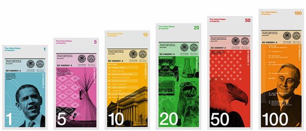
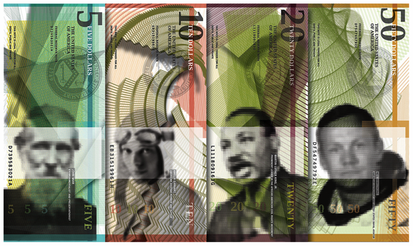
First, there's the first-place winner,
Dowling Duncan. Brilliant.
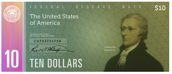
And the second-place winner,
Ani Ardzivian. Spiffy.
And an honorable mention,
Dan Swenson, whose design I liked better than the actual third-place winner.
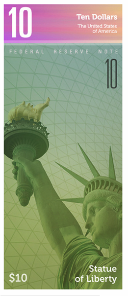
The backs of his money designs were just as lovely as the fronts. A couple of others from 2010 that I liked quite a bit:
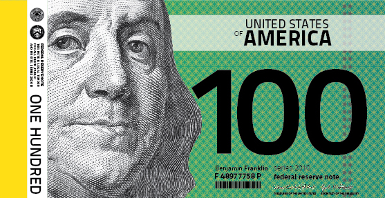
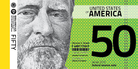
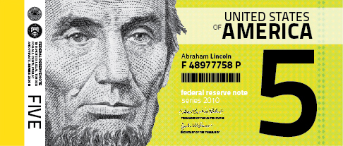
This set from
Reid Collier and
Evan Cotter makes everything change gradually according to denomination. The green of the background gets darker, and the width of each bill increases.
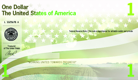
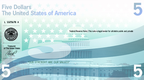
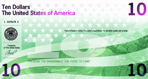
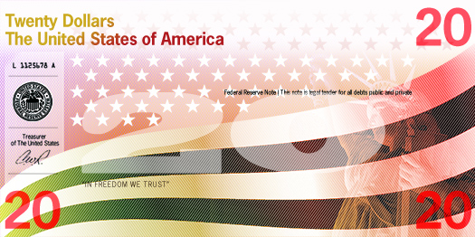
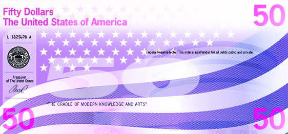 Toni Pareja-Cuadradas
 brings a really nice color palette into play for his interpretation. And here are a few of a more recent vintage:
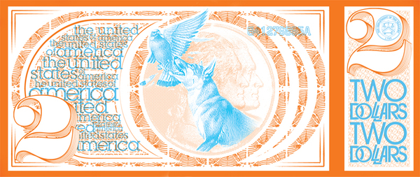
This wonderful, two-color, two-dollar-bill redesign is by
AJ Getz.
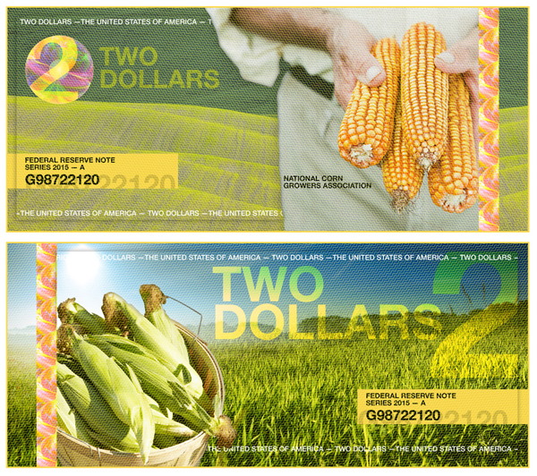
Another great interpretation of the two-dollar bill by
Lu Tapuch.
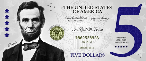
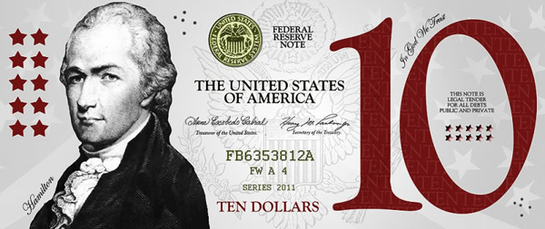
A couple of very elegant bills by John K Addis (creative director at
DMedia). You should go there yourself and read some of the thoughtful and clever ideas behind these designs or maybe submit your own:
http://richardsmith.posterous.com/ I mean, for heaven's sakes! You can't even really see the bumblebee watermark under the 50 on this bill! How great is a bumblebee watermark? Makes me wonder what the watermark is that I can't quite make out on this beauty below. Well played, Holland.
  And just so that I can pass on the inspiration to you. I'm going to throw in more examples of gorgeous money from all over the planet. You're welcome. Aruba
 Hong Kong
  Switzerland
  South Africa

 Venezuela
  Money Makeover So just a few years ago a blog was started by Richard Smith called the Dollar ReDe$ign Project. Designers and really anybody with a computer and the inclination to make our money cooler can submit their ideas for what each bill of U.S. money should look like. Some of the submissions are really stunning. And while The Huffington Post picked up on it and posted what they thought were 15 of the best, I can say they missed some good ones. Let me share some of my favorites. There's a competition to choose the best designs of the year, and these are some of the winners from 2010.
  First, there's the first-place winner, Dowling Duncan. Brilliant.
  And the second-place winner, Ani Ardzivian. Spiffy.
  And an honorable mention, Dan Swenson, whose design I liked better than the actual third-place winner.
  The backs of his money designs were just as lovely as the fronts. A couple of others from 2010 that I liked quite a bit:

 This set from Reid Collier and Evan Cotter makes everything change gradually according to denomination. The green of the background gets darker, and the width of each bill increases.


 Toni Pareja-Cuadradas brings a really nice color palette into play for his interpretation. And here are a few of a more recent vintage:
  This wonderful, two-color, two-dollar-bill redesign is by AJ Getz.
  Another great interpretation of the two-dollar bill by Lu Tapuch.
 A couple of very elegant bills by John K Addis (creative director at DMedia). You should go there yourself and read some of the thoughtful and clever ideas behind these designs or maybe submit your own: http://richardsmith.posterous.com/


The watermark on the 250 Guilder note is a bunny with the letters VHP. The bunny can also be seen on the backside of the note next to the digits 250 in the color green.