

![]()
A fairly recent revamp of a long-time San Francisco Bay Area newspaper flag.
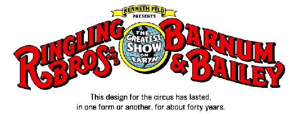
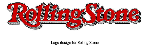
Jim Parkinson is a legend in the newspaper business, especially among those who are typophiles. Bay Area people have probably never heard of him, even though he's a local. You've most certainly seen his work at some point in your life. He's responsible, in part or in whole, for the Rolling Stone, Ringling Brothers and Esquire logos, among many others.
These images with captions are from Jim Parkinson's site, which you can peruse here.
He started out as a brush-and-ink sign painter. But when he spruced up the logo for Rolling Stone, he says, "I found that working for a publication, designing a custom typeface or a logo, was much more fulfilling than all the other lettering work I’d been doing and, after that, I tried to make it a point to work for publications as much as possible." And so he found his calling. He is very much a specialist in creating custom logos and tweaking old designs for various publications. The great part about his site is that he shows the old logo alongside his tweaked version, and it ends up being a great tool for analyzing typography.
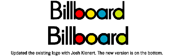
Take this revamp of the Billboard logo. I looked at it long and hard, and there's some subtle spacing between the L's, but mostly, he just improved the capital B in the logo. The more you look back and forth between them the more you realize that the previous B was just too condensed. The perfect rounded shapes of the B, O, A and D almost beg for a rounder, more generous B.
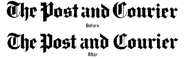
Or take the The Post and Courier of Charleston, S.C., for example. The important thing to note here is that a newpaper logo has to be printed on newsprint. Normally, when printing ink on paper, the ink bleeds into the paper a little, and the ink spreads. Most of the time this is something only a printer with a loop will notice. But as the quality of paper decreases, the spread of ink increases, and newsprint is notoriously absorbent.
Taking this into consideration, any letters with details that sit too closely together are in danger of bleeding into one another and creating an ink blob. As you can see in Parkinson's redesign, when you squint at the words, the overall impression is lighter and less clogged. But other things, like the bottom curl of the T and C, have been thickened to make them more consistent with the thickness of the P.
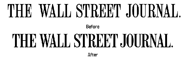
Here's one you may be familiar with. In this revamp the spacing has been tightened up, but also individual letters have been redrawn to make them look more even and consistent in the overall logo. You can see that both the N and U in "journal" have been widened and that the cross-bars on all the E's have been decreased. It makes you realize how aggressive they looked before.
Scrolling through the many other redesigns on his site is like taking a master class in publication logo typography. I encourage you to go and analyze a few yourself and see what you learn.


No comments yet.