A business card is your company in the palm of your potential client’s hand. It doesn’t have to be loud or outlandish to be a great design, but what it should be is specific to your business and its product or service. It never hurts to be memorable.
These businesses have found ways to make a statement out of a business card: 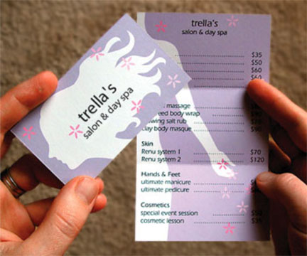 Trellas salon & day spa
 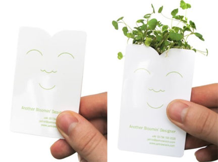 Another Bloomin' Designer
 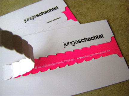 Junge Schachtel
 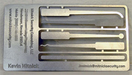 Mitnick Security Consulting
 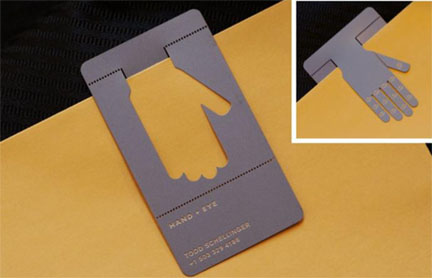 Aehrich O’Dubhchon
 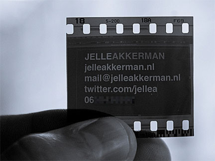 Jelle Ackkerman
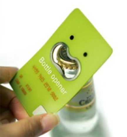
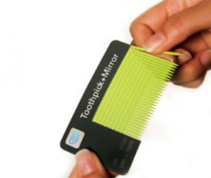
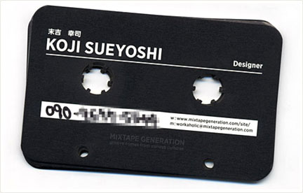 Koji Sueyoshi
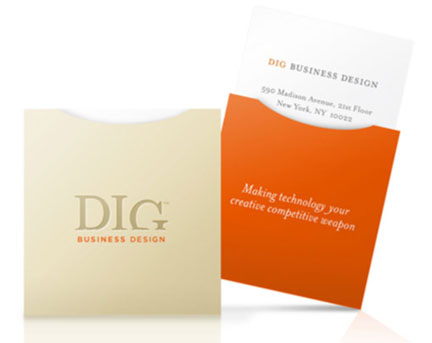


Some very cool designs. Junge Schachtel's tear away to reveal the info is a creative way to engage whomever it is holding the card. The last of the list is also quite innovative. The square design and containing it into the small envelope adds layers to the design of the card which is normally very simple. Some appear a bit too gimmicky, but great designs none the less.
Nice work. Very fresh.
Along with striking design, what makes a business card stand out is minimal text.
Our business card ( http://twitpic.com/18y7uo ) says little, but tells a lot. By including our Dot Tel online contact card, we have eliminated the need for clutter. It includes all contact details and will always be up to date.
Thanks Sari & Adrian for your thoughts! Absolutely a fresh and clean feeling is always appealing to the eye.
I love these.. the film and pull tab one defiantly stand out to me because you have to work to see the info. I also like the hand/bookmark one because of its usefulness
[...] See 9 more unique business card designs by reading the entire article here: http://blog.psprint.com/printing/unconventional-business-card-designs/ [...]