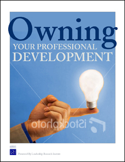
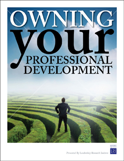
I love clean design. To me the less information, a.k.a. words, the better because I’m a visual thinker. The reality of media today, regardless of learning processes, is the fact that your window of opportunity to grab the public’s attention is merely seconds. So, in print media, how can you get your message across? Any good designer knows the design is not just about making something visually appealing; it should also drive home the client’s message. Emphasize the message I recently came up with some cover options for a seminar manual, and all I had to work with was the title and a little background on what the seminar was about. Let’s take a look at some of the comps, and how each one uses typography to grab attention and emphasize the message. This first option uses a graphic with the title, and the title typography puts the emphasis on the word “owning.”  The second option still puts the emphasis on the word “owning,” but I ditched the large graphic and opted for one that leads you straight to the beginning of the title. Of the two options, this one is stronger and is more about the typography of the title than the supporting image.
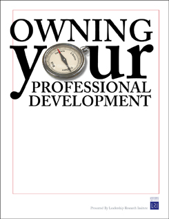
  In this next set of options the focus of the words change from “owning” to “your.” Note how this can change the implied message slightly, just like voice flux can change a statement to a question. This first example has a large graphic with the title.
  The second version again takes away the large graphic and changes the focus to the title through the use of varied typography. Note again how this version forces your eye to focus on the title and its message.
  Sometimes less is more Clearly with the last two sets of examples the strong typography won out over the large image in driving home the message. Often times our first reaction it to put a large graphic with something to help support or sell the message; but, as designers, we need to learn to edit our image impulses. White space can really help to focus the audience’s attention to the message. Words are graphics, too. They have form. They create positive and negative space and, depending on the font, a personality all there own. Words are visually more powerful than we often give them credit for.
Word play: The power of typography
March 17, 2009
Stock options: Coated and uncoated paper stockPrint marketing: 7 benefits to leverage in your business


No comments yet.