
You’ve worked half the night on this project. It really looks fantastic on your screen. You send a PDF to your client and they love it. They say, “Go with it, no changes.” Next you send it to the printer and you get a proof. With great anticipation you remove the proof from the oversized envelope and you can’t believe your eyes. “What’s wrong with the color?” you gasp. 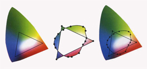 Here’s what could be happening: A range of colors is commonly referred to as a color gamut. A color gamut of a device is the range of colors that the device can reproduce. A gamut is produced by combining the complete range of color combinations for any device or printing press. The left graphics shows the color gamut of an RGB computer monitor. The area outside the triangle is colors that our eyes can detect but cannot be displayed on a computer monitor. Inside the circle in the right graphic is the color gamut based on what the CMYK printing process can produce. Every color outside the circle and triangle is a color that cannot be reproduced. Every color that is inside the triangle and also inside the circle is a color that both processes display the same. Now look at the graphic in the middle. That graphic shows all the colors that are displayed differently by the two devices. This means that an image may look fine on your screen but not how you would expect it to look when output on a printer. Color gamuts differ from one device to another, which presents a challenge for graphic designers. Imagine you only have three crayons with which to create a picture. Maybe the crayons are blue, yellow and red. You could make a very nice green by combining the blue and yellow crayons. You could make it lighter or darker or more yellow or more blue, but there would be some greens you couldn’t make without adding a different blue or yellow crayon. Now imagine that you hand your picture to another artist to reproduce, but they have different three different crayons to work with. Much like in the real world, the color reproduction probably wouldn’t match the original. So how do we minimize this surprising color shift? The answer is color management. Color management is the process of adjustments as we move images across a wide variety of electronic devices. Talk to your printer. They can help you determine the color profile you should use.

Color gamuts — What you see isn’t always what you get
April 3, 2009

About Lennis
Leave a Reply
What is the PsPrint Blog??
The PsPrint Blog is a resource for graphic designers, freelancers, small business owners and fans of print marketing. You'll find helpful techniques on printing everything there is to print, including business cards, postcards, brochures, stickers, invitations, greeting cards, door hangers, magnets and more. The PsPrint Blog shares creative ways to improve your design and layout skills, and useful tips for marketing your business in any medium. We also like to have a little fun, sharing design inspiration and spotlighting some our favorite customers' printed pieces in our "Hot Off the Press" series.


No comments yet.