In this segment we will identify the elements of a page. This can apply to any page in a publication whether it may be a magazine page, book page or newspaper page they all use some or all of the elements we will be reviewing. When designing a page it is important to keep all these elements in mind when laying out a page. Not only does it help the overall look but, when done properly, will help guide the reader through the page in a natural progression. Key points when laying out a page
- Headlines should be large; four or more times the body copy size.
- Subheads should be about one-third the size of your headline.
- Body copy should be no smaller than 9 points.
- No more than three different typefaces; this does not apply to variances in typeface families such as bold, italic, condensed, etc.
- Establishing a style sheet for your whole project beforehand will help with efficiency.
- Serif typefaces make body copy easier to read.
- Narrower text lengths are easier to read than wider hence the need for multiple columns.
- Look for ways to break up text into bite-sized pieces. Sidebars and pull quotes can help with this.
- Please no word widows and no line orphans.
Definitions of page elements (See element example highlighted below text) Head or headline – A summary phrase to a main section of material. The type treatment and use of white space for a head differs from the body copy. Heads organize the text into sections, draws the reader’s attention and informs the reader of what follows.  Subhead – The title of a subdivision of a chapter, article, etc. Just as with a headline the purpose of the subhead is to get the reader to continue reading.
  Byline – Quite simply the author of the story or article presented. This should be only a point or two larger than the body copy.
  Drop cap – The first letter in a paragraph that is set as an oversized capital and inserted into two or more lines of indented body copy. Also known as a hung initial cap.
  Folio – A page number and in magazines and newspapers is usually accompanied by volume or month and year.
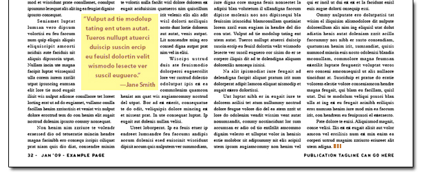
 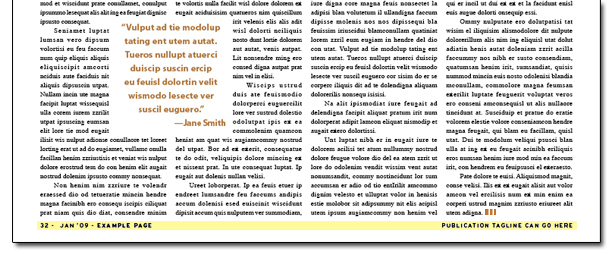 Call-out or pull-quote – Specially treated copy that is drawn out of the main body of text.
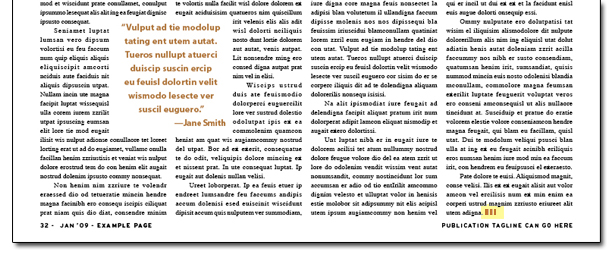
  End dot – An icon at the end of the body text to indicate to the reader it is the end of the story or article.
  Caption – Text that is placed in close proximity to an image to explain its relevance to the article.
 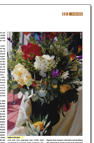 Photo credit – Text placed within or near a photo to credit the creator.
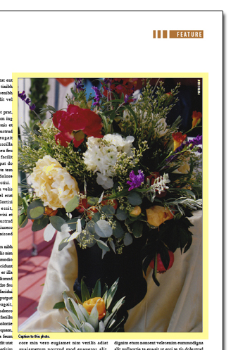
 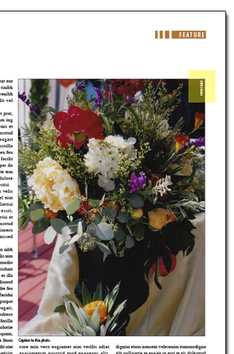 Image margin – The amount of spaced around an image. You never want your text to butt-up against the edge of an image.
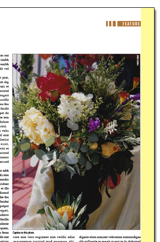
  Gutter – The inside margins of a publication.
  So now you know the elements of a page. All these elements need to be considered in the design of your page, so the overall layout helps guide the reader through the story or article. If you follow the points outlined in the beginning of this article while keeping in mind the images, side bars, call outs, and titles are all there to support the star of the show, the story, then you will have a successful page design.




[...] back to the basics Remember the basics of design; see my previous blog post “Elements of a Printed Page Every Designer Should Know”. Create a starting point; use the rule of odds; and then flow your text to see where you are at [...]
[...] ELEMENTS OF A PRINTED PAGE [...]
[...] Click this link to find out about elements of a printed page. [...]