Full color business cards are still the most widely used form of marketing there is. Even with PDAs and cell phones, the business card is the quickest and most transportable form of information around. So what should you advertise in such prime real estate to be noticed? Just like any other strong marketing material you need to keep in mind the basic principles of design when laying out your business card.
You used to have consider how much money you were willing to spend before you could figure out how many colors you were going to use in your business card design. But with digital printing presses becoming the norm it’s much more economical to print a four-color process card. With four-color process the sky is the limit with colors; however, you can still get a really clean and memorable design using only two colors and really nice paper stock.
A picture is worth a thousand words You could just put some words on your card but that would mean someone would have to read it to know who you are and what you do. If you have a well-thought out image to go with your information, then someone could take one glance at it to determine what it is for before getting close enough to read the type. Three questions to answer when choosing an image:
- What image will convey what you do with one glance?
- Does it look good at a small scale?
- Does it have a clean area for text if you are planning to use it on the whole card"
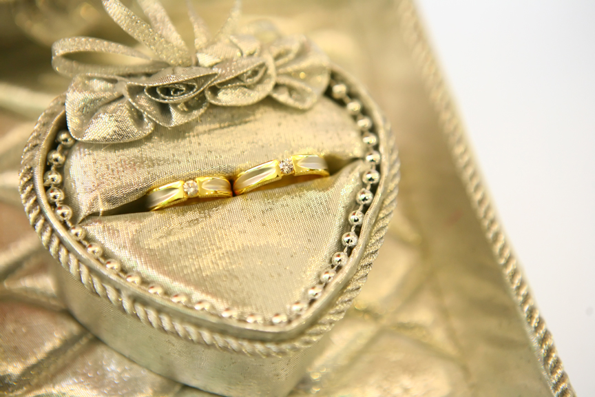
Sample scenario: Victoria Miles is a wedding planner. When you think of wedding planners you could think of many things that go along with the idea of a wedding: cake, flowers, a dress or rings. So as not to be confused with a cake maker or a florist, Victoria has decided to go with wedding rings for her image. Let’s take a look at a couple of images she found.

Picture 1

Picture 2
Say it like you mean it Now that we’ve chosen the image for Victoria’s cards we need to add her information to the card. Easy enough, right? First, let's go over a few key design points:
- Choose your fonts wisely. Victoria is a wedding planner not a preschool teacher or a rock band, so we need to look for a classic script or serif font to go with her classic wedding look. For you preschool teachers out there, feel free to use Comic Sans and for rock bands any grungy font will do.
- Allow the image to guide where you will place your text and how you will justify your text. For our image we could do a right justification or a combination of centered name and title with right-justified contact information.
- Edit what you put on your card since too much information in such a small space just gets lost and nothing will stand out as important. Who you are, what you do and two forms of contact information should suffice. Always include your website, if you have one, because it is another area where you have the ability to go into more detail about what you do and potentially sell to a potential client.
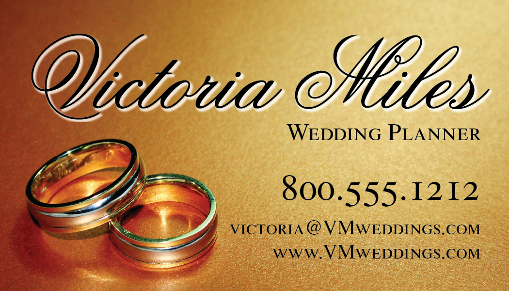
The result
Take a look at Victoria’s card below. Notice even though we had the option of using every color under the sun because she is getting a four-color process card we went with black text because it stood out the best on the photo. We even put a little bit of a glow around her name to help it stand out from the background. We put emphasis on her name and how to contact her by varying the font style and size.

Clean, elegant and effective is what Victoria got with this business card design. Remember your business card can be the most effective advertising tool if designed properly.


Good writing. Keep up the good work. I just added your RSS feed my Google News Reader..
Matt Hanson